Analysis is done here in the following way.
- The main variable is cumulative number of deaths per million people. This means that up to the latest available date, if D is the total number of deaths in a country up to a given date, and the country has a population of P million people, the main variable is simple D/P. Other variables are used in various charts, but they will be specified accordingly.
- A fundamental feature of the analysis done is the lag L vs. Italy. This is given in number of days. The idea is this: after China, S. Korea and Iran, Italy is the country in the western world that was hit first by the covid-19 pandemic. The value of 6 deaths per million is chosen as the value of the variable to align each country’s lag vs. Italy. For example, if we say that “Spain has a lag of 7 days”, this means that in Spain there were 6 deaths per million people 7 days after Italy. In Italy, this occurred on 8th March. Hence, it Spain on 15th March. Shifting Spain’s curve 7 days to the left, the two curves intersect. So, the comparison is made for the remaining period until today. Well, until today for Spain (or the country to compare it with) and <today – L> for Italy (so L days back). This comparison helps us understand how the development of the variable after the intersection continued.
Why like that?
The value of 6 deaths / million is chosen so that the COVID-19 disease was relatively mature in the country to be compared. We have seen analyses in various media that use:
- plain daily absolute deaths: this is not comparable between large and small countries
- aligning the country’s curves on the basis of: the first confirmed case, the first death, the third death or the tenth death: all of the above are too random, or – put it slightly better – too soon in the phase of the social contamination. So, not ideal to compare.
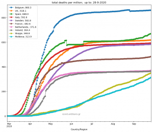
The daily graph will be published here
Other graphs and comparisons between countries will be published here
We also use absolute number of daily deaths, with or without the lag, but as a secondary piece of analysis
We also use unlagged curves, but as a secondary piece of analysis and comparison between countries.
Data come from John Hospkins university here
Data process with python
Enjoy and share!
Andreas Stalidis.