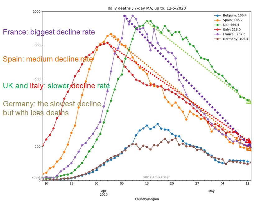
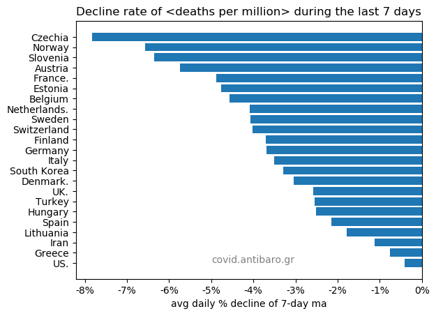
Commentary 12.5.2020: Daily update after a few days. Sweden is now far higher than Netherlands and heading towards France! Rest, as before. Two additional graphs to shoe that France has the fastest decline rate and the UK perhaps the slowest among the top countries.


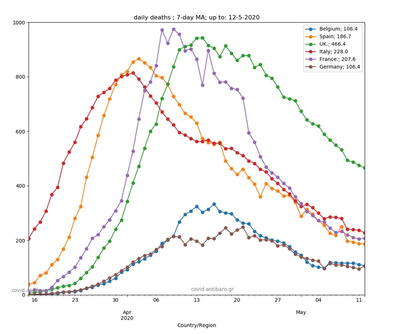
Commentary 10.5.2020: release of a video with developing graphs! All the graphs in one video Do watch it!
Commentary 5.5.2020: No big changes. Sweden still higher than Netherlands.
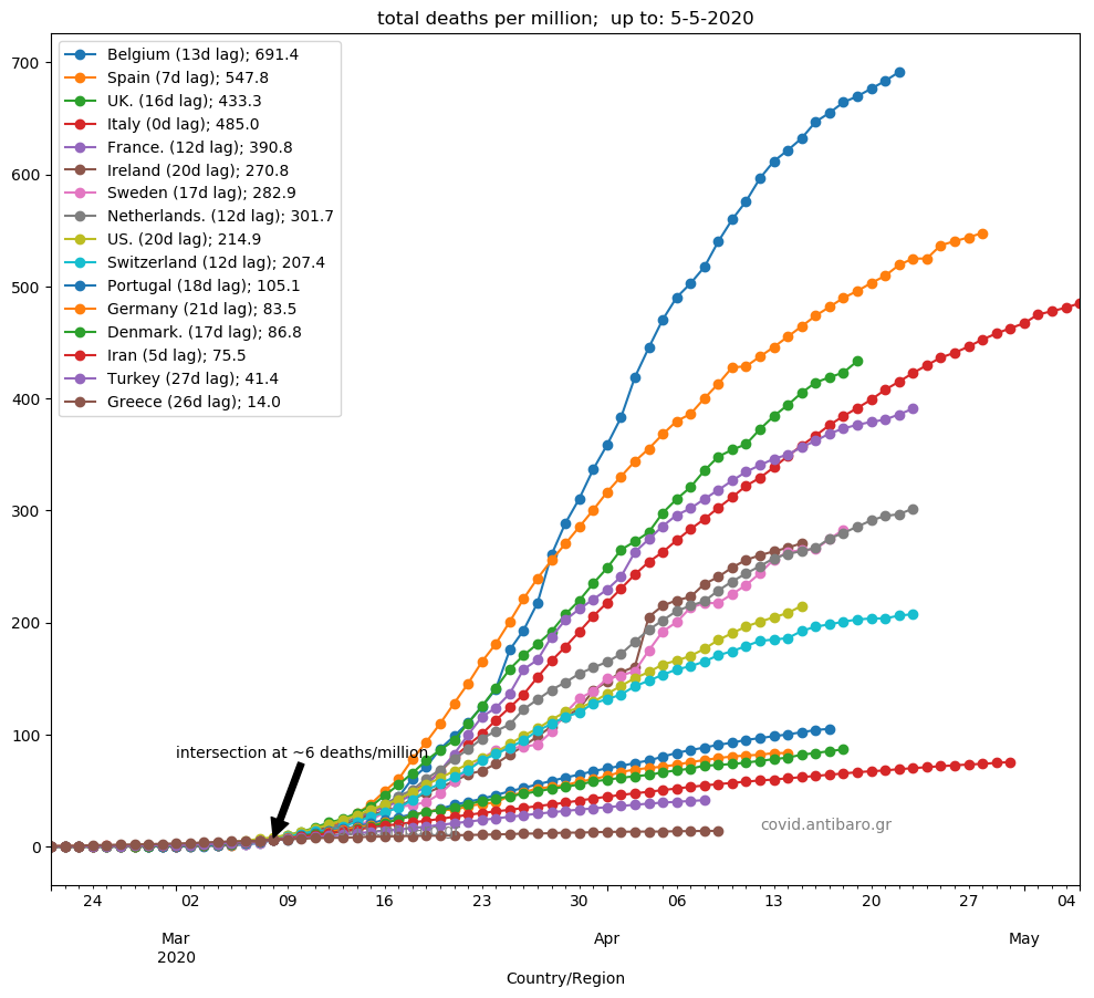
Commentary 4.5.2020: most countries stable in our main graph. Look the additional graphs for more insights.


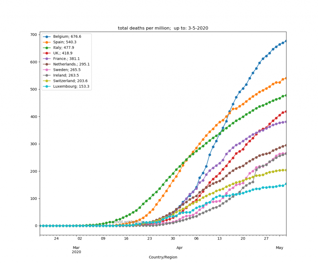
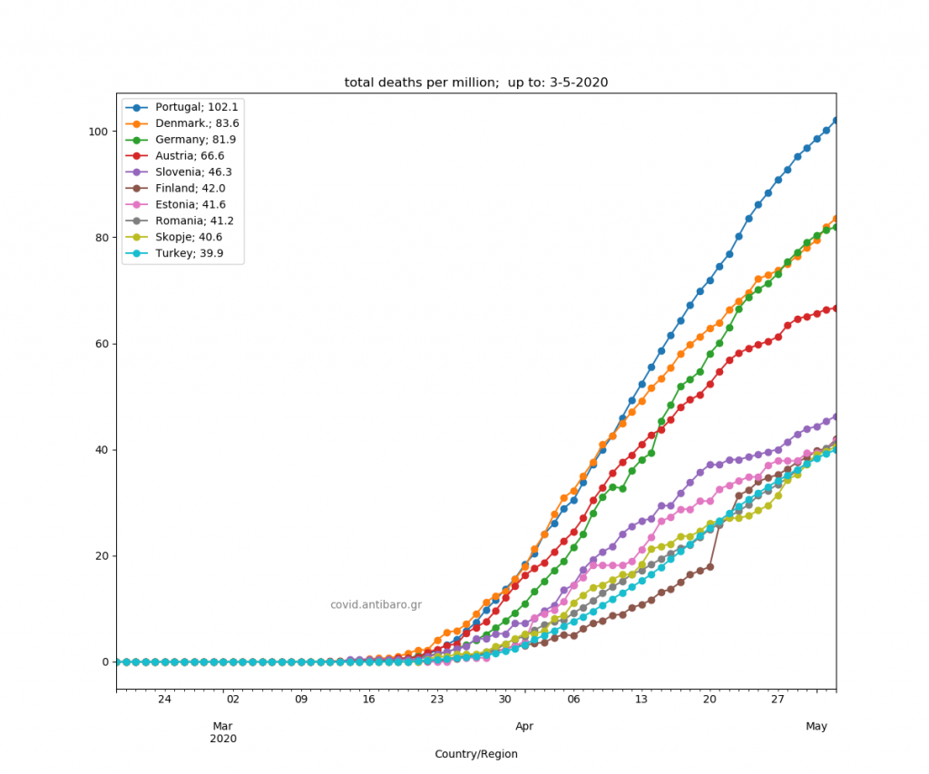
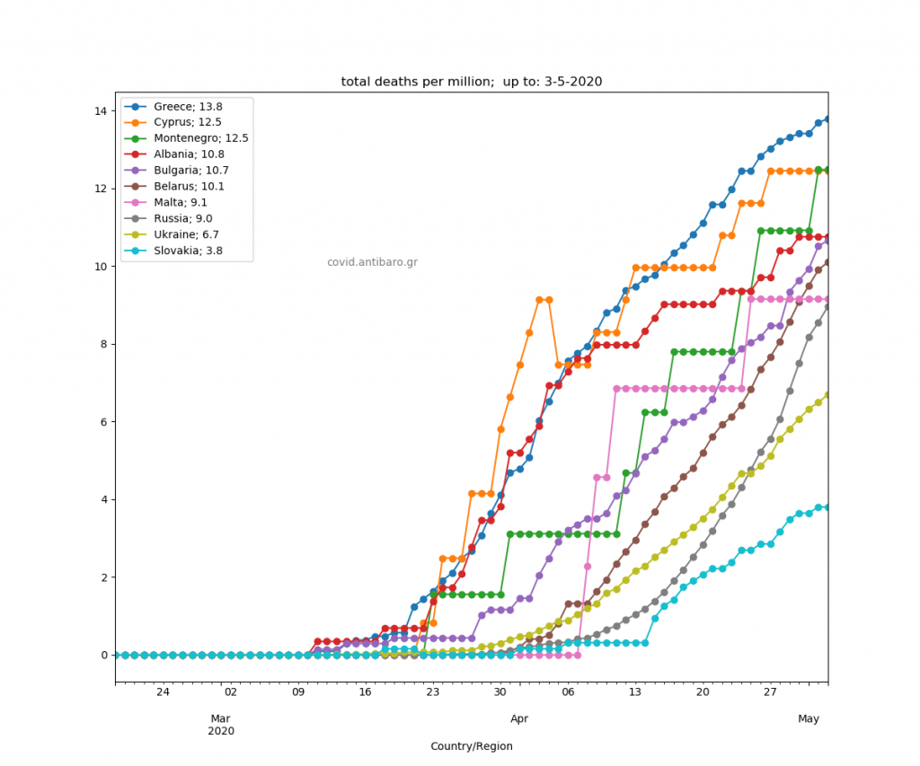
Commentary 3.5.2020: Sorry for not updating this in the last couple of days. All countries in decline. Ireland, Sweden and Netherlands very close together. Added top-40 european, balkan and outside Europe graphs.


Commentary 30.4.2020: Sweden ahead of Switzerland. Emphasis on the declining rate now. France very fast among the top countries. US not so much. Ireland in ascending trajectory.
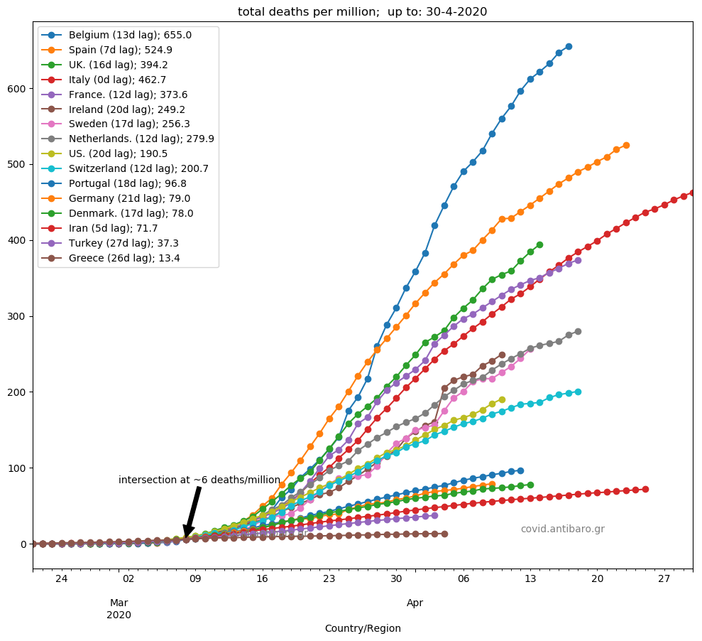
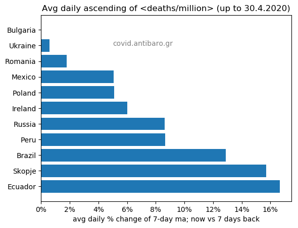

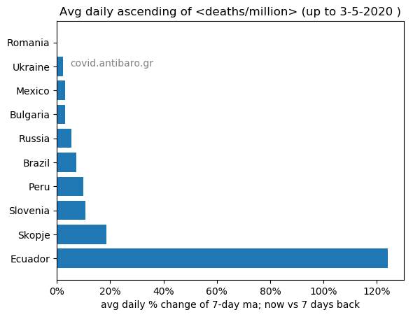
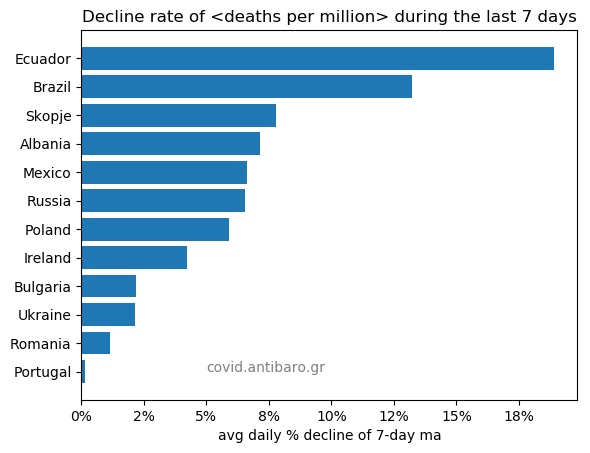
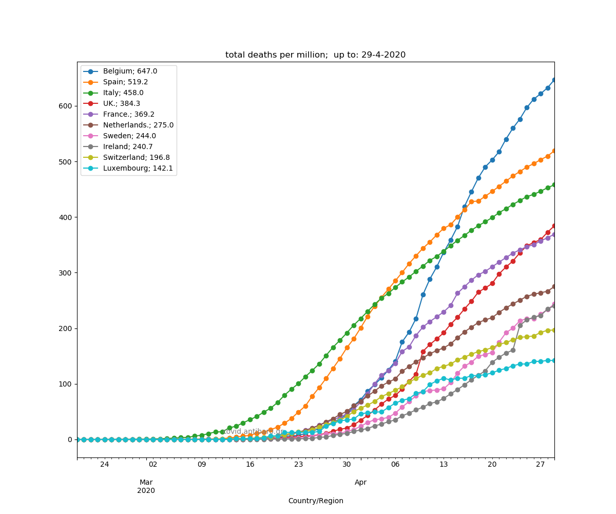
Commentary 29.4.2020: The UK revised previous number of deaths, including deaths in care homes. Added about 4200 more deaths. Now, clearly over Italy and France, which already fell below Italy. Sweden is approaching Netherlands. Many more graphs added! Declining/increasing rate in two different groups of countries. This shows the average daily change of the 7d moving average between now and 7 days back. Also, graphs for european top-40, balkan and some countries outside Europe are updated..
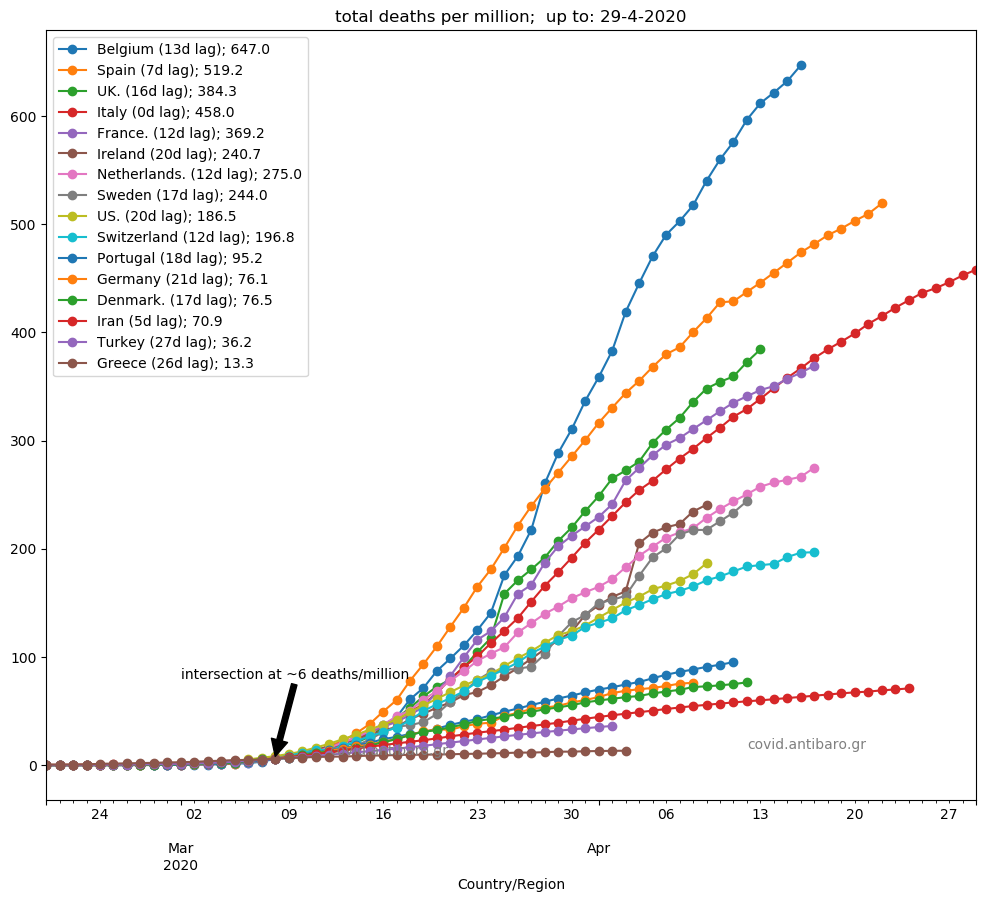

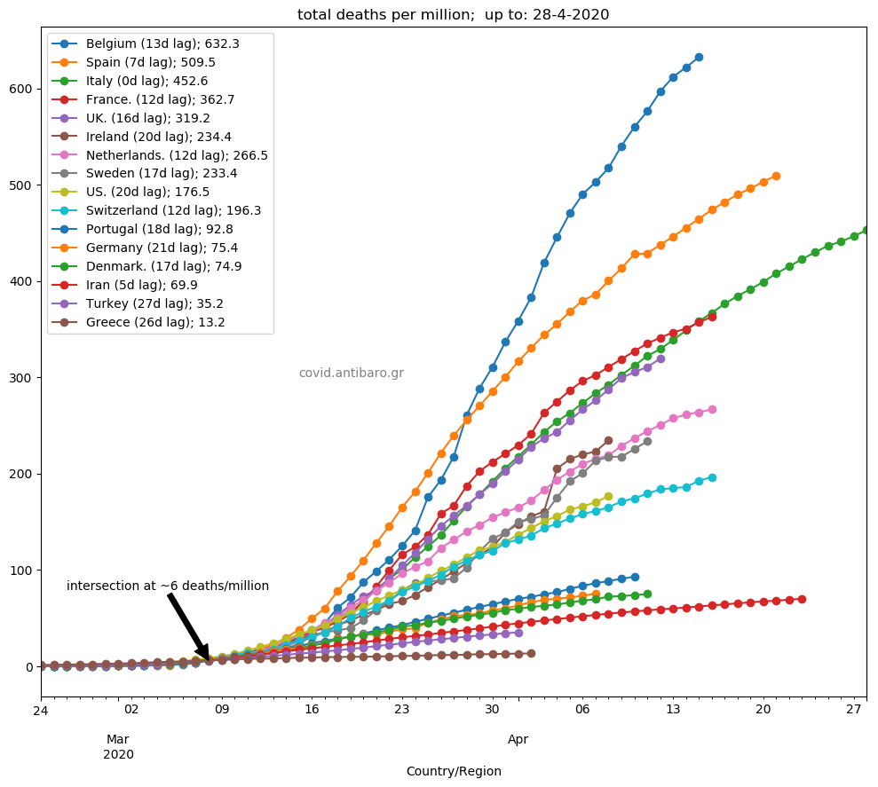
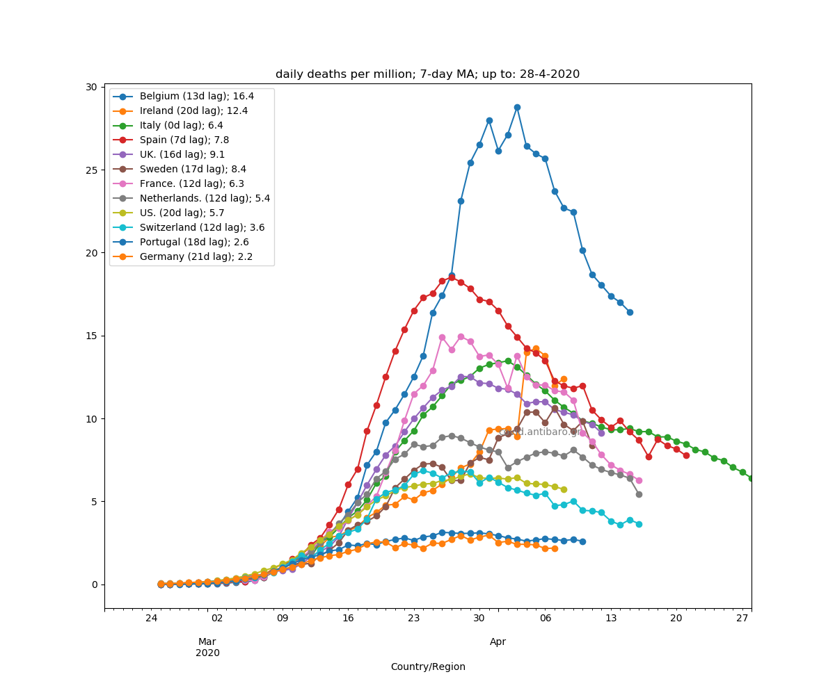
Commentary 28.4.2020: France lower than Italy now. Second graph on 7-day average deaths/million, Ireland is now second. Sweden very close to France. In the second group, added Ecuador and a few more.


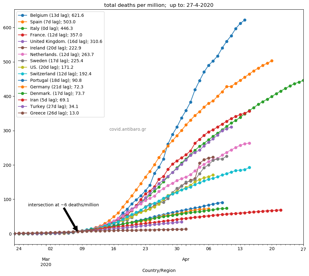
Commentary 27.4.2020: All in decline. France now lower than Italy. See additional graph today, with rate of decline of <daily deaths per million>. France leads. Belgium second. On the other extreme, the UK 6th and Spain 7th have the slowest declines out of the top-7.

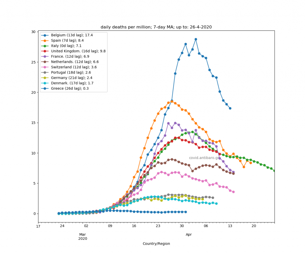
Commentary 26.4.2020: France reached Italy’s trajectory and will probably go lower tomorrow. All countries of the main daily graph in decline. Some faster, some slower. (I will focus on that element in the next few days). Split the second part into 3 slides now. First, the ones in sharp decline, second the ones still on the rise, and third some new comers. Finland is in both second and third, for comparison purposes of daily deaths per million.


Commentary 25.4.2020: France continues slowing down, soon to be under Italy. The UK still just below Italy, it needs to slow down more to sustain that position. Added a few more countries in the daily graphs.


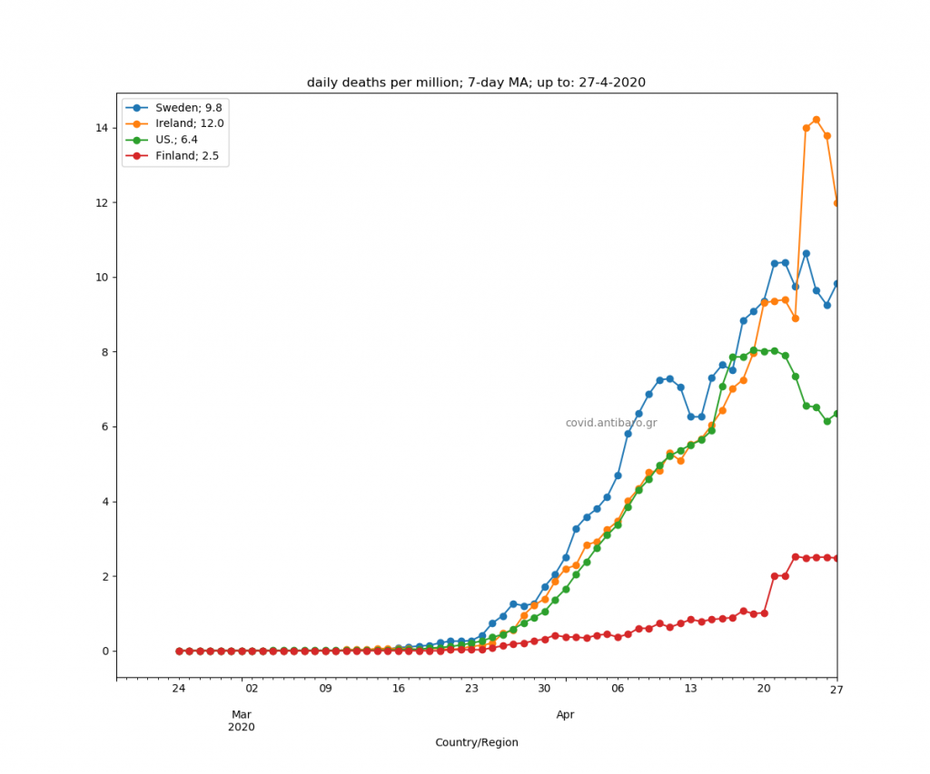
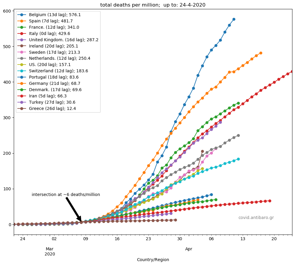
Commentary 24.4.2020: Ireland surge with 220 deaths today. Along with Sweden, now ahead of Netherlands.


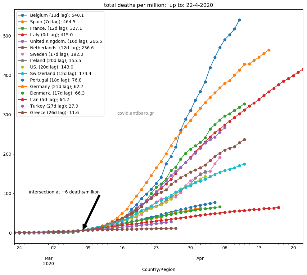
Commentary 23.4.2020: Moved the Netherlands into the first group of countries that show consistent declining signs. The UK still very close to Italian trajectory, but lower. It may need to slow down a bit more to keep being below.


Commentary 22.4.2020: Some countries clearly in decline mode, some still before the peak. So, I split the daily deaths per million graph into the two groups. Sweden and Ireland accelerate dangerously. Netherlands is struggling to stabilise.


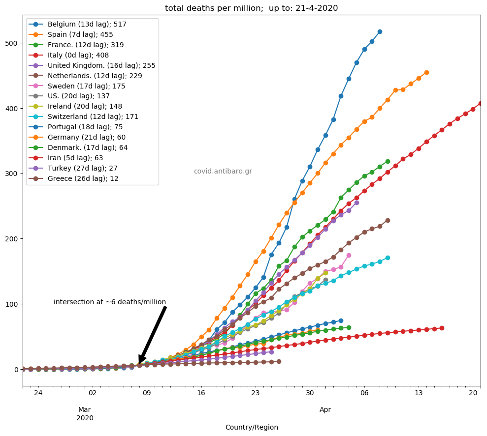
Commentary 21.4.2020: Sweden and Ireland, the US and partly Netherlands, seem to accelerate today. USA now clearly above Switzerland. Spain clearly on a much slower rate than previously.
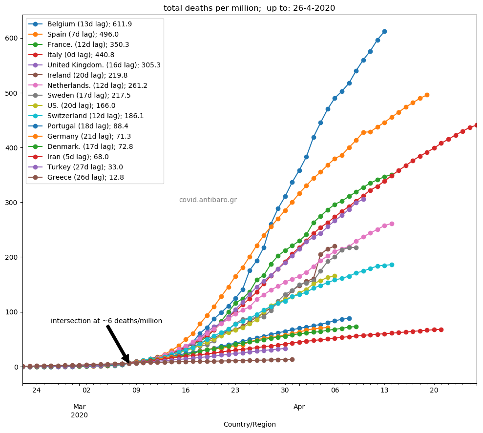
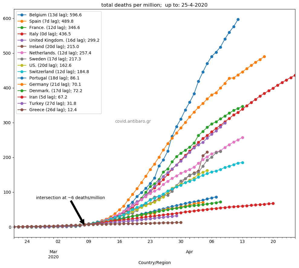
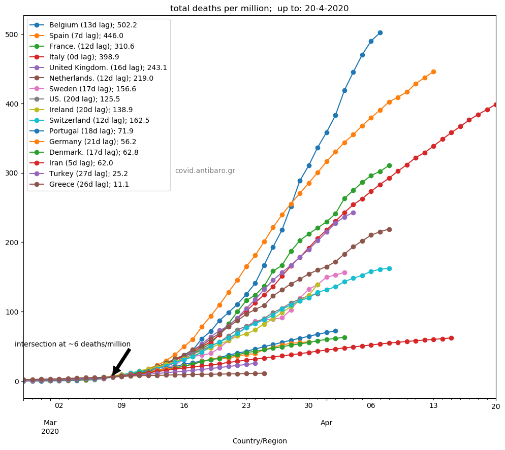
Commentary 20.4.2020: All countries seem to be in slowing down mode. Note the second graph with 5-day moving average daily deaths per million. All look as having passed the peak. Also: our estimation of the original lag to Italy, despite it was at a very early stage (6 deaths per million), it proved to be a very good forecast for the peak with +-2 days from the real one.

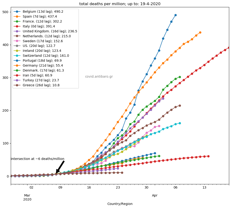
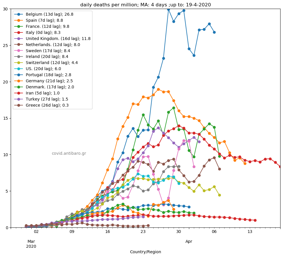
Commentary 19.4.2020: Belgium approaches 500 deaths per million. France, the UK, Netherlands, Sweden and Switzerland slowed down yesterday. The same for the US, back to under 2000 deaths per day (1561).
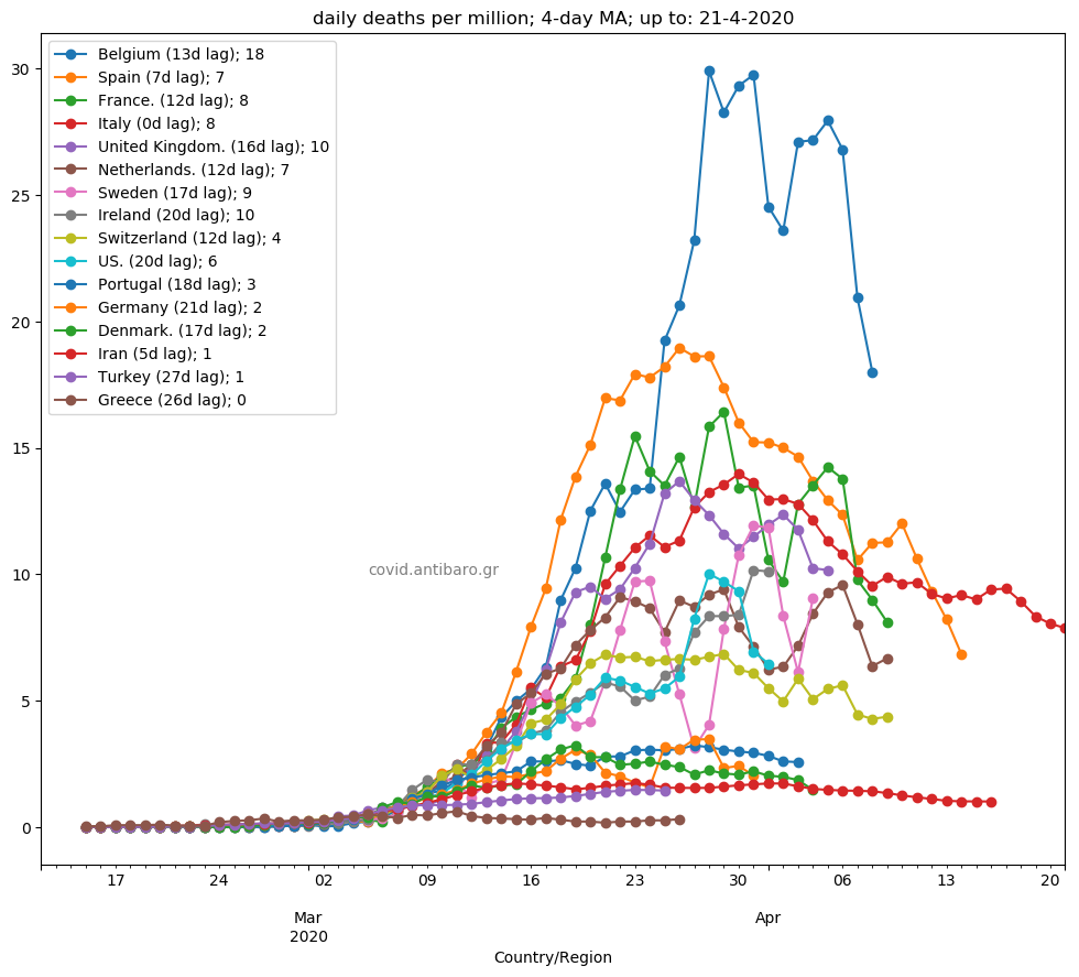
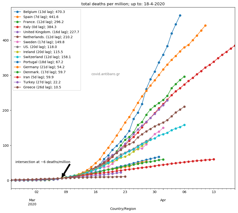
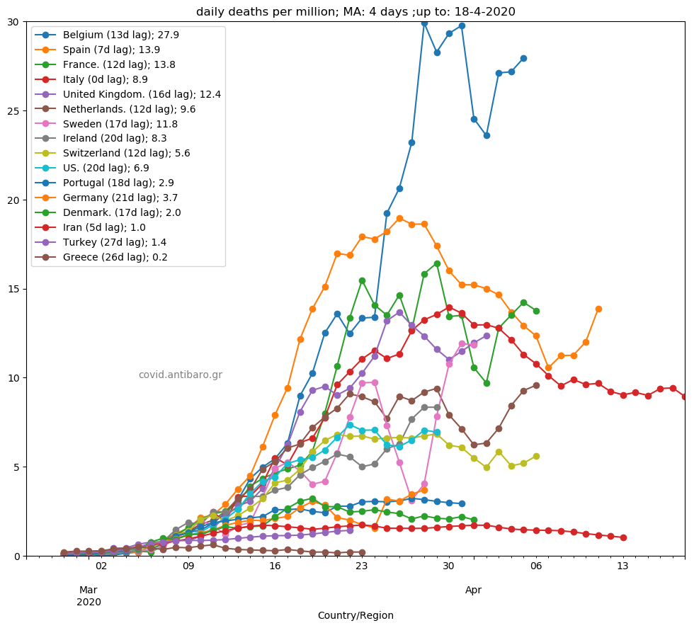
Commentary 18.4.2020: No sharp change from yesterday. No sign from Belgium to slow down. Spain, Italy, France, the UK and the US continue on their own trajectory. As there were not significant changes, I am adding an extra graph: 4-day moving average of daily <deaths per million>. In that we see:
Belgium is trying to get into stabilisation phase with some ups and downs,
Spain reverts back to avg of 15 deaths per million, after it was approaching 10 last week.
Italy consistently in decline mode
France looks being at its peak for some time and now in stabilisation phase
Sweden, Netherlands and Ireland still on the rise
US relatively stable
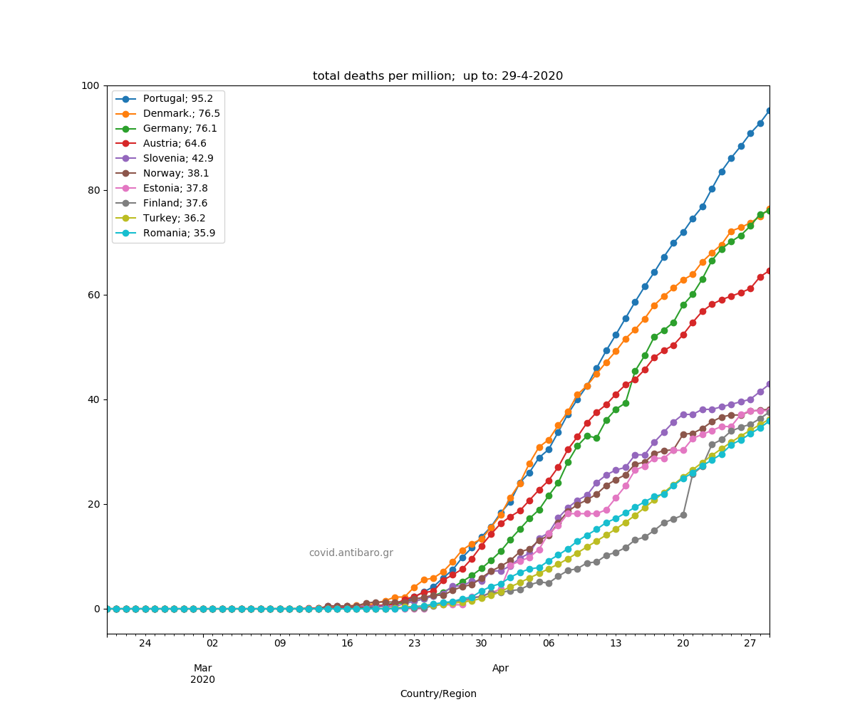
Germany on the rise, higher than Portugal
Denmark in decline
Turkey on the rise
Iran in very slow decline
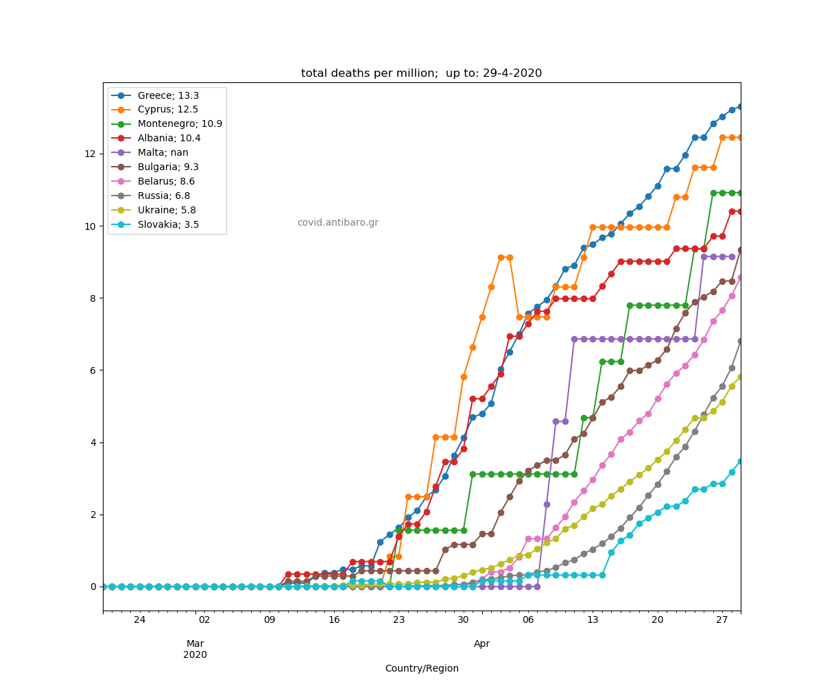
Greece in decline
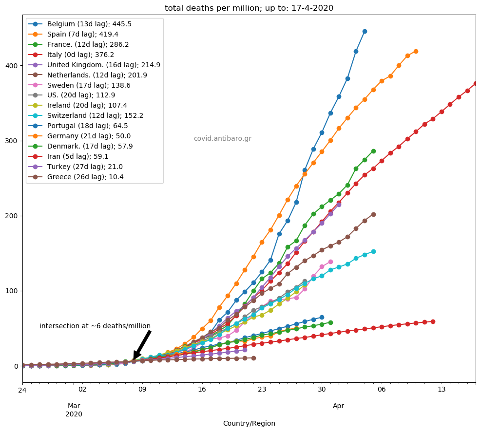
Commentary 17.4.2020: The news of the day is the sharp decline of Spain. On the contrary, Belgium continues high ride. US update keeps them ahead of Switzerland with very high daily number >2700! Rest, as expected. Concerns on UK numbers reliability.
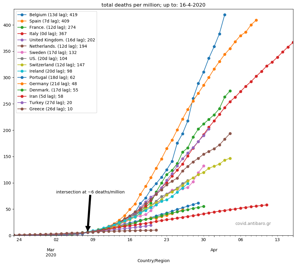
Commentary 16.4.2020: Belgium tops the graph with 419 deaths per million, even though it is 6 days behind Spain. Not good at all. Sweden accelerates in last 4 days. Ireland and France on the rise. Adjusted data for US, now ahead of Switzerland. The UK also on the rise.
Commentary 15.4.2020: Ireland (+38) surpassed Sweden, and Sweden (+170!) surpassed Switzerland. Both quite significant increases. France came back to very high numbers (+1438!) and remained higher than Italy. The UK (+761) around the 4-day average fell slightly below Italy amid public concerns that deaths could be 15% higher than the ones reported. The US is heading on another day with more than 2,000 deaths. Germany moves close to Denmark and Portugal.

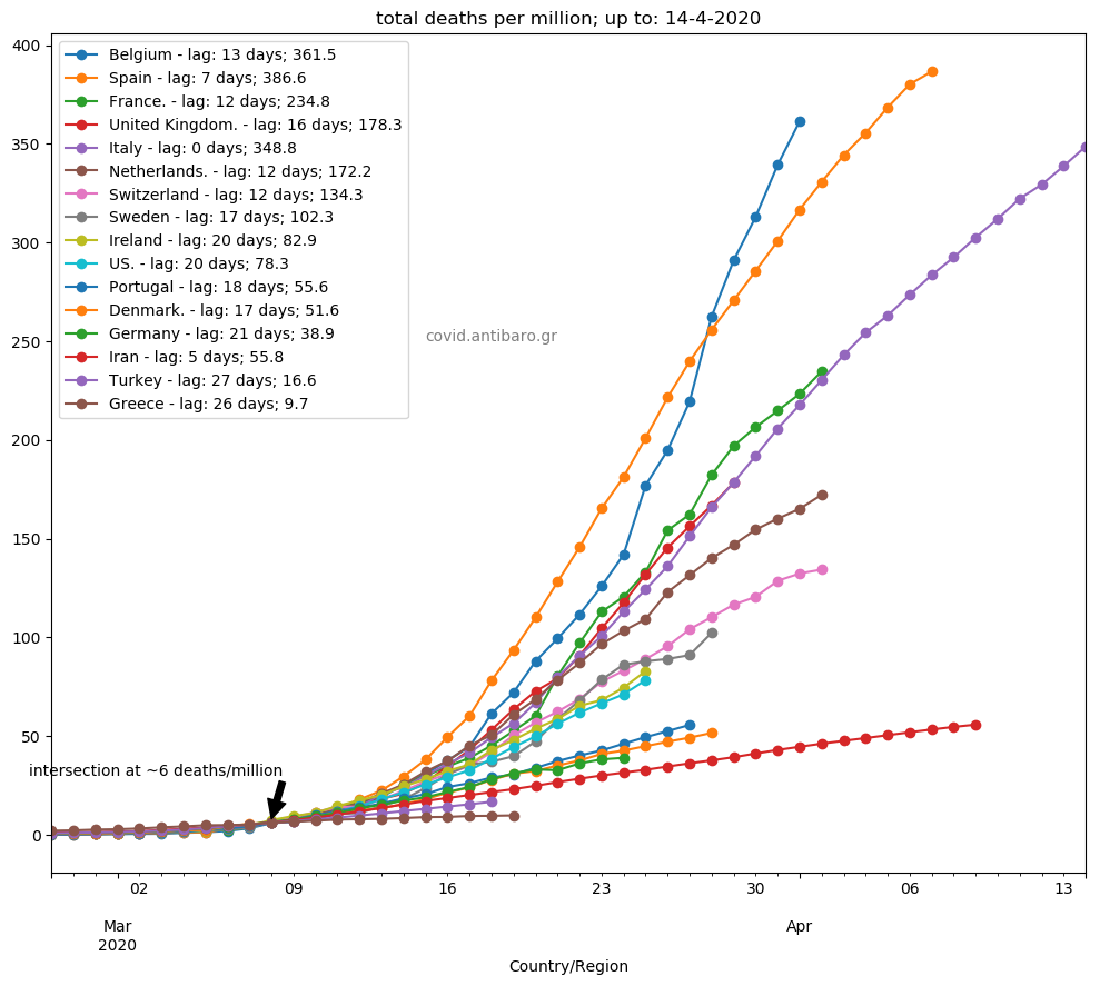
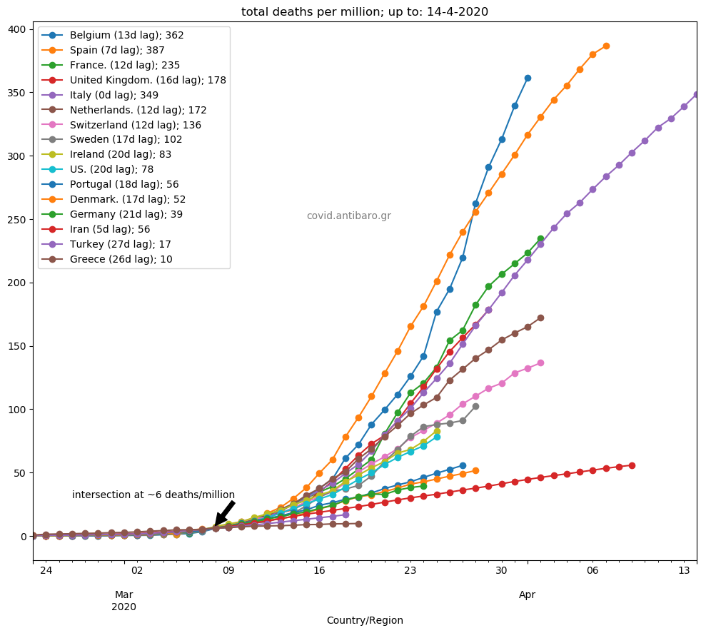
Commentary 14.4.2020: Nothing significant changed from yesterday. The UK now exactly on Italy’s trajectory, France only slightly higher. Sharp increase in Sweden. Replaced Luxembourg with Denmark in the graph, between Portugal and Germany.
View Post
Commentary 13.4.2020: France in decline, approaching again Italy. Similarly with the UK, which are even closer to Italy than before. Perhaps, an impact of the measures. Bear in mind that symptoms appear 4-5 days (on average) after contamination, and death comes in such cases, 10-14 days after the first symptom (again on average). So, now is the time to see the impact of social measures. Spain in good decline as well. Italy stabilisation with not much decline as in Spain. Belgium continues at high speed. Germany back towards Iran rather than Portugal. Sweden and Switzerland in stabilisation as well.
Commentary 12.4.2020: No change. Belgium consistently on higher trajectory than Spain. The UK turns closer to Italy. Sweden continues slower rate than Switzerland. The US is heading ahead of Ireland. Germany again towards Iran, away from Portugal.

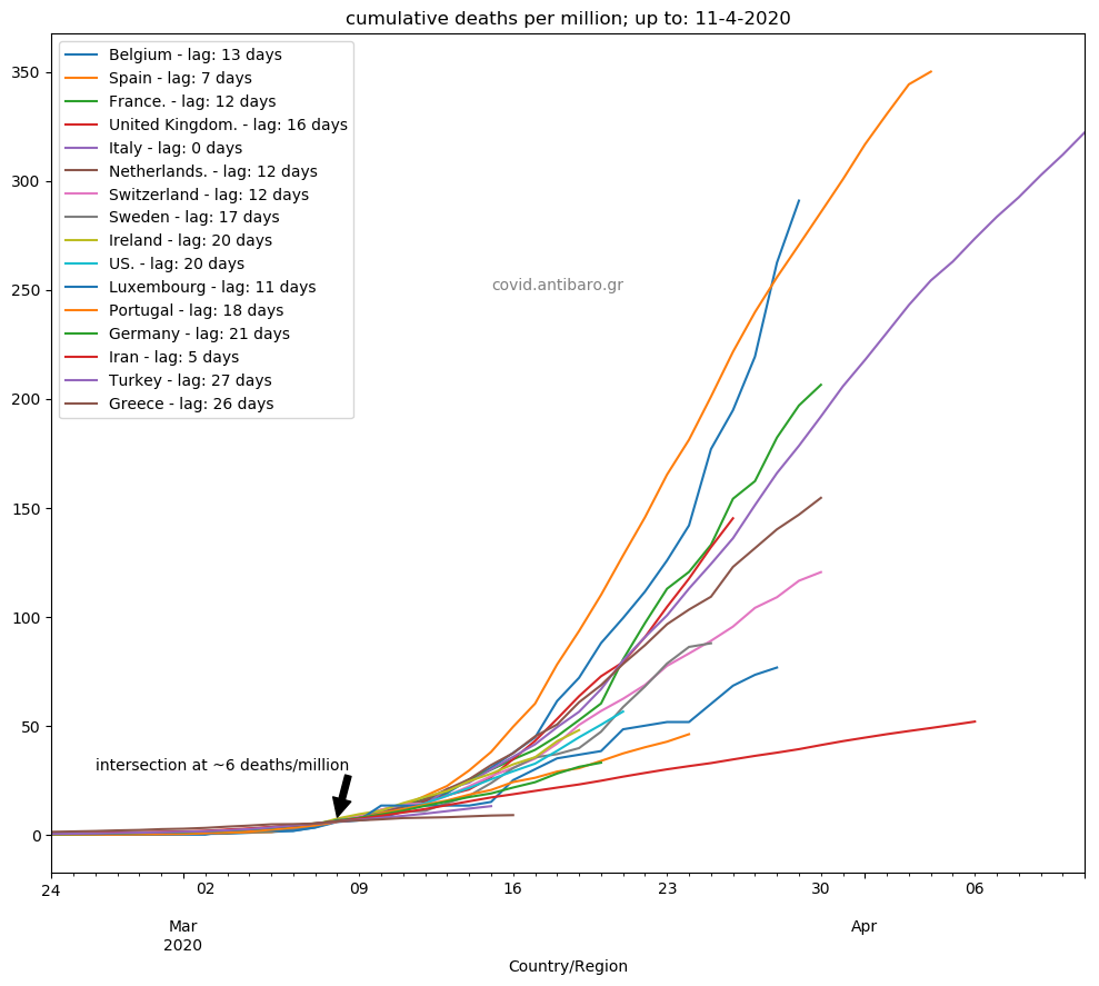
Commentary 11.4.2020: Spain in decline. Italy just stability. The UK remains below France. Sweden now back below Switzerland. Germany below Portugal.
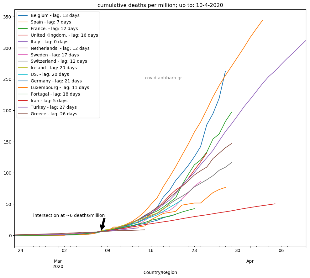
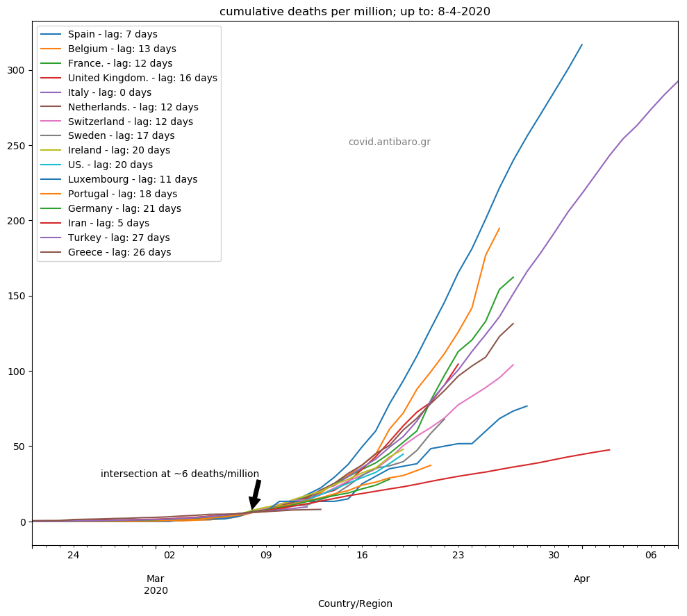
Commentary 10.4.2020: Belgium ahead of Spain for the first time. Germany heading ahead of Portugal. The UK very close to France.


Methodology here