Comparison between Spain and Belgium. Up to 12.4.2020
First, the graph that everybody sees. Absolute daily number of deaths (so, not <deaths per million>). No lag. Straight comparison. Here, it is not clear where each country stands, as Belgium has a population of 11.5 million, but Spain 46.7 million. Spain being more than 4.5 times bigger, the comparison of daily deaths can not be very easily worrying for Belgium. Besides that, we do see Belgium going higher than Spain in the last few days. Well, this was very clearly going to happen, if you saw the rest graphs.

Introducing ratio: deaths per million

Introducing lag in the absolute numbers. It is explained in the methodology. The lag in number of days, where all countries have 6 deaths per million.

Lag on the ratio

Cumulative, so no daily values. No ratio, no lag.

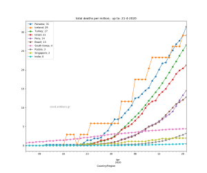
Introducing the ratio: deaths per million

Cumulative, absolute number, but with lags

Cumulative, ratio, with lags. Now, we see. This is also the part of the “main graph” that is used here.

Cumulative, ratio, with lags. Rolling moving average of 3 days.

Cumulative, ratio, with lags. Rolling moving average of 5 days.

This is the part of the “main graph” for Spain and Belgium

Thank you!
Andreas Stalidis.