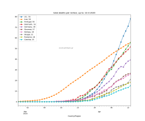
Those are some out-of-focus countries, so I thought it was worth to shed some light on them. The usual four graphs with :
- deaths per million
- total deaths
- cases per million
- total cases
The order in the legend is in line with the <deaths per million> graph.
Enjoy!


![Read more about the article Covid-19 pandemic: Cumulative deaths per million per country for Europe & USA [+ video!]. Daily updated](https://covid.antibaro.gr/wp-content/uploads/2020/12/covid-graph-detail-300x147.jpg)