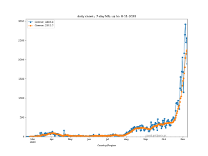
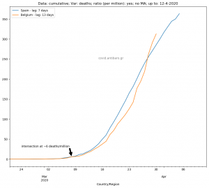
Those are some out-of-focus countries, so I thought it was worth to shed some light on them. The usual four graphs with :
- deaths per million
- total deaths
- cases per million
- total cases
The order in the legend is in line with the <deaths per million> graph.
Enjoy!


Can you be more specific about the content of your article? After reading it, I still have some doubts. Hope you can help me.
Your point of view caught my eye and was very interesting. Thanks. I have a question for you.