
Comparison between the UK and France. Data up to 12.4.2020
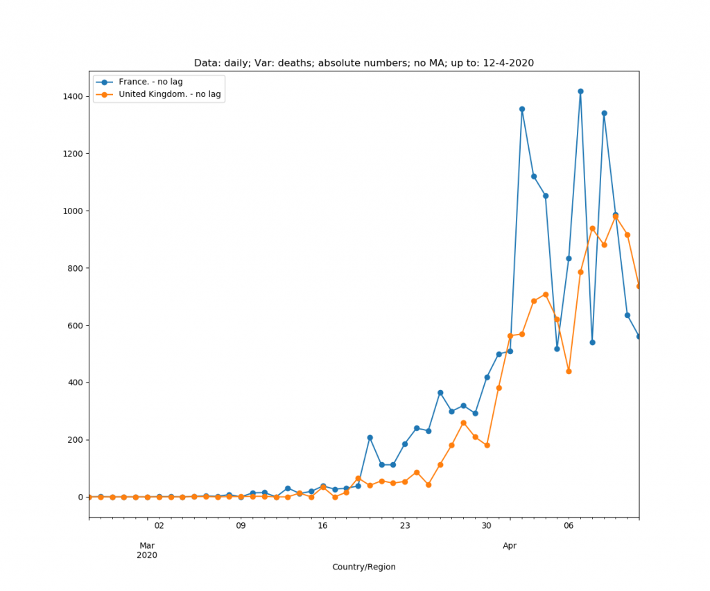
First, the graph that everybody sees. Absolute daily number of deaths (so, not <deaths per million>). No lag. Straight comparison.
Introducing ratio: deaths per million

Introducing lag in the absolute numbers. It is explained in the methodology. The lag in number of days, where all countries have 6 deaths per million.

Lag on the ratio

Cumulative, so no daily values. No ratio, no lag.

Introducing the ratio: deaths per million

Cumulative, absolute number, but with lags

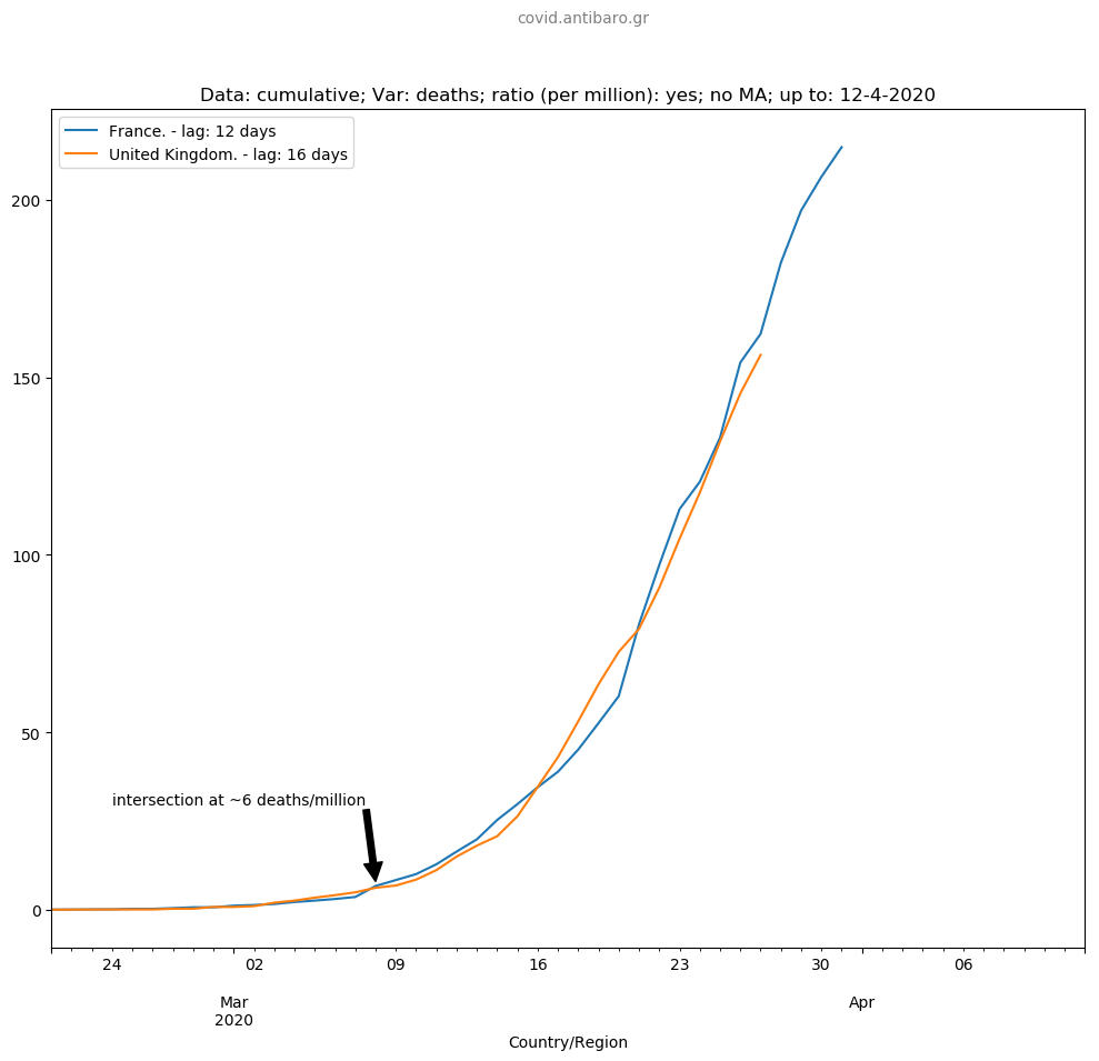
Cumulative, ratio, with lags. Now, we see. This is also the part of the “main graph” that is used here.

Cumulative, ratio, with lags. Rolling moving average of 3 days.

Cumulative, ratio, with lags. Rolling moving average of 5 days.

This is the part of the “main graph”
Main conclusion: A little more focus on the last few days tell us that they both follow a very similar pattern, France being slightly worse. However, 4 out of last 5 days, France shows first signs of decline. If the UK does the same is open question. If not, the UK could surpass France in 4-5 days.
The slight decline in France may be due to the measures taken earlier. Given that one needs 4-5 days to show symptoms, and 10-14 days between first symptoms and death, in such cases, this looks about right. So, if current trend continues in both France and the UK, France could return below Italy soon, and the UK would remain ahead of Italy, and ahead of France.

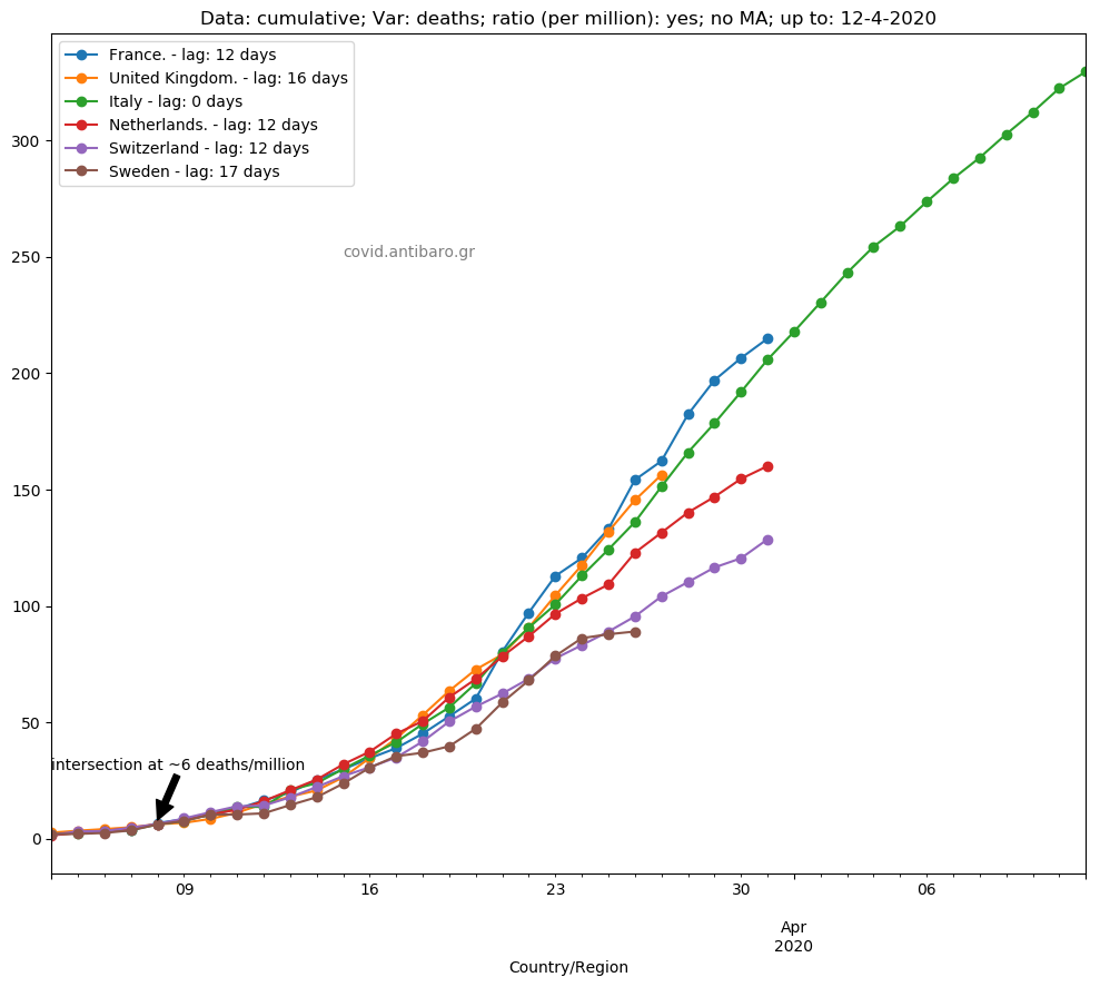
Six countries comparison, France and the UK as ones above Italy, Italy and 3 below Italy.
Thank you!
Andreas Stalidis.

Your article helped me a lot, is there any more related content? Thanks!
Your article helped me a lot, is there any more related content? Thanks!
Can you be more specific about the content of your article? After reading it, I still have some doubts. Hope you can help me.
I don’t think the title of your article matches the content lol. Just kidding, mainly because I had some doubts after reading the article.
Thanks for sharing. I read many of your blog posts, cool, your blog is very good.
Your article helped me a lot, is there any more related content? Thanks!
Can you be more specific about the content of your article? After reading it, I still have some doubts. Hope you can help me.
Your point of view caught my eye and was very interesting. Thanks. I have a question for you.
Thank you for your sharing. I am worried that I lack creative ideas. It is your article that makes me full of hope. Thank you. But, I have a question, can you help me?
Your article helped me a lot, is there any more related content? Thanks!
Your point of view caught my eye and was very interesting. Thanks. I have a question for you.
Can you be more specific about the content of your article? After reading it, I still have some doubts. Hope you can help me.
Can you be more specific about the content of your article? After reading it, I still have some doubts. Hope you can help me.
Your point of view caught my eye and was very interesting. Thanks. I have a question for you.
Thanks for sharing. I read many of your blog posts, cool, your blog is very good.
Your point of view caught my eye and was very interesting. Thanks. I have a question for you.
Thanks for sharing. I read many of your blog posts, cool, your blog is very good. https://accounts.binance.com/fr-AF/register?ref=JHQQKNKN
Thanks for sharing. I read many of your blog posts, cool, your blog is very good.
Thanks for sharing. I read many of your blog posts, cool, your blog is very good.
I went over this internet site and I conceive you have a lot of great information, bookmarked (:.
fantástico este conteúdo. Gostei muito. Aproveitem e vejam este site. informações, novidades e muito mais. Não deixem de acessar para saber mais. Obrigado a todos e até a próxima. 🙂
me encantei com este site. Pra saber mais detalhes acesse o site e descubra mais. Todas as informações contidas são conteúdos relevantes e exclusivos. Tudo que você precisa saber está está lá.
Thanks for sharing. I read many of your blog posts, cool, your blog is very good. https://accounts.binance.com/ka-GE/register-person?ref=RQUR4BEO
You are my breathing in, I own few web logs and sometimes run out from to brand.
Can you be more specific about the content of your article? After reading it, I still have some doubts. Hope you can help me.
I don’t think the title of your article matches the content lol. Just kidding, mainly because I had some doubts after reading the article.
Thank you for your sharing. I am worried that I lack creative ideas. It is your article that makes me full of hope. Thank you. But, I have a question, can you help me?
Valuable information. Lucky me I found your web site by accident, and I am shocked why this accident did not happened earlier! I bookmarked it.