
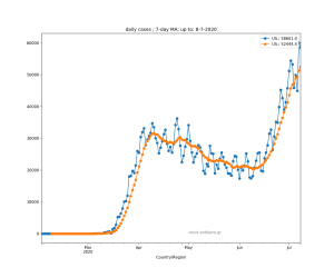
Video with daily graphs for various countries on the virus outbreak expansion in different countries.
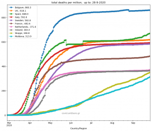
Estimation of lags behind Italy per country. Intersection at 6 deaths per million. Various daily graphs per country of deaths per million, and also 7-day averages of daily deaths per country. Top graph with main countries, plus top-40 european countries. Site with full graphs:

I don’t think the title of your article matches the content lol. Just kidding, mainly because I had some doubts after reading the article. https://accounts.binance.com/de-CH/register?ref=UM6SMJM3
Thanks for sharing. I read many of your blog posts, cool, your blog is very good.
I don’t think the title of your article matches the content lol. Just kidding, mainly because I had some doubts after reading the article.
Can you be more specific about the content of your article? After reading it, I still have some doubts. Hope you can help me.
Can you be more specific about the content of your article? After reading it, I still have some doubts. Hope you can help me.
Can you be more specific about the content of your article? After reading it, I still have some doubts. Hope you can help me.
Can you be more specific about the content of your article? After reading it, I still have some doubts. Hope you can help me.
Can you be more specific about the content of your article? After reading it, I still have some doubts. Hope you can help me.
Your article helped me a lot, is there any more related content? Thanks! https://accounts.binance.com/register?ref=P9L9FQKY
I don’t think the title of your article matches the content lol. Just kidding, mainly because I had some doubts after reading the article. https://accounts.binance.com/ru/register?ref=V3MG69RO
Thank you for your sharing. I am worried that I lack creative ideas. It is your article that makes me full of hope. Thank you. But, I have a question, can you help me?
Thank you for your sharing. I am worried that I lack creative ideas. It is your article that makes me full of hope. Thank you. But, I have a question, can you help me?
Thanks for sharing. I read many of your blog posts, cool, your blog is very good.
Hello there, I found your web site via Google while searching for a related topic, your website came up, it looks great. I’ve bookmarked it in my google bookmarks.
Can you be more specific about the content of your article? After reading it, I still have some doubts. Hope you can help me.
me encantei com este site. Pra saber mais detalhes acesse o site e descubra mais. Todas as informações contidas são informações relevantes e exclusivos. Tudo que você precisa saber está ta lá.
incrível este conteúdo. Gostei muito. Aproveitem e vejam este conteúdo. informações, novidades e muito mais. Não deixem de acessar para descobrir mais. Obrigado a todos e até mais. 🙂
It¦s really a great and helpful piece of info. I am satisfied that you shared this helpful information with us. Please keep us up to date like this. Thank you for sharing.
I wanted to thank you for this great read!! I definitely enjoying every little bit of it I have you bookmarked to check out new stuff you post…
hi!,I love your writing very so much! proportion we communicate extra approximately your post on AOL? I require a specialist in this space to resolve my problem. Maybe that’s you! Looking forward to look you.
Почему гильзы делают из латуни https://e-pochemuchka.ru/pochemu-gilzy-delayut-iz-latuni/
[url=https://shiba-akita.ru/]shiba-akita.ru/[/url] – что такое фосфены и почему мы их видим
займ под залог авто с правом пользования
zaimpod-pts90.ru
кредит под птс москва
лечение запоя
narkolog-krasnodar001.ru
вывод из запоя
вывод из запоя круглосуточно
narkolog-krasnodar001.ru
вывод из запоя круглосуточно краснодар
подключить интернет тарифы челябинск
domashij-internet-chelyabinsk004.ru
лучший интернет провайдер челябинск
вывод из запоя
narkolog-krasnodar001.ru
экстренный вывод из запоя краснодар
провайдеры интернета челябинск
domashij-internet-chelyabinsk005.ru
домашний интернет тарифы челябинск
вывод из запоя краснодар
narkolog-krasnodar002.ru
вывод из запоя круглосуточно краснодар
провайдеры интернета в челябинске
domashij-internet-chelyabinsk006.ru
подключение интернета челябинск
вывод из запоя цена
narkolog-krasnodar003.ru
вывод из запоя краснодар
Безопасность в интернете: советы для жителей Екатеринбурга Сегодня безопасность в интернете является приоритетом для всех пользователей. Екатеринбуржцам стоит проявлять особую бдительность, так как количество интернет-угроз продолжает расти. Начнем с проверки провайдера по адресу дома. Выбор надежного интернет-провайдера в Екатеринбурге – это основа для безопасного серфинга в интернете. Важно также заботиться о защите данных и конфиденциальности. Установите антивирусное ПО и не забывайте обновлять его, чтобы избежать вирусных угроз. Будьте внимательны к фишингу – мошенническим письмам, которые пытаются украсть ваши данные. Проверка провайдера по адресу дома в Екатеринбурге поможет вам сделать правильный выбор.Не забывайте о безопасности вашего Wi-Fi: выбирайте сложные пароли и используйте шифрование WPA2. VPN-сервисы помогут скрыть ваш IP-адрес и защитить онлайн-активность.Следуя этим рекомендациям, вы сможете минимизировать риски сетевых мошенничеств и сделать интернет-серфинг более безопасным. Имейте в виду, что ваша собственная кибербезопасность зависит от ваших действий!
экстренный вывод из запоя краснодар
narkolog-krasnodar004.ru
лечение запоя
вывод из запоя цена
narkolog-krasnodar004.ru
вывод из запоя краснодар
Интернет по кабелю в Екатеринбурге становится в связи с растущими требованиями пользователей. Екатеринбургие провайдеры предлагают разнообразные тарифы на интернет, что позволяет выбрать лучший тариф для любого клиента. Подключение к сети осуществляется с использованием технологии DOCSIS, которая обеспечивает высокоскоростной доступ к сети. Установка кабельного интернета чаще всего происходит без каких-либо затруднений; Преимущества кабельного интернета относятся надежное соединение, что особенно важно для работы, учебы и досуга. При выборе провайдера стоит обратить внимание на мнения пользователей о компаниях и сравнительный анализ провайдеров по скорости и стоимости подключения. Предоставляемые услуги связи, которые предлагают различные компании, могут варьироваться, поэтому стоит изучить все возможности. Если вы ищете интернет для своего дома, кабельный интернет станет отличным решением. На сайте domashij-internet-ekaterinburg005.ru вы можете ознакомиться с актуальными предложениями, и выбрать лучший тариф по вашим требованиям.
вывод из запоя цена
narkolog-krasnodar005.ru
вывод из запоя
вывод из запоя круглосуточно
narkolog-krasnodar005.ru
вывод из запоя
В современном мире онлайн телевидение набирает популярность, в больших городах, таких как столице России. Выбор подходящего пакета каналов иногда вызывает трудности, из-за множества предлагаемых услуг, которые предоставляют разные провайдеры. Существует несколько форматов телевидения: кабельное телевидение, спутниковое ТВ и интернет-телевидение. Каждый из них имеет свои преимущества. Например цифровое телевидение предлагает высокое качество изображения, в то время как IPTV предлагает доступ к контенту по интернету.При подборе пакетов каналов обязательно учитывайте свои предпочтения. Многие интернет-провайдеры Екатеринбурга дают возможность настроить индивидуальный выбор телеканалов, что помогает сэкономить на тех каналах, которые не интересуют.Сравнение провайдеров поможет выбрать самое выгодное предложение по цене и качеству услуг. Отзывы клиентов могут рассказать о настоящем опыте пользователей и качестве обслуживания. domashij-internet-ekaterinburg006.ru Не забывайте о стриминговых платформах и видеосервисах, которые могут стать альтернативой классическому телевидению. Мобильное телевидение позволяет смотреть любимые каналы на ходу, что удобно для людей с активным образом жизни.
Can you be more specific about the content of your article? After reading it, I still have some doubts. Hope you can help me.
Экстренная наркологическая помощь — это незаменимый элемент в профилактике зависимостей. На сайте narkolog-tula001.ru вы можете найти информацию о постоянной помощи, которая предлагает необходимую поддержку. Наркологическая служба предоставляет медицинскую помощь в случаях наркозависимости и алкоголизма. Специалисты предлагают консультации нарколога, а также предлагают лечение без раскрытия личных данных. В рамках ситуационной помощи возможны программы реабилитации и госпитализация. Поддержка психологов играет важную роль в процессе восстановления. Обратитесь за помощью незамедлительно, спасите жизнь!
Капельница от запоя на дому – это действующим методом детоксикации организма и помощи при запое. В городе Тула медицинские услуги на дому оказывают профессиональную помощь, включая инфузионную терапию. Длительность процедуры составляет от 1 до 3 часов в зависимости от состояния пациента. Зависимость от алкоголя требует профессионального подхода, и срочная медицинская помощь при алкоголизме способствует значительному улучшению здоровье и безопасность. По завершении процедуры пациент начинает восстановление после запоячто помогает в реабилитации людей, страдающих от алкоголизма. вывод из алкогольной зависимости
провайдеры домашнего интернета казань
domashij-internet-kazan004.ru
интернет по адресу
Значение поддержки семьи при борьбе с алкоголизмом Зависимость от алкоголя — это не только проблема зависимогоно и его близких. В Туле обращение к специалисту может стать первым этапом к исцелению зависимости. Семейная поддержка играет решающую роль в процессе реабилитации. Близкие могут помочь, предоставляя эмоциональную поддержку и создавая атмосферу понимания. В сложной ситуации важно обращаться за профессиональной помощью. Консультация нарколога поможет найти правильный путь лечения алкоголизма. Психотерапия также может стать существенным инструментом для восстановления. вызов нарколога тула Социальная поддержка семьи необходима на всех этапах лечения, от первой встречи с наркологом до дальнейшей реабилитации. Помощь близких может ускорить выздоровления и вернуть зависимого к обычной жизни.
Детоксикация организма после запоя в Туле – существенный шаг на пути к нормализации состояния и улучшению жизни. Нарколог на дом из клиники предлагает детоксикациюкоторая включает в себя лечение алкогольной зависимости и медицинское сопровождение при алкоголизме. Лечебные программы зачастую включают психотерапию и помощь близких. Восстановление после запоя начинается с обращения к наркологу, что способствует эффективному очищению организма и улучшению качества жизни. Нарколог на дом клиника
провайдеры по адресу дома
domashij-internet-kazan005.ru
подключить интернет казань
Платная наркологическая помощь, это ключевой момент в процессе восстановления. В наркологической клинике, такой как narkolog-tula003.ru, предлагаются квалифицированные услуги, включая программы по борьбе с наркоманией и алкоголизмом. Программа восстановления включает детоксикацию организма и психотерапию. Обсуждение с наркологом позволяет создать персонализированную программу к конкретной ситуации. Клиники обеспечивают конфиденциальность и помощь в кризисных ситуациях. Поддержка родственников также имеет огромное значение. Групповые занятия помогают поддерживать друг друга, а медицинская поддержка обеспечивает комфортное восстановление. Платные услуги позволяют достигать лучших результатов и индивидуальный подход врачей, что способствует эффективному выздоровлению.
Обращение к анонимному наркологу в Туле – важный шаг для восстановления здоровья и улучшения качества жизни. Если вы испытывают проблемы с зависимостью‚ профессиональная помощь нарколога может стать решающим фактором. Услуги нарколога включают определение типа зависимости‚ индивидуальные консультации и конфиденциальное лечение. Нарколог‚ работающий анонимно в Туле предлагает персонализированные программы реабилитации‚ включая психотерапевтические занятия и поддержку близких. Комплексный подход является необходимым для успешного лечения зависимости‚ поэтому важно обратиться за помощью как можно раньше. Восстановление после наркотической зависимости с поддержкой профессионала обеспечит успешное возвращение к нормальной жизни и вернет радость жизни. Не откладывайте‚ обратитесь к наркологу через narkolog-tula003.ru прямо сейчас!
интернет провайдеры по адресу
domashij-internet-kazan006.ru
домашний интернет подключить казань
Капельница от запоя на дому – это необходимая мера для лечения алкогольной зависимости. Если вам нужно вызвать нарколога на дом в Туле‚ ознакомьтесь с репутацией клиники. Важно обратить внимание на клинику‚ который предлагает лечение без лишних вопросов и услуги нарколога с опытом. вызвать нарколога на дом тула Перед вызовом специалиста стоит узнать о домашних методах лечения‚ таких как процедуры с капельницей. Это позволит гарантировать безопасность процесса и быстрое восстановление после алкогольной интоксикации. Убедитесь‚ что клиника имеет программы реабилитации на дому‚ что поддерживает эффективность терапии. При выборе клиники важно учитывать несколько факторов. Обратите внимание на отзывы‚ квалификацию врачей и возможность получения помощи в любое время. Опытный специалист по наркологии сможет предоставить необходимую помощь быстро‚ обеспечивая поддержку и понимание в трудный период.
В наше время проблемы с алкоголем становятся все более актуальными . Многие личности сталкиваются с зависимостью от алкоголя , которая требует оперативном вмешательстве врачей. В таких случаях вызов нарколога на дом – это разумный подход. Помощь нарколога включают диагностику алкоголизма и лечение запойных состояний . Это позволяет быстро и эффективно справиться с запоем , минимизируя стресс для пациента . Анонимное лечение алкоголизма – важный аспект , поскольку многие пациенты не хотят раскрывать свои проблемы . Поддержка при алкоголизме также включает поддержку семьи в борьбе с алкоголизмом. Нарколог на дом предоставляет консультацию , что помогает семье разобраться, как правильно общаться с зависимым. Домашнее лечение зависимостей даёт возможность пройти реабилитацию от алкоголя в комфортной обстановке . Сайт narkolog-tula005.ru делится информацией о вызове врача на дом , чтобы поддержать тех, кто ищет профессиональную помощь .
интернет по адресу красноярск
domashij-internet-krasnoyarsk004.ru
провайдеры в красноярске по адресу проверить
лечение алкоголизма в Туле
Капельницы для избавления от запоя — данная эффективных процедур, применяемых наркологами для очищения организма. Нарколог на дом анонимно в Туле надеется предложить такие услуги, как лечение алкоголизма и восстановление пациентов после запоев. При помощи капельницы возможно быстро повысить состояние пациента, облегчить проявления абстиненции и стимулировать процесс вывода токсинов из организма. Медицинская помощь при запое состоит не только из капельниц, но и психологическими методами, что способствует способствует лучшему пониманию проблемы алкогольной зависимости. Профилактика запоя тоже является важным аспектом, поэтому рекомендуют регулярные консультации и обращаться за анонимной помощью. Реабилитация алкоголиков часто требует комплексного подхода, включающего как медицинские, так и психологические методы. Рекомендуем обратиться к специалисту, чтобы получить профессиональные рекомендации нарколога и приступить к процессу выздоровления.
проверить провайдера по адресу
domashij-internet-krasnoyarsk005.ru
интернет по адресу красноярск
Лечение запоя с помощью капельниц, это важный шаг в лечении алкоголизма. Обращение к наркологу на дом в Туле дает возможность получить квалифицированную помощь. Если появляются симптомы запоя, таких как дрожь, потливость и тревожность, важно сразу обратиться за помощью. Наркологи проводят диагностику алкоголизма и назначают медикаментозное лечение алкоголизма, включая инфузии для детоксикации. вызов нарколога на дом тула Реабилитация после запоя включает поддержку семьи, что значительно увеличивает шансы на эффективное лечение. Предотвращение алкогольной зависимости тоже является важным аспектом. Услуги нарколога, включая выезд врача на дом, помогают решить вопросы, касающиеся алкогольной зависимости, и обеспечить безопасное лечение.
какие провайдеры на адресе в красноярске
domashij-internet-krasnoyarsk006.ru
провайдеры интернета по адресу
Выездной нарколог в Туле — это практичное решение для людей‚ которые испытывают необходимость в наркологической помощи‚ но не могут посещать медицинское учреждение. Профессиональная помощь в борьбе с зависимостями доступна в домашних условиях‚ что гарантирует комфорт и конфиденциальность.Консультация нарколога позволяет проанализировать текущее состояние и выбрать оптимальную программу реабилитации‚ включая стационарное лечение или выезд на дом. Специалисты предлагают психологическую помощь при зависимостях и медицинское вмешательство‚ что помогает эффективной профилактике зависимостей. Семейная поддержка играет важную роль в лечении‚ помогая пациентам преодолеть сложности. Свяжитесь с narkolog-tula006.ru для получения подробной информации о наших услугах.
пансионат для пожилых с деменцией
pansionat-msk001.ru
пансионаты для инвалидов в москве
проверить провайдеров по адресу краснодар
domashij-internet-krasnodar004.ru
проверить провайдера по адресу
пансионат для лежачих больных
pansionat-msk002.ru
дом престарелых в москве
Доступность наркологической помощи на дому в Туле становится все более востребованной. В условиях современного общества многочисленные граждане испытывают проблемы с зависимостями, и существенно понимать, что помощь можно получить. Наркологическая клиника предлагает лечение зависимостей, включая конфиденциальные консультации нарколога и диагностику зависимостей. Наши эксперты готовы оказать наркологическую помощь, включая лечение зависимостей с применением медикаментов и психотерапии. Программа реабилитации может осуществляться в стационаре или на дому, что позволяет пациентам лечиться в привычной обстановке. Помощь семьям зависимых является важным аспектом. В профилактике алкоголизма и помощи наркозависимым важен выезд нарколога на дом, что способствует началу лечения в комфортных условиях. Не теряйте времени, обращайтесь за поддержкой на narkolog-tula007.ru, чтобы получить поддержку и начать путь к выздоровлению.
интернет провайдеры по адресу
domashij-internet-krasnodar005.ru
провайдер по адресу
пансионат для престарелых людей
pansionat-msk003.ru
пансионат для пожилых
интернет провайдеры по адресу краснодар
[url=https://domashij-internet-krasnodar006.ru]domashij-internet-krasnodar006.ru[/url]
провайдеры по адресу
пансионаты для инвалидов в москве
pansionat-msk001.ru
частные пансионаты для пожилых в москве
частный пансионат для пожилых людей
pansionat-tula001.ru
пансионат с медицинским уходом
Сегодня стабильное соединение и скоростное соединение играют решающую роль для комфортного онлайн-гейминга. При выборе интернет-провайдера в столице необходимо обратить внимание на несколько факторов: тарифы на интернет‚ обратная связь от пользователей и надежность подключения. domashij-internet-msk004.ru Поставщики интернета в Москве предоставляют разнообразные пакеты услуг‚ и нужно тщательно подойти к выбору. Скорость соединения и небольшая задержка гарантируют качественный гейминг. Анализ предложений провайдеров поможет вам определиться с выбором‚ учитывая разные предложения и его условия. Не упустите возможности от популярных провайдеров‚ которые доказали свою надежность. Как правило‚ у них есть разнообразные планы подключения‚ которые подойдут всем категориям пользователей‚ так и профессиональным геймерам. Важно изучить мнения клиентов‚ чтобы оценить уровень сервиса.
пансионат для лежачих пожилых
pansionat-msk002.ru
пансионат для престарелых людей
В столице России представлено большое количество провайдеров, которые предлагают высокоскоростной домашний интернет. При выборе тарифа важно рассмотреть различные аспекты: стоимость подключения, скорость подключения и мнения пользователей о провайдерах. На сайте domashij-internet-msk005.ru представлено сравнение различных тарифов, что сделает выбор более простым и удобным; Многие интернет-провайдеры предлагают безлимитный интернет, а также различные акции и специальные предложения, что делает подключение интернета более выгодным. В Москве услуги связи разнообразны, и, чтобы обеспечить себе качественный интернет, стоит тщательно изучить предложения.
пансионат для пожилых в москве
pansionat-msk003.ru
частный пансионат для пожилых
пансионат для пожилых
pansionat-tula003.ru
пансионат для лежачих тула
лечение запоя
[url=https://vivod-iz-zapoya-chelyabinsk001.ru]https://vivod-iz-zapoya-chelyabinsk001.ru[/url]
экстренный вывод из запоя
пансионат для пожилых в туле
pansionat-tula001.ru
дом престарелых
провайдеры интернета в нижнем новгороде по адресу проверить
domashij-internet-nizhnij-novgorod004.ru
дешевый интернет нижний новгород
экстренный вывод из запоя челябинск
vivod-iz-zapoya-chelyabinsk002.ru
вывод из запоя круглосуточно челябинск
пансионат для пожилых
pansionat-tula002.ru
пансионат для лежачих больных
интернет провайдеры по адресу нижний новгород
domashij-internet-nizhnij-novgorod005.ru
провайдеры интернета в нижнем новгороде
вывод из запоя цена
vivod-iz-zapoya-chelyabinsk003.ru
лечение запоя челябинск
пансионат после инсульта
pansionat-tula003.ru
пансионат после инсульта
интернет провайдеры по адресу
domashij-internet-nizhnij-novgorod006.ru
домашний интернет тарифы нижний новгород
лечение запоя череповец
vivod-iz-zapoya-cherepovec004.ru
экстренный вывод из запоя череповец
вывод из запоя
[url=https://vivod-iz-zapoya-chelyabinsk001.ru]https://vivod-iz-zapoya-chelyabinsk001.ru[/url]
вывод из запоя цена
Новые технологии в телевидении и интернете новосибирска стремительно развиваются, изменяя опыт пользователей. С появлением IPTV и потокового видео пользователи получают доступ к контенту на заказ через видеосервисов и мобильных приложений. Технологии 5G обеспечивает высокоскоростное подключение, что улучшает качество онлайн стриминга. Умные телевизоры включают Augmented Reality (AR) и интерактивные приложения, а социальные медиа в телевидении становятся важной частью медийного контента. Рекламные технологии приспосабливаются к новым медиачто создает новые горизонты для интернет-провайдеров и операторов кабельного телевидения. domashij-internet-novosibirsk004.ru
вывод из запоя круглосуточно
vivod-iz-zapoya-cherepovec005.ru
вывод из запоя череповец
вывод из запоя
vivod-iz-zapoya-chelyabinsk002.ru
вывод из запоя круглосуточно челябинск
В новосибирске имеется множество способов подключения интернета без заключения договора. Это особенно актуально для тех, кто ищет временное решение или не желает связываться с долгосрочными обязательствами. На сайте domashij-internet-novosibirsk005.ru вы сможете найти информацию о лучших интернет-провайдерах, предлагающих услуги интернета без контракта.Самыми востребованными вариантами являются мобильный интернет и беспроводной интернет. Мобильные тарифы позволяют быстро подключить доступ в сеть, используя SIM-карты. Также существуют специальные предложения на Wi-Fi в новосибирске, которые можно использовать на ограниченный срок. Для временного подключения можно рассмотреть альтернативные способы, такие как аренда роутеров и использование точек доступа. Тарифы на интернет варьируются, поэтому следует внимательно изучить все предложения. Не упустите возможность воспользоваться интернетом на время без лишних формальностей!
экстренный вывод из запоя череповец
vivod-iz-zapoya-cherepovec006.ru
вывод из запоя
В современном мире, где киберугрозы становятся все более изощренными, выбор антивирусного программного обеспечения и надежного интернет-провайдера играет ключевую роль в обеспечении интернет-безопасности. На сайте https://domashij-internet-novosibirsk006.ru можно найти множество рекомендаций по выбору антивируса для дома, который защитит ваши данные от вирусов и сетевых угроз; При выборе провайдеров интернета важно учитывать не только скорость и стабильность соединения, но и дополнительные услуги провайдера, такие как защита информации и защита данных. Комплексные решения, предлагаемые интернет-провайдерами России, могут включать в себя антивирусное программное обеспечение, что значительно упростит процесс обеспечения безопасности сети. Надежная связь в сочетании с качественным антивирусом позволит минимизировать риски, связанные с интернет-угрозами. Необходимо учитывать, что правильный выбор антивируса и провайдера — это залог вашей безопасности в цифровом мире.
вывод из запоя челябинск
vivod-iz-zapoya-chelyabinsk003.ru
вывод из запоя
лечение запоя иркутск
vivod-iz-zapoya-irkutsk001.ru
лечение запоя иркутск
подключение интернета омск
domashij-internet-omsk004.ru
подключить интернет
экстренный вывод из запоя череповец
vivod-iz-zapoya-cherepovec004.ru
лечение запоя
вывод из запоя иркутск
vivod-iz-zapoya-irkutsk002.ru
вывод из запоя круглосуточно иркутск
подключить интернет в омске в квартире
domashij-internet-omsk005.ru
провайдеры домашнего интернета омск
экстренный вывод из запоя череповец
vivod-iz-zapoya-cherepovec005.ru
вывод из запоя
вывод из запоя
vivod-iz-zapoya-kaluga004.ru
вывод из запоя цена
домашний интернет тарифы
domashij-internet-omsk006.ru
домашний интернет тарифы омск
лечение запоя
vivod-iz-zapoya-cherepovec006.ru
вывод из запоя круглосуточно череповец
I truly appreciate this post. I¦ve been looking all over for this! Thank goodness I found it on Bing. You’ve made my day! Thank you again
вывод из запоя калуга
vivod-iz-zapoya-kaluga005.ru
вывод из запоя цена
подключить интернет пермь
domashij-internet-perm004.ru
подключить интернет
лечение запоя
vivod-iz-zapoya-irkutsk001.ru
лечение запоя
вывод из запоя калуга
vivod-iz-zapoya-kaluga006.ru
экстренный вывод из запоя калуга
подключение интернета пермь
domashij-internet-perm005.ru
подключить интернет тарифы пермь
вывод из запоя круглосуточно иркутск
vivod-iz-zapoya-irkutsk002.ru
лечение запоя иркутск
домашний интернет в перми
domashij-internet-perm006.ru
подключить домашний интернет в перми
вывод из запоя цена
vivod-iz-zapoya-krasnodar002.ru
вывод из запоя круглосуточно краснодар
лечение запоя иркутск
vivod-iz-zapoya-irkutsk003.ru
вывод из запоя иркутск
домашний интернет подключить ростов
domashij-internet-rostov004.ru
дешевый интернет ростов
вывод из запоя
vivod-iz-zapoya-krasnodar003.ru
вывод из запоя круглосуточно
вывод из запоя круглосуточно
vivod-iz-zapoya-kaluga004.ru
лечение запоя
домашний интернет тарифы ростов
domashij-internet-rostov005.ru
домашний интернет в ростове
экстренный вывод из запоя краснодар
vivod-iz-zapoya-krasnodar004.ru
вывод из запоя круглосуточно
вывод из запоя круглосуточно
vivod-iz-zapoya-kaluga005.ru
вывод из запоя
провайдеры интернета в ростове
domashij-internet-rostov006.ru
недорогой интернет ростов
лечение запоя
vivod-iz-zapoya-krasnodar005.ru
лечение запоя краснодар
вывод из запоя круглосуточно калуга
vivod-iz-zapoya-kaluga006.ru
вывод из запоя круглосуточно калуга
провайдеры в самаре по адресу проверить
domashij-internet-samara004.ru
проверить провайдеров по адресу самара
Детоксикация от алкоголя – важный шаг в борьбе с алкоголизмом‚ но около этого процесса существует множество мифов. Первое заблуждение заключается в том‚ что стоимость вывода из запоя высока. На самом деле стоимость лечения алкоголизма варьируются‚ и доступные программы detox содержат множество вариантов. Второй миф: симптомы запойного состояния неопасны. Запой может вызвать алкогольное отравление и серьезным последствиям. вывод из запоя цена Медицинская помощь при запое включает детоксикацию организма и психотерапию при зависимости. Реабилитация после алкоголя важна для восстановления и социальной адаптации. Осознание заблуждений о процессе детоксикации позволяет избежать ошибок на пути к выздоровлению.
какие провайдеры интернета есть по адресу самара
domashij-internet-samara005.ru
провайдеры интернета по адресу
вывод из запоя круглосуточно краснодар
vivod-iz-zapoya-krasnodar001.ru
вывод из запоя
Зависимость от алкоголя — это острая проблема, которая затрагивает не только зависимого, но и окружающих его людей. Вызов нарколога на дом в Красноярске является начальным этапом к лечению алкогольной зависимости. Обсуждение с наркологом поможет оценить степень проблемы и рекомендовать подходы к лечению, включая психологическую помощь.Проблемы в семье из-за алкоголя часто влекут к кризису в семье. Поддержка родственников играет ключевую роль в процессе восстановления. Важно, чтобы семья понимала, как помочь, и какие советы по борьбе с зависимостью могут быть полезны. Реабилитация алкоголиков включает в себя не только медицинское вмешательство, но и поддержку социума. Профилактика алкоголизма начинается с осознания проблемы и готовности к изменениям. Возобновление нормальных отношений — это долгий процесс, который нуждается в совместной работе всей семьи. вызов нарколога на дом Красноярск Обращение к врачу на дом дает возможность получить помощь в комфортной обстановке, что способствует лучшему восприятию информации и снижает уровень стресса. Поддержка семьи и готовность к лечению — это основные этапы на дороге к восстановлению.
интернет провайдеры в самаре по адресу дома
domashij-internet-samara006.ru
интернет по адресу самара
Запой – это серьезное состояние‚ требующее профессионального вмешательства. Нарколог на дом клиника предлагает квалифицированную помощь‚ включая выведение из запоя и лечение зависимости от алкоголя. Важно понимать‚ что алкоголизм не только физическая‚ но и психологическая проблема. В таких кризисных ситуациях крайне важно обратиться к специалисту. Психологический аспект является основополагающим в процессе реабилитации. С помощью психотерапии можно выявить корни зависимости и научиться новым моделям поведения. Семья и алкоголь часто связаны‚ поэтому поддержка близких также важна. Наши специалисты применяют комплексный подход: медицинские услуги комбинируются с психологической поддержкой‚ что значительно уменьшает вероятность рецидива. Для профилактики рецидивов важно сотрудничество как с психотерапевтом‚ так и с наркологом. Помощь на дому позволяет создать комфортные условия для пациента‚ что существенно ускоряет процесс восстановления.
вывод из запоя круглосуточно краснодар
vivod-iz-zapoya-krasnodar002.ru
вывод из запоя цена
домашний интернет санкт-петербург
domashij-internet-spb004.ru
подключить интернет тарифы санкт-петербург
лечение запоя
vivod-iz-zapoya-minsk001.ru
вывод из запоя цена
тарифы интернет и телевидение санкт-петербург
domashij-internet-spb005.ru
провайдеры домашнего интернета санкт-петербург
вывод из запоя
vivod-iz-zapoya-minsk002.ru
вывод из запоя цена
вывод из запоя круглосуточно краснодар
vivod-iz-zapoya-krasnodar004.ru
вывод из запоя
подключить интернет
domashij-internet-spb006.ru
провайдеры интернета по адресу санкт-петербург
лечение запоя минск
vivod-iz-zapoya-minsk003.ru
вывод из запоя круглосуточно минск
лечение запоя краснодар
vivod-iz-zapoya-krasnodar005.ru
вывод из запоя цена
вывод из запоя омск
vivod-iz-zapoya-omsk001.ru
лечение запоя
провайдеры интернета в уфе по адресу проверить
domashij-internet-ufa004.ru
провайдеры по адресу дома
Проблема зависимости от наркотиков и алкоголя требует квалифицированного подхода. Наркологическая помощь состоит из диагностики и лечения зависимостейчто может существенно изменить жизнь человека. Консультация нарколога. Лечение алкоголизма и реабилитация наркоманов проводятся в специализированных центрах, таких как vivod-iz-zapoya-krasnoyarsk001.ru. Программы восстановления предполагают психотерапевтические сеансы и группы поддержки, а также поддержку семьи наркомана. Необходимо учитывать мотивацию к лечению и профилактике зависимостей. Адаптация в обществе после лечения помогает предотвратить рецидивы. Анонимная помощь наркозависимым доступна и эффективна. Начните новый этап своей жизни с помощью профессионалов!
вывод из запоя круглосуточно омск
vivod-iz-zapoya-omsk002.ru
вывод из запоя цена
интернет по адресу дома
domashij-internet-ufa005.ru
какие провайдеры по адресу
Услуги наркологов в Красноярске становится все более востребованной‚ особенно когда речь идет о лечении алкоголизма. Нарколог на дом круглосуточно Красноярск предлагает услуги для людей‚ нуждающихся в незамедлительной поддержке. В рамках наркологической клиники проводится детоксикация от наркотиков и алкоголя‚ что является первым шагом к оздоровлению. Лечение алкоголизма включает в себя облегчение абстиненции‚ что способствует облегчению состояния пациента. Круглосуточная помощь нарколога обеспечит необходимую медицинскую помощь при алкоголизме в любое время суток. Визит нарколога поможет составить индивидуальную программу лечения алкоголизма, учитывающую все особенности пациента. Реабилитация зависимых включает психотерапию для зависимых‚ что помогает улучшить психологического состояния и адаптации к жизни без алкоголя. Поддержка близких играет важную роль в процессе лечения; Анонимное лечение зависимости даст возможность пациенту обращаться за помощью без боязни осуждения. Вызывая нарколога на дом‚ вы делаете важный шаг к счастливой жизни.
вывод из запоя омск
vivod-iz-zapoya-omsk003.ru
вывод из запоя
интернет провайдеры уфа по адресу
domashij-internet-ufa006.ru
провайдеры в уфе по адресу проверить
Вызов врача-нарколога на дом – необходимый шаг для тех, кто столкнулся с проблемами зависимости. На сайте vivod-iz-zapoya-krasnoyarsk003.ru можно получить конфиденциальную помощь и квалифицированную помощь на дому. Преодоление зависимости, будь то алкогольная или наркотическая, требует внимательного подхода. Наши специалисты предлагают консультацию нарколога, которая включает психотерапию зависимостей и медикаментозное лечение. Важно помнить о поддержке родственников в этот сложный период. Процесс реабилитации от алкоголизма и профилактика алкоголизма возможны благодаря домашней терапии и предоставляемым наркологическим услугам. Не откладывайте, закажите выездного нарколога прямо сейчас!
вывод из запоя
vivod-iz-zapoya-orenburg001.ru
вывод из запоя цена
подключить домашний интернет омск
domashij-internet-volgograd004.ru
тарифы интернет и телевидение омск
лечение запоя
vivod-iz-zapoya-minsk001.ru
вывод из запоя круглосуточно
вывод из запоя оренбург
vivod-iz-zapoya-orenburg002.ru
экстренный вывод из запоя оренбург
интернет провайдеры омск
domashij-internet-volgograd005.ru
домашний интернет тарифы
экстренный вывод из запоя
vivod-iz-zapoya-minsk002.ru
вывод из запоя круглосуточно минск
лечение запоя
vivod-iz-zapoya-orenburg003.ru
лечение запоя оренбург
домашний интернет тарифы омск
domashij-internet-volgograd006.ru
домашний интернет тарифы омск
вывод из запоя
vivod-iz-zapoya-minsk003.ru
вывод из запоя
вывод из запоя цена
vivod-iz-zapoya-smolensk004.ru
экстренный вывод из запоя смоленск
подключить интернет воронеж
domashij-internet-voronezh004.ru
лучший интернет провайдер воронеж
вывод из запоя цена
vivod-iz-zapoya-smolensk005.ru
экстренный вывод из запоя
вывод из запоя цена
vivod-iz-zapoya-omsk001.ru
лечение запоя омск
интернет тарифы воронеж
domashij-internet-voronezh005.ru
подключить домашний интернет в воронеже
вывод из запоя круглосуточно
vivod-iz-zapoya-smolensk006.ru
экстренный вывод из запоя
вывод из запоя цена
vivod-iz-zapoya-omsk002.ru
вывод из запоя
провайдеры интернета воронеж
domashij-internet-voronezh006.ru
домашний интернет
ПРОКАПАТЬСЯ ОТ ЗАПОЯ: КОГДА ЭТО НЕОБХОДИМО Запой – это серьезная проблема, для решения которой нужна медицинская помощь. В Туле и других городах лечение запоя включает детоксикацию от алкоголя, что является ключевым этапом в процессе восстановления. Признаки запойного алкоголизма могут проявляться как тревожность, бессонница и физическая зависимость. Терапия запойного состояния требует комплексного подхода. Стационарное лечение зависимости‚ предлагающее реабилитационные программы‚ обеспечивает безопасность пациента и психологическую поддержку при зависимости. Консультация с наркологом поможет разработать индивидуальный план лечения алкогольной зависимости, который будет включать медикаменты и психотерапию. лечение запоя тула Поддержка родственников алкозависимого играет ключевую роль в профилактике рецидивов алкоголизма. Необходимо помнить о тяжелых последствиях длительного запоя, которые могут быть весьма серьезными. Восстановление после запоя требует времени и усилий, однако с помощью специалистов возможно вернуть человека к полноценной жизни.
вывод из запоя
vivod-iz-zapoya-omsk003.ru
экстренный вывод из запоя
подключить интернет в челябинске в квартире
domashij-internet-chelyabinsk004.ru
домашний интернет челябинск
Нарколог на дому в Туле — это важная помощь для людей‚ испытывающих трудности с зависимостями. Профессиональная помощь‚ включая лечение алкоголизма и наркомании‚ становится доступной в комфортной обстановке. Ресурс vivod-iz-zapoya-tula005.ru предоставляет услуги нарколога в Туле‚ включая анонимное лечение и реабилитацию. Когда вы вызываете врача на дом‚ вы получаете комплексную помощь при зависимости‚ но и психологическую реабилитацию. Консультация нарколога поможет разработать индивидуальный план лечения. Домашний визит врача обеспечивает безопасность и комфорт. Помните‚ что быстрое обращение к специалисту может изменить жизнь. Не откладывайте вызов нарколога‚ если вы или ваши близкие нуждаются в поддержке.
лечение запоя
vivod-iz-zapoya-orenburg001.ru
лечение запоя оренбург
интернет тарифы челябинск
domashij-internet-chelyabinsk005.ru
подключить интернет тарифы челябинск
Капельница от запоя на дому: мифы и реальность (Тула) С каждым годом проблема алкогольной зависимости становится все более важной. Люди стремятся к анонимному лечению алкоголизма, обращаясь за помощью к наркологу на дом. Одним из популярных методов является капельница от запоя. Однако вокруг этого метода существует множество мифов. Во-первых, миф о том, что капельница, это панацея от запойного состояния. Реальность такова, что она лишь временно облегчает симптомы. Нарколог на дом может предложить комплексный подход к лечению, включая детоксикацию в домашних условиях. Это более безопасно и эффективно. Следующий миф — предположение, что лечение на дому не имеет рисков. На самом деле, безопасность домашнего лечения определяется уровнем квалификации специалиста. Услуги нарколога в Туле предлагают разнообразные профессиональные услуги, но важно выбирать специалистов с хорошей репутацией. Также стоит отметить, что восстановление после запойного состояния, это небыстрый процесс, требующий поддержки. Эффекты капельницы от алкоголя могут быть кратковременными, поэтому важно следовать советам по лечению запоя и не забывать о психологической помощи. Помощь при алкогольной зависимости должна быть комплексной. Избавление от запойного состояния — это задача, требующая как физического, так и психоэмоционального вовлечения. [нарколог на дом анонимно](https://vivod-iz-zapoya-tula006.ru)
вывод из запоя круглосуточно
vivod-iz-zapoya-orenburg002.ru
вывод из запоя
домашний интернет тарифы
domashij-internet-chelyabinsk006.ru
домашний интернет тарифы челябинск
Капельницы при запое – это необходимая медицинская манипуляция, которая может оказать помощь в лечении алкоголизма. Вызвать нарколога на дом в владимире стоит, если наблюдаются симптомы запоя: сильные головные боли, рвота, дрожь. Медицинская помощь при алкоголизме включает капельницы, помогающие восстановить водно-солевой баланс и деконтаминацию. Вызов врача на дом позволяет получить экстренную медицинскую помощь алкоголикам в комфортной обстановке. Доступные услуги наркологов в владимире включают помощь при запойном состоянии и реабилитацию после запоя. Чтобы успешно завершить восстановление, важно следовать рекомендациям специалистов и пройти курс лечения алкогольной зависимости. Используйте возможности домашней наркологии для оперативного и результативного восстановления.
вывод из запоя круглосуточно оренбург
vivod-iz-zapoya-orenburg003.ru
вывод из запоя круглосуточно
Наркологическая помощь – это набор действий‚ направленных на лечение зависимости от психоактивных веществ . На сайте vivod-iz-zapoya-vladimir005.ru можно ознакомиться с информацией о наркологических клиниках ‚ предлагающих профессиональную помощь при различных формах зависимости. Лечение начинается с процесса очищения организма‚ после которой проводятся консультации специалистов и персонализированное лечение. Психотерапия и группы поддержки играют важную роль в восстановлении после зависимости . Также важна социальная адаптация и поддержка родственников ‚ что способствует предотвращению возврата к зависимости.
вывод из запоя цена
vivod-iz-zapoya-smolensk004.ru
вывод из запоя круглосуточно смоленск
Капельница от запоя в владимире: что нужно знать Если вы или кто-то из ваших близких страдает от алкогольной зависимости, важно знать, что есть действенные способы лечения. В владимире нарколог на дом анонимно предоставляет услуги по выведению из запоя и капельницы на дому. Эти процедуры направлены на восстановление здоровья после запоя и улучшение общего состояния. Капельницы помогают устранить симптомы абстиненции, обеспечивая организм необходимыми витаминами и электролитами. Лечение запоя начинается с консультации нарколога, который оценит состояние пациента и предложит медикаментозную терапию алкоголизма. Анонимная помощь предоставляется в наркологической клинике владимир, где также предлагаются программы реабилитации от запойного поведения. нарколог на дом анонимно владимир Знание признаков алкогольной зависимости поможет своевременно обратиться за медицинской помощью. Лечение в домашних условиях возможно, но требует контроля специалиста. Комплексный подход, включающий поддержку близких и помощь специалистов в области наркологии в владимире, является ключом к успешному восстановлению после запоя.
При выборе антенны для цифрового телевидения в Екатеринбурге требует учета нескольких факторов. Прежде всего, необходимо определиться с типом антенны: антенны с усилителем усиливают сигнал, что особенно полезно в местах с плохим приемом, а безусилительные антенны проще в установке и дешевле. Направленные антенны обеспечивают высокое качество приема в определенном направлении, что особенно актуально в условиях городской архитектуры, где могут создавать помехи другие здания. Многодиапазонные антенны подходят для различных диапазонов частот и позволяют ловить эфирный сигнал в HD качестве. Важно помнить о наличии ретрансляторов, которые могут улучшить качество сигнала. Также стоит учесть на телевизионный тюнер, чтобы он умел работать с цифровыми форматами. При установке антенны учитывайте высоту, чтобы минимизировать влияние соседних зданий. Для уверенности в качестве приема можно использовать сигнализацию качества сигнала. Альтернативой может стать спутниковое или кабельное телевидение, но эфирное вещание остается доступным и удобным вариантом. Подробности можно найти на сайте domashij-internet-ekaterinburg004.ru.
экстренный вывод из запоя
vivod-iz-zapoya-smolensk005.ru
экстренный вывод из запоя
вывод из запоя круглосуточно
narkolog-krasnodar001.ru
вывод из запоя
Установка ТВ в Екатеринбурге сделалось доступнее из-за разнообразию промоакций и скидок от разных операторов. На портале domashij-internet-ekaterinburg005.ru можно найти привлекательные акции для новичков клиентов‚ включая специальные предложения на подключение. Сравнение ценовых планов на телевидение поможет определить оптимальный пакет среди предложений кабельного телевидения. Не забудьте изучить мнения о провайдерах‚ чтобы сделать осознанный выбор; Монтаж телевизионного оборудования обычно входит в цену подключения‚ а специальные предложения на телевидение могут включать комплексные тарифы‚ включая интернет и ТВ.
вывод из запоя круглосуточно
narkolog-krasnodar002.ru
лечение запоя краснодар
вывод из запоя круглосуточно смоленск
vivod-iz-zapoya-smolensk006.ru
вывод из запоя смоленск
лечение запоя краснодар
narkolog-krasnodar003.ru
вывод из запоя краснодар
Выбор лучшего тарифа на стационарный интернет в Екатеринбурге — вопрос, требующая внимательного подхода. На сайте domashij-internet-ekaterinburg006.ru вы найдете множество предложений от различных провайдеров, что поможет вам сделать выбор с тарифом.Первое, на что необходимо обратить внимание, это производительность интернета. Для удобного использования (стриминг, онлайн-игры) рекомендуют выбирать тарифы с высокой скоростью. Сравнение тарифов по этому критерию можно посмотреть на ресурсах, предлагающих услуги интернет-провайдеров. Цена тарифов также является важной аспектом. Исследуйте различные предложения и ознакомьтесь с условиями подключения. Не забудьте проверить наличие акций и скидок, которые могут значительно снизить стоимость. Не менее важно изучить отзывы о провайдерах. Надежность соединения и качество технической поддержки — основные факторы. Также рассмотрите пакетные предложения, которые содержат дополнительные услуги, такие как мобильный интернет или аренда Wi-Fi роутеров. При определении провайдера учитывайте свои требования и финансовые возможности. Правильный подход к выбору тарифа позволит вам наслаждаться стабильным интернет-соединением и качественным уровнем услуг.
Выездной нарколог – это прекрасная возможность для тех, кто сталкивается с алкогольной зависимостью или наркоманией. Лечение наркомании включает в себя очистку организма и восстановление зависимых. Нарколог на дому предоставляет конфиденциальную помощь, что особенно важно для пациентов, стыдящихся обращаться в клинику. Кодирование от алкоголизма – эффективный метод, который можно провести на дому. Выездная помощь включает в себя консультации психолога и медицинскую помощь. Встречи с наркологом помогут понять, как преодолеть зависимости. Реабилитационные программы и семейная терапия играют важную роль в процессе лечения. На сайте vivod-iz-zapoya-tula004.ru вы найдете всю необходимую информацию о доступных услугах.
вывод из запоя круглосуточно краснодар
narkolog-krasnodar004.ru
вывод из запоя цена
какие провайдеры интернета есть по адресу казань
domashij-internet-kazan004.ru
подключить интернет
Помощь при зависимостях в Туле предлагает разнообразные услуги для людей‚ страдающих от зависимости. Важно понимать‚ что преодоление зависимости — это сложный процесс. Первый этап — это встреча с наркологом‚ который оценит состояние пациента и порекомендует индивидуальную программу. В Туле доступны кризисные центры‚ где можно получить анонимную помощь наркологов. Роль психотерапии в лечении зависимостей крайне важна. Семейная терапия способствует улучшению отношений и поддерживает пациента. Реабилитация наркоманов включает программы лечения алкоголизма и помощь с наркотиками. Важно знать о методах предотвращения зависимостей и следовать указаниям врачей. Процесс восстановления после зависимости требует времени и поддержки. Свяжитесь с клиникой зависимостей на vivod-iz-zapoya-tula005.ru для профессиональной помощи.
экстренный вывод из запоя краснодар
narkolog-krasnodar005.ru
лечение запоя
интернет провайдер казань
domashij-internet-kazan005.ru
провайдеры интернета в казани по адресу проверить
Запой, тяжелая ситуация‚ которое требует профессионального вмешательства; Миф о том, что можно справиться с запоем самостоятельно‚ опасен и приводит к тяжелым последствиям. В Туле алкогольная зависимость — это проблема для многих, и услуги нарколога на дому играют важную роль в решении этой проблемы. Вызвать нарколога на дом в Туле Признаки запойного состояния включают тремор, потливость, тревожность. Самостоятельный вывод может вызвать серьезные проблемы со здоровьем‚ включая различные психические заболевания. Помощь нарколога важна для безопасного выхода из запоя и восстановления психического здоровья. Кроме того‚ реабилитация от алкоголя требует поддержки близких и профессионалов. Вызвав нарколога на дом в Туле‚ вы сможете рассчитывать на профессиональную помощь‚ избежите рисков, связанных с самостоятельным выходом и начнете путь к выздоровлению. Не рискуйте своим здоровьем‚ обратитесь за помощью!
Запой — серьезное состояние, требующее помощи специалиста. Состояние запоя требует лечения и внимательного подхода. Лечение запоя включает в себя множество подходов, среди которых капельницы занимают важное место. Капельница эффективна при алкогольной интоксикации и способствует облегчению похмельного синдрома. Однако можно ли проводить процедуру в домашних условиях? Капельницы содержат ряд лекарственных средств, способствующих быстрому восстановлению. Такие препараты играют ключевую роль в процессе снятия абстиненции. Домашняя терапия может быть эффективной, но требует серьезного подхода. Самостоятельное введение капельниц может привести к ошибкам, что усугубит состояние. Поэтому лучше обратиться за медицинскими услугами в Туле. Специалисты обеспечат качественное лечение зависимости и помогут в восстановлении после запоя. Если требуется помощь на дому, не стесняйтесь обращаться к медработникам. Они организуют детоксикацию и введут все необходимые препараты, что гарантирует безопасность лечения. Не рискуйте своим здоровьем, доверяйте медицинской помощи!
узнать провайдера по адресу казань
domashij-internet-kazan006.ru
провайдеры в казани по адресу проверить
Нарколог — это медицинский работник, который обеспечивает поддержку людям, испытывающим проблемы от зависимостей. Процесс лечения включает в себя детоксикацию, медикаментозное лечение и психотерапию. Важно обратиться за консультацией нарколога для определения индивидуального плана реабилитации. Поддержка родственников играет важную роль в выздоровлении, а группы взаимопомощи помогают адаптироваться в обществе. Профилактика зависимостей также важна, чтобы предотвратить рецидивы. Консультация с профессионалами на vivod-iz-zapoya-vladimir004.ru обеспечит качественную медицинскую помощь и поддержку на каждом этапе лечения.
Капельницы для лечения запойной зависимости – это популярным способом лечения алкоголизма, который внедряется в клиниках на территории Тулы с целью детоксикации организма. Круглосуточная помощь дает возможность эффективно снять симптомы запоя. Однако важно помнить о возможных побочных эффектах, таких как аллергические реакции и нарушение водно-солевого баланса. вывод из запоя круглосуточно тула
провайдер по адресу красноярск
domashij-internet-krasnoyarsk004.ru
интернет по адресу красноярск
В современном мире вопрос зависимостей становится всё более важной. Наркология на дом в владимире предлагает многообразные наркологических услуг, такие как анонимное лечение и помощь при алкоголизме. Вызов нарколога позволяет получить квалифицированную медицинскую помощь в случае наркотической зависимости без необходимости посещения клиники. Одной из характеристик является detox на дому, что гарантирует комфортную обстановку для клиента. Консультация нарколога и психологическая поддержка имеют большое значение для восстановления после зависимости. Программа реабилитации предполагает лечение зависимостей и созависимости, а также поддержку семейных членов. Кроме того, реабилитация на дому способствует более эффективному восстановлению. Если вы испытываете трудности, воспользуйтесь ресурсами, такими как vivod-iz-zapoya-vladimir005.ru, чтобы получить необходимую информацию о наркологических услугах в владимире.
Наркологическая скорая помощь на дому – это важный аспект лечения зависимостей‚ который предоставляет экстренную помощь при алкогольной зависимости и зависимости от наркотиков. Выездная наркологическая служба оказывает профессиональную помощь зависимым‚ включая очищение организма от наркотиков и экстренное вмешательство в кризисных ситуациях. На сайте narkolog-tula003.ru можно получить консультации по наркологии‚ узнать о лечении наркомании и реабилитации на дому. Конфиденциальное лечение зависимых позволяет сохранить конфиденциальность. Важно также помнить о поддержке родственников‚ что помогает в процессе восстановления. Программа реабилитации после зависимости включает профилактику зависимостей и психологическую поддержку‚ что помогает успешному возвращению к нормальной жизни.
проверить провайдеров по адресу красноярск
domashij-internet-krasnoyarsk005.ru
узнать провайдера по адресу красноярск
Нарколог на дом, ценная помощь для людей‚ страдающих от зависимости от наркотиков. Лечение наркомании требует комплексного подхода‚ и домашняя помощь обеспечивает комфорт и анонимность. Вызов нарколога позволяет получить консультацию врача и начать detox программу‚ не покидая домашнего уюта; Психотерапия и медицинская помощь помогают пациентам преодолеть зависимость‚ а поддержка близких играет ключевую роль в восстановлении после зависимости. Конфиденциальное лечение и профилактика наркомании также являются важными элементами. Посетив narkolog-tula004.ru‚ вы получите квалифицированную помощь и поддержку.
Капельница для лечения алкоголизма – это эффективный способ‚ который помочь в восстановлении после запоя на дому. Вызвав наркологу на дом‚ вы сможете получить профессиональную поддержку и необходимые медикаменты для облегчения симптомов похмелья. Признаки запойного состояния могут состоять из головной боли‚ тошноты и слабости; вызвать нарколога на дом владимир Процесс очистки организма начинается с капельницы‚ что гарантирует достаток жидкости и витаминов‚ что помогает снять симптомы абстиненции. Услуги наркологов в владимире подразумевают индивидуальный подход к каждому пациенту‚ что важно для успешного лечения алкоголизма в домашних условиях. Поддержка близких при алкоголизме является важной составляющей в процессе восстановления здоровья после алкоголя. Домашняя реабилитация возможна благодаря капельниц и медикаментов‚ которые помогают предотвратить последующие запои и упростить процесс восстановления. Таким образом профилактика запоев является ключевым моментом в лечении зависимости.
интернет провайдеры по адресу
domashij-internet-krasnoyarsk006.ru
подключение интернета по адресу
Преимущества стационарной алкогольной детоксикации в Туле Стационарное лечение предлагает ряд преимуществ, включая персонализированный подход к терапии и круглосуточный доступ к медицинским услугам для пациентов с алкогольной зависимостью. Программы детоксикации включают детоксикацию организма, что способствует восстановлению здоровья после алкоголя. вывод из запоя Кроме того, психологическая поддержка и реабилитация наркозависимых играют важную роль в процессе восстановления. Поддержка семьи также оказывает значительное влияние на успешность лечения, способствуя созданию благоприятной атмосферы для пациентов. В Туле существует множество центров, предлагающих эффективные решения для тех, кто страдает от алкогольной зависимости.
вывод из запоя круглосуточно краснодар
narkolog-krasnodar001.ru
вывод из запоя цена
провайдеры интернета по адресу
domashij-internet-krasnodar004.ru
провайдеры интернета в краснодаре по адресу
Алкоголизм — это глубокая проблема‚ требующая профессионального подхода к лечению. В городе Тула можно обратиться за помощью нарколога‚ такими как лечение алкоголизма на дому. Нарколог на дом незамедлительно поможет диагностировать зависимость и выявить признаки алкоголизма. Важно проконсультироваться с наркологом для выбора оптимальной программы восстановления. Лечение на дому позволяет пациенту находиться в привычной обстановке‚ что уменьшает уровень стресса. Психотерапия при алкоголизме совместно с поддержкой родных играет важную роль в реабилитации от алкоголизма. Помощь родственникам алкоголиков также важна для создания условий для трезвой жизни. Нарколог на дом срочно Тула Не стоит откладывать вызовом нарколога на дом‚ это начальный этап к освобождению от алкогольной зависимости.
провайдеры по адресу дома
domashij-internet-krasnodar005.ru
интернет провайдеры в краснодаре по адресу дома
вывод из запоя краснодар
narkolog-krasnodar002.ru
вывод из запоя круглосуточно краснодар
интернет провайдеры по адресу
[url=https://domashij-internet-krasnodar006.ru]domashij-internet-krasnodar006.ru[/url]
интернет провайдеры по адресу дома
вывод из запоя
narkolog-krasnodar003.ru
экстренный вывод из запоя
пансионат для престарелых
pansionat-msk001.ru
пансионат для пожилых с инсультом
Установка интернет-соединения в загородном доме в Москве – это необходимым этапом для обеспечения доступа к информации и услугам. При выборе интернет-провайдера, обратите внимание на скорость интернета и тарифы на интернет. Рассмотрите различные предложения по проводному и безлимитному интернету, чтобы найти наилучший вариант для своих потребностей.Чтобы подключиться к Wi-Fi вам понадобятся роутеры и модемы. Не забудьте учесть оборудование, которое может предложить провайдер. В Москве представлено множество провайдеров, поэтому имеет смысл сопоставить различные предложения. domashij-internet-msk004.ru При проблемах с подключением, рекомендуется обратиться в техподдержку. Также необходимо корректно настроить соединение, чтобы избежать перебоев. Следуя советам по выбору провайдера, чтобы обеспечить стабильный доступ к интернету в вашем доме.
лечение запоя
narkolog-krasnodar004.ru
вывод из запоя цена
частный пансионат для пожилых людей
pansionat-msk002.ru
пансионат после инсульта
В современном мире интернет для работы является неотъемлемой частью жизни, особенно для тех, работающих удаленно. В Москве существует множество провайдеров, предлагающих различные тарифы на интернет, но как выбрать лучший? Основные требования к интернету для домашнего офиса включают в себя стабильное соединение и высокую скорость интернета. Оптимальная скорость для комфортной работы ? от 50 Мбит/с. Это обеспечит качественную связь для видеозвонков и передачи данных. domashij-internet-msk005.ru Выбирая провайдера в Москве, важно учитывать качество услуг связи, а также наличие оптоволоконного интернета и мобильного интернета для резервного варианта. Обязательно сравните различных провайдеров, чтобы выбрать наиболее выгодное предложение. Ваш домашний Wi-Fi должен быть надежным, что повысит вашу производительность при работе из дома.
пансионат инсульт реабилитация
pansionat-msk003.ru
пансионат после инсульта
вывод из запоя круглосуточно краснодар
narkolog-krasnodar005.ru
экстренный вывод из запоя краснодар
пансионат для людей с деменцией в туле
pansionat-tula001.ru
пансионат с деменцией для пожилых в туле
Капельный метод лечения запоя, является необходимая мера в лечении алкогольной зависимости. Интравенозное введение помогает выведению токсинов, улучшает психоэмоциональное состояние и укрепляет организм. По завершении процедуры необходимо помнить несколько советов. помощь нарколога Во-первых, важно соблюдать указаниям нарколога и не прекращать лечение алкоголизма. Процесс реабилитации является длительным и трудоемким. Во-вторых, уделите внимание профилактику возврата к запою: избегайте триггеров, которые могут вызвать новый запой.
домашний интернет подключить нижний новгород
domashij-internet-nizhnij-novgorod004.ru
домашний интернет нижний новгород
пансионат для престарелых людей
pansionat-tula002.ru
пансионат для реабилитации после инсульта
МИФЫ И РЕАЛЬНОСТЬ ВЫВОДА ИЗ ЗАПОЯ В ТУЛЕ Лечение алкоголизма – это сложный и многогранный процесс, требующий комплексного подхода. В городе Тула существует множество наркологических клиник, предлагающих лечение запоя и реабилитацию от запоя, однако есть мифы о лечении алкоголизма, способные ввести в заблуждение. Во-первых, широко распространено мнение, что вывод из запоя происходит быстро. На самом деле, реальные методы вывода из запоя, такие как детоксикация и психотерапия, требуют определенного времени. Наркологическая клиника Тула в Туле предлагает программы реабилитации, в рамках которых специалисты оказывают помощь в восстановлении после запоя. Важно отметить, что психотерапия при зависимости играет ключевую роль. Консультация нарколога позволит определить причины зависимости и составить персонализированную программу лечения. Не стоит забывать, что в Туле лечение зависимости доступно и эффективно, при условии своевременного обращения за помощью.
подключить интернет в нижнем новгороде в квартире
domashij-internet-nizhnij-novgorod005.ru
домашний интернет тарифы нижний новгород
пансионат с медицинским уходом
pansionat-tula003.ru
пансионат инсульт реабилитация
Предотвращение алкоголизма — важная задача, требующая внимания и усилий. Врач нарколог на дом способен оказать необходимую помощь, предоставляя консультации и медицинское вмешательство. Симптомы алкоголизма состоят в регулярном употреблении спиртного и изменениях в психоэмоциональном состоянии. Психотерапевтическая поддержка и коллективные занятия также играют ключевую роль в лечении зависимостей. Для предотвращения запойного состояния, рекомендуется придерживаться ряда рекомендаций по отказу от спиртного. Поддержка семьи и близких способствует успешной реабилитации от алкогольной зависимости. Профилактические меры, такие как самопомощь при алкоголизме и участие в социальных программах, поддерживают социализацию и усиливают желание вести трезвый образ жизни.
интернет домашний нижний новгород
domashij-internet-nizhnij-novgorod006.ru
проверить провайдера по адресу
экстренный вывод из запоя челябинск
[url=https://vivod-iz-zapoya-chelyabinsk001.ru]https://vivod-iz-zapoya-chelyabinsk001.ru[/url]
вывод из запоя
В новосибирске огромное количество интернет-провайдеров, предлагающих интернет-сервисы. При выборе провайдера, необходимо обратить внимание на не только тарифы на интернет, но и уровень обслуживания клиентов. Качественные провайдеры в новосибирске обеспечивают доступ в интернет с отличной скоростью и надежным подключением. Техническая поддержка 24/7 является важным аспектом, поскольку техническая поддержка 24/7 помогает оперативно устранять проблемы с подключением к интернету. Мнения пользователей о провайдерах способствуют правильному выбору. Многие компании предлагают беспроводной интернет, которые делают домашний интернет более доступным и удобным. интернет провайдеры новосибирск Сравните предложения разных провайдеров по скоростям интернета и тарифам на связь, для того чтобы найти наилучший вариант, соответствующий вашим требованиям.
экстренный вывод из запоя
vivod-iz-zapoya-chelyabinsk002.ru
вывод из запоя челябинск
Капельница от запоя — является работающим методом, используемым в наркологии для помощи зависимости от алкоголя; терапия с применением инфузий даёт возможность оперативно удалить токсические вещества из организма и нормализовать водно-электролитный баланс. Нарколог на дом конфиденциально в Туле предоставляет такую услугу, обеспечивая пациентам комфорт и конфиденциальность. нарколог на дом анонимно тула Симптомы похмелья, включающие боль в голове, тошноту и рвоту и слабость, могут быть сняты с помощью капельницы, включающей необходимые медикаменты. Лечение алкоголизма требует индивидуального подхода, и специалист по наркологии на дому осуществляет первичную консультацию, выбирая нужные процедуры для облегчения симптомов абстиненции. Детоксикация организма — важный этап, позволяющий вернуться к норме после алкогольной зависимости. Поддержка близких и родственников занимает ключевую роль в реабилитации зависимых, а фармацевтическое лечение в комбинации с инфузионной терапией гарантирует эффективный результат.
В столице России выбор интернет-провайдеров в зависимости от адреса очень широкий. Чтобы проверить, какие интернет-провайдеры доступны именно вам, используйте специальными сервисами для проверки адреса. Множество провайдеров реализуют комплексные тарифы, которые включают как домашний интернет, так и телевидение.Сравнение тарифов на интернет и телевидение, вы сможете выбрать наиболее подходящий вариант. Провайдеры в новосибирске предоставляют различные акции и скидки, что делает предложения по интернету еще более привлекательными. Также стоит обратить внимание на отзывы о провайдерах, чтобы получить информацию о реальной скорости и качестве предоставляемых услуг. При выборе провайдера, необходимо учитывать не только цену, но и скорость интернета, а также набор услуг. Некоторые компании предлагают выгодные тарифы включающие телевидение, что дает возможность сэкономить.Не забывайте проверять актуальные предложения и условия подключения интернета, чтобы насладиться всеми преимуществами современного домашнего интернета в новосибирске. провайдеры в новосибирске интернета по адресу проверить
лечение запоя челябинск
vivod-iz-zapoya-chelyabinsk003.ru
вывод из запоя круглосуточно
УДОБНЫЙ ИНТЕРНЕТ ДЛЯ ГЕЙМЕРОВ В новосибирске В новосибирске огромное количество провайдеров интернета, предлагающих различные тарифы на интернет для игроков. Ключевыми факторами при подборе провайдера являются скорость интернета и стабильность соединения. Для онлайн-игр важен оптимальный пинг, который обеспечивает избежать задержек в игровом процессе. Волоконно-оптический интернет — оптимальный выбор для геймеров, так как гарантирует высокоскоростное соединение и стабильность. Лучшие провайдеры для игр предоставляют доступный интернет для геймеров с разными тарифами, соответствующими потребностям пользователей. провайдеры интернета новосибирск Чтобы выбрать идеальный вариант, стоит обратить внимание на отзывы о провайдерах новосибирска и провести тест скорости интернета. Это поможет определить, какой провайдер обеспечит необходимую скорость интернета в новосибирске.
вывод из запоя круглосуточно
vivod-iz-zapoya-cherepovec004.ru
лечение запоя череповец
лечение запоя
vivod-iz-zapoya-cherepovec005.ru
экстренный вывод из запоя
дешевый интернет омск
domashij-internet-omsk004.ru
интернет провайдер омск
Подбор клиники для лечение запойного состояния в Туле – важный шаг‚ который необходимо тщательно обдумать к нескольким аспектам‚ включая стоимость услуг и качество медицинской помощи. При выборе клиники следует учитывать несколько ключевых факторов. Во-первых‚ ознакомьтесь с наркологическими услугами‚ которые предлагает учреждение. Многие коммерческие медицинские центры Тулы имеют опытных профессиональных наркологов‚ которые могут обеспечить экстренную помощь на дому. Это особенно актуально‚ если состояние пациента нуждается в оперативном решении.Во-вторых‚ изучите отклики о клиниках Тулы. Это поможет понять‚ как другие пациенты оценили качество оказанной помощи и эффективность терапии. Не забудьте узнать о ценах на услуги вывода из запоя – они могут значительно отличаться в зависимости от уровня сервиса и используемых терапий. Также стоит рассмотреть программы реабилитации от алкоголизма и другие предложения‚ такие как лечение алкогольной зависимости. Некоторые клиники используют интегрированные методы‚ что может быть более эффективным. Важно помнить‚ что низкие цены на лечение не всегда являются показателем высокого качества. Выбирая клинику‚ ищите баланс между ценой и качеством медицинской помощи при алкоголизме. Не стесняйтесь задавать вопросы о подходах к терапии и услугах‚ доступных в учреждении. нарколог на дом срочно
вывод из запоя
vivod-iz-zapoya-cherepovec006.ru
экстренный вывод из запоя
провайдеры омск
domashij-internet-omsk005.ru
домашний интернет тарифы
частные пансионаты для пожилых в москве
pansionat-msk001.ru
пансионат для пожилых с инсультом
вывод из запоя круглосуточно
vivod-iz-zapoya-irkutsk001.ru
лечение запоя иркутск
частный пансионат для пожилых
pansionat-msk002.ru
частные пансионаты для пожилых в москве
вывод из запоя
vivod-iz-zapoya-irkutsk002.ru
лечение запоя
пансионат для лежачих после инсульта
pansionat-msk003.ru
пансионат инсульт реабилитация
вывод из запоя иркутск
vivod-iz-zapoya-irkutsk003.ru
вывод из запоя цена
дом престарелых
pansionat-tula001.ru
частный пансионат для пожилых людей
лечение запоя
vivod-iz-zapoya-kaluga004.ru
экстренный вывод из запоя
пансионат для престарелых людей
pansionat-tula002.ru
пансионат для пожилых людей
вывод из запоя цена
vivod-iz-zapoya-kaluga005.ru
вывод из запоя круглосуточно
пансионат для престарелых людей
pansionat-tula003.ru
пансионат для пожилых с инсультом
вывод из запоя круглосуточно калуга
vivod-iz-zapoya-kaluga006.ru
вывод из запоя калуга
экстренный вывод из запоя
vivod-iz-zapoya-krasnodar001.ru
вывод из запоя круглосуточно
вывод из запоя
vivod-iz-zapoya-krasnodar002.ru
вывод из запоя краснодар
вывод из запоя
vivod-iz-zapoya-krasnodar003.ru
вывод из запоя круглосуточно краснодар
вывод из запоя цена
vivod-iz-zapoya-chelyabinsk003.ru
вывод из запоя круглосуточно челябинск
вывод из запоя цена
vivod-iz-zapoya-krasnodar004.ru
лечение запоя краснодар
вывод из запоя круглосуточно
vivod-iz-zapoya-cherepovec004.ru
вывод из запоя череповец
вывод из запоя цена
vivod-iz-zapoya-cherepovec005.ru
экстренный вывод из запоя череповец
Инфузионная терапия от алкогольной зависимости – эффективное решение для помощи алкогольной зависимости. Она способствует мгновенное вливание жидкости‚ что приводит к детоксикации тела и улучшению состояния здоровья. В учреждениях по лечению алкогольной зависимости‚ таких как vivod-iz-zapoya-krasnoyarsk001.ru‚ опытные специалисты предлагают комплексную помощь‚ включая уколы от алкоголизма. Терапия включает также капельницы‚ но и процессы реабилитации‚ поддержку при алкогольной зависимости‚ что способствует пациентам возвращаться к нормальной жизни.
лечение запоя череповец
vivod-iz-zapoya-cherepovec006.ru
вывод из запоя круглосуточно череповец
домашний интернет тарифы
domashij-internet-perm004.ru
подключить домашний интернет в перми
Срочная наркотическая помощь в Красноярске занимает важную роль в профилактике зависимостей. Если ваши близкие столкнулись с кризисной ситуацией, рекомендуется обратится в специализированную клинику, где предоставляют медицинскую услуги при алкогольной зависимости. Врачи проводят процедуры детоксикации, чтобы освободить токсичные вещества из организма; затем начинается лечебный процесс, целью которой является преодоление после зависимости. Эмоциональная поддержка также имеет значимую роль в лечебном процессе. Сайт vivod-iz-zapoya-krasnoyarsk002.ru организует консультации нарколога, где вы сможете ознакомиться о признаках зависимости и необходимых шагов. Не затягивайте обращение за необходимой помощью – это первый шаг к улучшению состояния.
вывод из запоя иркутск
vivod-iz-zapoya-irkutsk001.ru
вывод из запоя цена
интернет провайдеры пермь
domashij-internet-perm005.ru
дешевый интернет пермь
Наша клиника предоставляет вывод из запоя в анонимном порядке и медицинскую помощь на высшем качественном уровне. Мы осознаем, как важно поддержать людей, страдающих от зависимости в сложных ситуациях, по этой причине обеспечиваем круглосуточную службу поддержки и консультации по алкоголизму. После вывода из запоя начинается этап реабилитации, которая направлена восстановление и предотвращение рецидивов. Наша команда опытных специалистов поддержит каждого пациента вернуться к нормальной жизни, обеспечивая индивидуальный подход к каждому пациенту. Не ждите, чтобы позаботиться о своем здоровье. Свяжитесь на vivod-iz-zapoya-krasnoyarsk003.ru за поддержкой уже сегодня!
экстренный вывод из запоя
vivod-iz-zapoya-irkutsk002.ru
вывод из запоя иркутск
домашний интернет подключить пермь
domashij-internet-perm006.ru
лучший интернет провайдер пермь
вывод из запоя минск
vivod-iz-zapoya-minsk001.ru
экстренный вывод из запоя минск
экстренный вывод из запоя иркутск
vivod-iz-zapoya-irkutsk003.ru
лечение запоя
провайдеры интернета ростов
domashij-internet-rostov004.ru
домашний интернет ростов
Thank you for your sharing. I am worried that I lack creative ideas. It is your article that makes me full of hope. Thank you. But, I have a question, can you help me?
вывод из запоя
vivod-iz-zapoya-minsk002.ru
вывод из запоя круглосуточно
домашний интернет подключить ростов
domashij-internet-rostov005.ru
недорогой интернет ростов
экстренный вывод из запоя
vivod-iz-zapoya-kaluga004.ru
вывод из запоя круглосуточно калуга
лечение запоя
vivod-iz-zapoya-minsk003.ru
лечение запоя минск
домашний интернет в ростове
domashij-internet-rostov006.ru
домашний интернет ростов
вывод из запоя цена
vivod-iz-zapoya-kaluga005.ru
вывод из запоя круглосуточно
вывод из запоя омск
vivod-iz-zapoya-omsk001.ru
вывод из запоя цена
провайдер по адресу
domashij-internet-samara004.ru
какие провайдеры интернета есть по адресу самара
лечение запоя калуга
vivod-iz-zapoya-kaluga006.ru
вывод из запоя круглосуточно калуга
вывод из запоя круглосуточно
vivod-iz-zapoya-omsk002.ru
лечение запоя
провайдер интернета по адресу самара
domashij-internet-samara005.ru
какие провайдеры на адресе в самаре
экстренный вывод из запоя краснодар
vivod-iz-zapoya-krasnodar001.ru
вывод из запоя круглосуточно
вывод из запоя цена
vivod-iz-zapoya-omsk003.ru
экстренный вывод из запоя омск
провайдеры интернета в самаре по адресу проверить
domashij-internet-samara006.ru
провайдеры по адресу дома
экстренный вывод из запоя краснодар
vivod-iz-zapoya-krasnodar002.ru
вывод из запоя цена
вывод из запоя круглосуточно
vivod-iz-zapoya-orenburg001.ru
лечение запоя оренбург
подключить интернет в квартиру санкт-петербург
domashij-internet-spb004.ru
провайдеры интернета в санкт-петербурге по адресу
экстренный вывод из запоя
vivod-iz-zapoya-krasnodar003.ru
вывод из запоя круглосуточно краснодар
экстренный вывод из запоя оренбург
vivod-iz-zapoya-orenburg002.ru
вывод из запоя
домашний интернет в санкт-петербурге
domashij-internet-spb005.ru
интернет тарифы санкт-петербург
интернет провайдеры по адресу санкт-петербург
domashij-internet-spb006.ru
какие провайдеры на адресе в санкт-петербурге
подключение интернета по адресу
domashij-internet-ufa004.ru
провайдер интернета по адресу уфа
узнать интернет по адресу
domashij-internet-ufa006.ru
провайдер интернета по адресу уфа
Your point of view caught my eye and was very interesting. Thanks. I have a question for you.
подключить проводной интернет омск
domashij-internet-volgograd004.ru
домашний интернет
подключить домашний интернет в волгограде
domashij-internet-volgograd005.ru
подключить домашний интернет омск
подключение интернета омск
domashij-internet-volgograd006.ru
домашний интернет подключить омск
интернет домашний воронеж
domashij-internet-voronezh004.ru
интернет провайдеры воронеж
подключение интернета воронеж
domashij-internet-voronezh006.ru
подключение интернета воронеж
Your article helped me a lot, is there any more related content? Thanks!
Your point of view caught my eye and was very interesting. Thanks. I have a question for you.
Your article helped me a lot, is there any more related content? Thanks!
Thanks for sharing. I read many of your blog posts, cool, your blog is very good.
Срочная наркологическая помощь в Красноярске доступна на сайте vivod-iz-zapoya-krasnoyarsk004.ru. Наркологическая клиника предлагает лечение зависимости от наркотиков и алкоголявключая методы кодирования от алкоголизма и специализированные программы лечения. Здесь вы найдете поддержку при запойных состояниях и реабилитацию наркоманов. Консультация психотерапевта также доступны. Специальные кризисные центры обеспечивают психологическую помощь для близких пациентов. Предотвращение зависимостей и реабилитация после наркотической зависимости, ключевые шаги к восстановлению здоровья. Анонимная помощь гарантирована.
Наша клиника предлагает анонимные услуги по выводу из запоя и высококачественную медицинскую помощь на высшем уровне. Мы знаем, насколько важно обеспечить поддержку зависимых в трудные моменты, поэтому обеспечиваем круглосуточную службу поддержки и консультирование по вопросам алкоголизма. Когда пациент проходит вывод из запоя начинается реабилитация, которая направлена на восстановление и профилактику рецидивов. Наша команда профессионалов сопроводит каждого пациента возвратиться к обычной жизни, обеспечивая индивидуальный подход к лечению. Не откладывайте свое здоровье на потом. Пожалуйста, обратитесь на vivod-iz-zapoya-krasnoyarsk004.ru для получения помощи в любое время!
Капельница от запоя — это необходимая медицинская помощь при алкогольной зависимости. Если вы вы увидите признаки, такие как интенсивная жажда, боли в голове, недомогание и общая слабость, вызов нарколога на дом в Красноярске может стать хорошим решением. Специалист осуществит медицинскую помощь и назначит капельницу, которая способствует восстановлению организма. вызвать нарколога на дом Красноярск Преодоление алкогольной зависимости включает вывод пациента из состояния запоя, что способствует существенному повышению здоровья после алкогольного запоя. Капельница содействует устранить обезвоживание, восполнить дефицит электролитов и оптимизировать общее состояние пациента. При необходимости можно провести лечение на дому, что обеспечивает комфорт и безопасность.Красноярск наркология предлагает профессиональные услуги по лечение алкогольной зависимости, что позволяет справиться с зависимостью эффективно. Эффекты капельницы заметны быстро: пациенты замечают повышение жизненного тонуса и возвращение энергии. Не стоит промедлить обращение за помощью, бережное отношение к здоровью — залог вашей жизни!
Подбор клиники для вывода из запоя в Красноярске – важный шаг‚ который необходимо тщательно обдумать к нескольким аспектам‚ включая цену предоставляемых услуг и качество медицинской помощи. При выборе клиники необходимо обратить внимание на следующие моменты. Во-первых‚ обратите внимание на наркологическими параметрами‚ которые имеет учреждение. Многие частные клиники Красноярска представляют квалифицированных профессиональных наркологов‚ которые могут обеспечить экстренную помощь на дому. Это особенно важно‚ если состояние пациента требует немедленного вмешательства.Во-вторых‚ ознакомьтесь с отзывами о клиниках Красноярска. Это даст возможность оценить‚ как другие пациенты отметили качество оказанной помощи и эффективность терапии. Не забудьте узнать о стоимости вывода из запоя – они могут значительно отличаться в зависимости от уровня сервиса и используемых методов. Также стоит рассмотреть варианты реабилитации и другие предложения‚ такие как лечение алкогольной зависимости. Некоторые клиники используют интегрированные методы‚ что может быть достаточно результативным. Важно помнить‚ что низкие цены на лечение не всегда являются показателем высокого качества. Выбирая клинику‚ ищите оптимальное соотношение цены и качества при лечении алкоголизма. Не стесняйтесь задавать вопросы о подходах к терапии и услугах‚ доступных в учреждении. нарколог на дом срочно
Детоксикация алкоголя в Красноярске , важный этап в борьбе с зависимостью от алкоголя. Наркологические клиники в Красноярске предлагают различные курсы детоксикации, которые помогают справиться с зависимостью от спиртного . Выездной нарколог может предоставить поддержку при алкогольной зависимости на дому что является удобным решением для многих пациентов. нарколог на дом Лучшие врачи-наркологи проводят лечение запойного состояния и обеспечивают необходимую медицинскую помощь при алкогольной зависимости. Консультация нарколога позволяет разработать персонализированный план терапии. Не менее важна психологическая поддержка в процессе детоксикации, что способствует восстановлению после алкоголя и эффективной реабилитации от алкогольной зависимости;
Your article helped me a lot, is there any more related content? Thanks!
Лечение алкоголизма в Красноярске: современные методы Алкоголизм — серьезная проблема, требующая профессионального подхода. Красноярск предлагает широкий спектр наркологических услуг, включая возможность вызвать нарколога на дом для конфиденциального лечения. Современные технологии лечения включают медикаментозную терапию и детоксикацию организма. Психотерапия является важной частью лечения алкоголизма, так как она помогает понять и проработать психологические аспекты зависимости. Реабилитация людей с зависимостями осуществляется в специализированных центрах, где семья играет ключевую роль в процессе восстановления. Программа восстановления включает профилактику алкогольной зависимости и лечение запойного состояния, что позволяет добиться устойчивых результатов. заказать нарколога на дом
вывод из запоя смоленск
vivod-iz-zapoya-smolensk007.ru
экстренный вывод из запоя смоленск
вывод из запоя
vivod-iz-zapoya-smolensk008.ru
лечение запоя
лечение запоя
vivod-iz-zapoya-smolensk007.ru
вывод из запоя круглосуточно
лечение запоя смоленск
vivod-iz-zapoya-smolensk009.ru
вывод из запоя цена
вывод из запоя круглосуточно смоленск
vivod-iz-zapoya-smolensk008.ru
вывод из запоя цена
экстренный вывод из запоя
narkolog-krasnodar006.ru
лечение запоя краснодар
недорогой интернет челябинск
chelyabinsk-domashnij-internet004.ru
домашний интернет тарифы челябинск
лечение запоя
narkolog-krasnodar007.ru
вывод из запоя круглосуточно
интернет провайдер челябинск
chelyabinsk-domashnij-internet005.ru
провайдеры интернета челябинск
лечение запоя краснодар
narkolog-krasnodar007.ru
вывод из запоя круглосуточно
вывод из запоя круглосуточно краснодар
narkolog-krasnodar008.ru
вывод из запоя
интернет тарифы челябинск
chelyabinsk-domashnij-internet006.ru
подключить проводной интернет челябинск
лечение запоя
narkolog-krasnodar008.ru
вывод из запоя цена
Thank you for your sharing. I am worried that I lack creative ideas. It is your article that makes me full of hope. Thank you. But, I have a question, can you help me?
вывод из запоя круглосуточно краснодар
narkolog-krasnodar009.ru
вывод из запоя круглосуточно
Развитие IoT в Екатеринбурге активно продвигается, что сказывается на бизнес и повседневную жизнь. Подключенные устройства и технологии предоставляют быструю передачу информации, что дает возможность немедленно обрабатывать данные. Однакобезопасность IoT остаются критически важной задачей. Системы мониторинга и защита данных критичны для защиты информации. Беспроводные технологии и системы связи способствуют оптимизации бизнес-процессов, а анализ больших объемов данных предоставляет новые возможности для цифровой трансформации.ekaterinburg-domashnij-internet004.ru предлагает современные методы для улучшения IoT в Екатеринбурге.
вывод из запоя цена
narkolog-krasnodar009.ru
вывод из запоя
Корпоративные сети в Екатеринбурге: услуги провайдеров В условиях современного бизнеса качественное интернет-соединение — это основной элемент продуктивной деятельности компании. Провайдеры интернета в Екатеринбурге предлагают широкий спектр услуг связи‚ что позволяет выбрать наиболее подходящие предложения для различных компаний. При поиске провайдера важно учитывать скорость интернета‚ тарифы на интернет и наличие технической помощи. Провайдеры интернета в Екатеринбурге по адресу проверить Для бизнесов‚ нуждающихся в надежных соединениях‚ выделенные каналы и оптоволоконный интернет обеспечивают высокое качество и стабильность. Также необходимо обратить внимание на бизнес-услуги провайдеров‚ такие как корпоративные VPN и инфраструктурные решения‚ которые могут значительно улучшить конфиденциальность данных. Если вы ищете информацию о провайдерах в Екатеринбурге‚ это поможет вам найти наиболее подходящие варианты. Не игнорируйте о телефонных услугах для бизнеса‚ которая также является критически важной для общения. Выбор провайдера — это ответственный шаг‚ который должен быть основан на всестороннем анализе предложений на рынке.
Лечение запоя с помощью капельницы на дому – это необходимая мера для лечения алкоголизма. Если вам хочется вызвать нарколога на дом в Туле‚ убедитесь в надежности клиники. Важно выбрать центр‚ который предлагает конфиденциальное лечение и квалифицированных специалистов. вызвать нарколога на дом тула Перед приходом специалиста стоит пообщаться о возможностях лечения на дому‚ таких как внутривенные инфузии. Это позволит позаботиться о безопасности пациента и быстрое восстановление после алкогольной интоксикации. Убедитесь‚ что клиника имеет программы реабилитации на дому‚ что может улучшить результаты лечения. Важно внимательно подойти к выбору клиники. Обратите внимание на рекомендации‚ квалификацию врачей и график работы клиники. Надежный нарколог на дому сможет предоставить необходимую помощь быстро‚ обеспечивая внимание и заботу в трудный период.
лечение запоя краснодар
narkolog-krasnodar010.ru
лечение запоя краснодар
В наше время работа из дома становится все более популярной, в частности, в крупных городах, например, Екатеринбург. Чтобы успешно справляться с задачами важен быстрый и стабильный интернет. При выборе интернет-провайдера, необходимо обратить внимание на тарифы на интернет, качество связи и технические характеристики. Удаленной работе нужен безлимитный интернет и стабильная Wi-Fi сеть. Оптоволоконные технологии гарантируют высокую скорость подключения, что критично для видеозвонков и передачи больших файлов. На сайте ekaterinburg-domashnij-internet006.ru можно сравнить провайдеров поможет выбрать оптимальный вариант. Не забывайте читать отзывы о провайдерах, чтобы получить представление о качестве их услуг. Сотовый интернет может выступать в качестве альтернативы, но его стабильность, как правило, не идеальна. Убедитесь, что ваше сетевое оборудование соответствует требованиям для подключения к интернету. Выбор подходящего интернет-провайдера позволит вам работать в Екатеринбурге более комфортно и эффективно.
Капельница от запоя – это эффективный метод, используемый наркологами для помощи в лечении алкоголизма и симптомов похмелья. Срочный нарколог на дом в Туле обеспечивает медицинскую помощь на дому, гарантируя удобство и безопасность больного. Показания к капельнице охватывают интенсивное похмелье, дегидратацию и необходимость детоксикации организма. Нарколог на дом срочно Тула Тем не менее существуют и противопоказания: аллергия на компоненты раствора, проблемы с сердечно-сосудистой системой и определенные хронические заболевания. Инфузионная терапия помогает восстановлению после запоя, улучшает самочувствие и способствует оздоровлению организма. Компетентная поддержка нарколога необходима для правильного выбора лечения и минимизации рисков. Помощь при запое является своевременной, чтобы предотвратить серьезные последствия.
провайдер по адресу казань
kazan-domashnij-internet004.ru
подключение интернета казань
Капельница при алкогольной зависимости – это эффективный метод‚ который находит применение в условиях дома. Если вам необходим домашний нарколог в Туле‚ то вызов врача станет отличным решением. Удобство вызова врача позволяет получить медицинскую помощь в уютной обстановке‚ что является важным для пациентов‚ находящихся в состоянии алкогольной зависимости.Детоксикация с помощью вливания обеспечивает быстрое улучшение состояния и безопасность для пациента. Врач нарколог на дом осуществит лечение запоя‚ соблюдая конфиденциальность и поддержку в процессе выздоровления. врач нарколог на дом тула Процесс восстановления дома способствует созданию комфортных условий‚ что оказывает положительное влияние на восстановление после алкогольной зависимости. Срочная помощь при запое может оказаться решающим фактором в выздоровлении‚ что подчеркивает важность вызова врача на дом.
интернет провайдеры по адресу дома
kazan-domashnij-internet005.ru
подключить домашний интернет казань
Услуги наркологов в Туле становится все более популярной‚ особенно когда речь идет о лечении алкоголизма. Нарколог на дом круглосуточно Тула предлагает услуги для людей‚ нуждающихся в экстренной помощи. В рамках наркологической клиники проводится детоксикация от наркотиков и алкоголя‚ что является первым шагом к оздоровлению. Лечение алкоголизма включает в себя облегчение абстиненции‚ что позволяет облегчению состояния пациента. Круглосуточная помощь нарколога обеспечит необходимую медицинскую помощь при алкоголизме в любой момент. Консультация нарколога поможет составить персонализированный план терапии, учитывающую все особенности пациента. Реабилитация зависимых включает психотерапию для зависимых‚ что способствует восстановлению психологического состояния и адаптации к жизни без алкоголя. Не стоит забывать о поддержке родственников зависимых; Анонимное лечение зависимости позволит пациенту обращаться за помощью без страха осуждения. Вызывая нарколога на дом‚ вы делаете важный шаг к счастливой жизни.
Can you be more specific about the content of your article? After reading it, I still have some doubts. Hope you can help me.
Капельницы для лечения запоя — является работающим методом, используемым в наркологии для лечения алкоголизма; терапия с применением инфузий даёт возможность оперативно удалить токсины из организма и восстановить баланс воды и электролитов. Нарколог на дом анонимно в Туле предоставляет такую услугу, обеспечивая пациентам удобство и конфиденциальность. нарколог на дом анонимно тула Симптомы похмелья, включающие головную боль, тошноту и слабость, можно устранить устранены с помощью инфузионной терапии, включающей необходимые медикаменты. Процесс лечения зависимости от алкоголя предполагает индивидуального подхода, и специалист по наркологии на дому осуществляет консультацию, определяя подходящие методы для облегчения симптомов абстиненции. Очистка организма — важный этап, позволяющий вернуться к норме после запоя. Забота и поддержка семьи играет ключевую роль в реабилитации зависимых, а медикаментозное лечение в сочетании с инфузионной терапией гарантирует эффективный результат.
провайдеры казань
kazan-domashnij-internet006.ru
лучший интернет провайдер казань
Warm greetings to all casino enthusiasts!
1xbet login registration Nigeria allows you to access your account instantly from any device. This seamless process is ideal for new and experienced players alike. [url=https://1xbet-nigeria-registration-online.com/#]https://www.1xbet-nigeria-registration-online.com/[/url]. With 1xbet Nigeria registration online, you’re ready to play in minutes.
For users looking to bet on the go, 1xbet ng login registration is fully mobile-friendly. You don’t need to download an app to get started. Just complete your 1xbet ng registration and enjoy instant access.
Learn how to complete your 1xbet registration in Nigeria today – https://1xbet-nigeria-registration-online.com/#
Hoping you hit amazing legendary triumphs!
Капельница от запоя: экстренная помощь при алкогольном отравлении Инфузионная терапия содержит необходимые препараты для восстановления водно-электролитного баланса и поддержки здоровья пациента. Комплексное лечение зависимости включает в себя не только детоксикацию, но и долгосрочную терапию алкоголизма. Важно помнить о восстановлении после запоя, который может занять время и потребовать усилий со стороны пациента. вывод из запоя круглосуточно Скорая помощь включает в себя оценку состояния пациента и индивидуальный подход к каждому пациенту. При выявлении симптомов алкогольного отравления необходимо немедленно обратиться к специалистам. Не забывайте, что здоровье является наивысшей ценностью, и профессиональная помощь в наркологической клинике поможет вернуть контроль над своей жизнью.
интернет провайдеры по адресу
krasnoyarsk-domashnij-internet004.ru
проверить провайдеров по адресу красноярск
Капельницы для вывода из запоя — важный элемент медицинского вмешательства при лечении алкоголизма. В данном контексте следует рассматривать правовые аспекты, которые затрагивают права пациентов и ответственность медиков. Важным аспектом является согласие пациента на терапию, что является основой медицинской этики. вывод из запоя При предоставлении наркологической помощи необходимо придерживаться законодательных норм, сохраняя права пациентов. Клинические рекомендации подчеркивают необходимость индивидуального подхода в каждом конкретном случае запоя. Медицинская помощь включает социальные услуги, направленные на реабилитацию. Врачебная ответственность за качество лечения алкоголизма не должна оставаться без внимания. Необходимо обеспечить безопасность и эффективность процесса вывода из запоя, что требует высокой квалификации и выполнения всех стандартов.
Удобное решение для пациентов — удобное вариант для людей, которым необходимо медицинская помощь и восстановление после болезни. С помощью медицинских услуг на дому, таких как капельницы и инфузионная терапия, профессиональные медицинские работники обеспечивают удобное обслуживание в домашней атмосфере. Услуги медсестры позволяют пациентам получать медицинскую помощь без лишних затрат времени и необходимости выходить из дома. Здоровье — это приоритетное, и возможность прокапаться на дому предлагает уникальный подход к уходу на дому, сохраняя время и обеспечивая эффективное лечение. Для получения подробной информации посетите narkolog-tula014.ru.
подключение интернета по адресу
krasnoyarsk-domashnij-internet005.ru
провайдеры по адресу дома
Капельница при запое — существенный аспект медицинской помощи при лечении алкоголизма. В данном контексте следует обращать внимание на правовые нюансы, касающиеся прав пациента и ответственности врачей. Ключевое значение является получение согласия пациента на оказание помощи, что является краеугольным камнем медицинской этики. вывод из запоя При оказании наркологической помощи важно соблюдать правовые нормы, сохраняя права пациентов. Рекомендации специалистов подчеркивают необходимость индивидуального подхода в отношении каждого случая запоя. Помощь в лечении может включать социальные услуги, направленные на реабилитацию. Ответственность медицинских работников за качество лечения алкоголизма не должна быть упущена из виду. Крайне важно, чтобы вывод из запоя проходил безопасно и эффективно, что подразумевает высокий уровень профессионализма и строгого соблюдения норм.
Неотложная помощь при алкогольной зависимости в Туле все чаще требуется многим. Сайт narkolog-tula010.ru предоставляет квалифицированную помощь наркологов, специализирующегося на лечении алкоголизма и вывода из запоя. Процесс включает медицинское вмешательство, детоксикацию алкоголя и психотерапию при запое. Обязательно обратитесь к врачу для эффективного преодоления алкогольной зависимости. Наша программа восстановления фокусируется на реабилитации и поддержке зависимых, а также социальной адаптации. Профилактика повторных случаев, важный аспект успешного лечения. Помните, что обратится за помощью, это первый шаг к здоровью.
пансионат для лежачих пожилых
pansionat-msk004.ru
пансионаты для инвалидов в москве
I don’t think the title of your article matches the content lol. Just kidding, mainly because I had some doubts after reading the article.
пансионат для пожилых после инсульта
pansionat-msk005.ru
частный пансионат для пожилых
Преимущества стационарной алкогольной детоксикации в Туле Стационарное лечение предлагает ряд преимуществ, среди которых индивидуальный подход к лечению и круглосуточная медицинская помощь при алкоголизме. Программы детоксикации включают детоксикацию организма, что способствует восстановлению здоровья после алкоголя. вывод из запоя Кроме того, психологическая поддержка и реабилитация наркозависимых играют важную роль в процессе восстановления. Семейная поддержка существенно влияет на эффективность лечения, создавая позитивную атмосферу для пациентов. В Туле существует множество центров, предлагающих эффективные решения для тех, кто страдает от алкогольной зависимости.
пансионат для лежачих пожилых
pansionat-msk006.ru
пансионат инсульт реабилитация
провайдеры интернета в красноярске по адресу
krasnoyarsk-domashnij-internet006.ru
интернет провайдеры по адресу красноярск
Неотложная наркологическая помощь – это ключевой аспект в борьбе с зависимостями. Следует помнить, что при появлении признаков передозировки, таких как ускоренное дыхание, обморок или конвульсии, необходимо незамедлительно вызывать скорую помощь. Наркоманы и их близкие могут обратиться в наркологическую клинику, где окажут профессиональную помощь. Специальные кризисные службы предлагают консультацию нарколога, что позволяет обрести помощь близким и самим зависимым. Терапия зависимостей включает в себя не только медикаментозную терапию, но и психотерапевтические методы, что важно для восстановления после зависимости. Профилактические меры против алкоголизма и социальная адаптация также играют важную роль в процессе реабилитации наркоманов, обеспечивая успешное воссоединение с обычной жизнью. Важно помнить, что помощь при наркотической зависимости должна быть оперативной и многосторонней. Эмоциональная поддержка со стороны близких помогают преодолеть сложности на пути к восстановлению. Для получения дополнительной информации посетите narkolog-tula012.ru.
пансионат для лежачих пожилых
pansionat-tula004.ru
пансионат с деменцией для пожилых в туле
подключение интернета по адресу
krasnodar-domashnij-internet004.ru
какие провайдеры на адресе в краснодаре
Клиники предлагают восстановление зависимых, которая включает лечение зависимости и консультации психолога. Процедура кодирования также выступает популярной методом, помогающей снизить тягу к алкоголю. Круглосуточные клиники обеспечивают анонимное лечение и консультации нарколога, что позволяет пациентам чувствовать себя комфортно и безопасно. вывод из запоя круглосуточно Социальная адаптация и поддержка после лечения — важные аспекты, обеспечивающие успешной интеграции в общество. Лечение алкоголизма в Туле становится доступным благодаря различным программам и программам, которые способствуют решению этой серьезной проблемы.
дом престарелых в туле
pansionat-tula005.ru
пансионат для престарелых людей
провайдер интернета по адресу краснодар
krasnodar-domashnij-internet005.ru
провайдер по адресу
пансионат для пожилых с деменцией
pansionat-tula005.ru
пансионат для пожилых
провайдеры по адресу
krasnodar-domashnij-internet005.ru
какие провайдеры на адресе в краснодаре
Kind regards to all gambling fans!
Quick login and registration via 1xbet nigeria login registration allow you to not miss out on favorable odds. In the world of sports betting, every second matters, especially in real-time. 1xbet ng login registration online With 1xBet, you will always be one step ahead.
Completing the 1xbet registration nigeria process unlocks a world of live streaming content. Watch thousands of sporting events for free directly on the platform. This feature enhances the live betting experience significantly.
Nigeria Login & Registration | 1xbet-login-nigeria.com – http://www.1xbet-login-nigeria.com/
Wishing you incredible epic wins!
пансионат для пожилых с инсультом
pansionat-tula006.ru
пансионат инсульт реабилитация
провайдеры интернета по адресу краснодар
krasnodar-domashnij-internet006.ru
интернет провайдеры по адресу краснодар
Вызов нарколога – значимый шаг в поддержке людей с зависимостями. На сайте narkolog-tula014.ru вы имеете возможность узнать информацию о способах лечения зависимостей и конфиденциальном лечении. Помощь наркологов состоит из медицинских услуг, консультации специалиста и медикаментозной терапии. В кризисные моменты важно не оставаться наедине со своей проблемой. Реабилитация наркозависимых и психотерапия при зависимости содействуют восстановлению. Поддержка семьи имеет важное значение в процессе. Профилактика наркомании и лечение алкоголизма также должны быть в поле внимания. Сопровождение пациента обеспечит лучшие шансы на успешное восстановление.
лечение запоя тула
tula-narkolog001.ru
экстренный вывод из запоя тула
В нынешнее время интернет в квартире стал жизненно важным. В Москве множество провайдеров, предлагающих разнообразные тарифные планы. При выборе интернет-провайдера стоит обратить внимание на скорость интернета и стабильность соединения. На сайте msk-domashnij-internet004.ru предоставлено сравнение провайдеров, что упростит выбор подходящего варианта.Настоятельно рекомендуем ознакомиться с отзывами о провайдерах, чтобы понять, какие услуги интернет-провайдеров наиболее востребованы. Высокоскоростной интернет — это то, на что ориентированы многие пользователи, поэтому стоит обратить внимание на доступные тарифы и пакет услуг. Помимо этого, обязательно учитывайте технической поддержке и возможности подключения. Выбор интернет-провайдера — это ответственный шаг, который повлияет на ваш комфорт и качество связи.
частный дом престарелых
pansionat-msk004.ru
частный пансионат для престарелых
экстренный вывод из запоя тула
tula-narkolog002.ru
экстренный вывод из запоя тула
В современном мире доступ к интернету стал неотъемлемой частью нашей жизни. В Москве множество интернет-провайдеров предлагают различные тарифы на интернет‚ что может затруднить выбор. Для того чтобы сделать осознанный выбор‚ полезно ознакомиться с обзором провайдеров‚ которые предлагают надежный и быстрый интернет.Сравнение тарифов на интернет поможет понять‚ какое предложение наиболее выгодное. Многие компании‚ включая популярные интернет-провайдеры Москвы‚ предлагают услуги связи как для домашних пользователей‚ так и для бизнеса. Оптический интернет гарантирует высокую скорость и стабильность соединения. msk-domashnij-internet005.ru При выборе провайдера важно учитывать отзывы о провайдерах‚ чтобы оценить качество обслуживания и доступ в интернет. Не менее важно учитывать условия подключения и актуальные акции провайдеров. В итоге‚ сделав правильный выбор‚ вы сможете наслаждаться быстрым и надежным интернетом.
дом престарелых в москве
pansionat-msk005.ru
частный пансионат для пожилых
вывод из запоя
tula-narkolog003.ru
вывод из запоя цена
В современном мире интернет для работы является важным аспектом нашей жизни, особенно для тех, работающих удаленно. В Москве существует множество провайдеров, предлагающих различные тарифы на интернет, но как же выбрать лучший вариант? Ключевые требования к интернету для домашнего офиса включают в себя стабильное соединение и высокую скорость интернета. Оптимальная скорость для комфортной работы ? от 50 Мбит/с. Эта скорость гарантирует качественные видеозвонки и быструю передачу данных. msk-domashnij-internet006.ru При выборе провайдера в Москве, важно обращать внимание на качество предоставляемых услуг, а также наличие оптоволоконного и мобильного интернета в качестве резервного варианта. Не забудьте сравнить провайдеров, чтобы найти лучшее предложение. Ваш домашний Wi-Fi должен быть надежным, что повысит вашу производительность при работе из дома.
частные пансионаты для пожилых в москве
pansionat-msk006.ru
пансионат с деменцией для пожилых в москве
вывод из запоя челябинск
vivod-iz-zapoya-chelyabinsk004.ru
лечение запоя
подключить интернет в нижнем новгороде в квартире
nizhnij-novgorod-domashnij-internet004.ru
провайдеры интернета в нижнем новгороде по адресу
пансионат инсульт реабилитация
pansionat-tula004.ru
пансионат с медицинским уходом
лечение запоя
vivod-iz-zapoya-chelyabinsk005.ru
лечение запоя
интернет провайдеры по адресу
nizhnij-novgorod-domashnij-internet005.ru
подключение интернета по адресу
экстренный вывод из запоя челябинск
vivod-iz-zapoya-chelyabinsk006.ru
лечение запоя челябинск
частный дом престарелых
pansionat-tula005.ru
пансионат для людей с деменцией в туле
подключить интернет по адресу
nizhnij-novgorod-domashnij-internet006.ru
провайдер по адресу
лечение запоя череповец
vivod-iz-zapoya-cherepovec007.ru
экстренный вывод из запоя череповец
пансионат для пожилых после инсульта
pansionat-tula006.ru
пансионат для пожилых
В новосибирске выбор интернет-провайдеров широкий‚ особенно для семей с детьми. Подключение телевидения и интернета в рамках одного пакета — это комфортное и выгодное решение. Многие провайдеры предлагают семейные тарифы‚ которые включают как доступный интернет‚ так и телевидение для детей. Уделите внимание семейным акциям: они часто предоставляют скидки на интернет и дополнительные услуги связи. подключить телевидение новосибирск При выборе провайдера стоит провести сравнение тарифов‚ чтобы найти лучшие предложения для семей. Обязательно учитывайте скорость интернета и доступные тарифы. Большинство компаний предлагает специальные предложения‚ помогающие подключить интернет и телевидение по привлекательной цене. Не упустите возможность рассмотреть дополнительные опции‚ такие как тематические каналы для детей или семейные пакеты.
лечение запоя череповец
vivod-iz-zapoya-cherepovec008.ru
вывод из запоя круглосуточно
лечение запоя тула
tula-narkolog001.ru
лечение запоя
I don’t think the title of your article matches the content lol. Just kidding, mainly because I had some doubts after reading the article.
Подбор поставщика интернета в новосибирске — задача, требующий внимания к деталям. Для начала стоит узнать, какие интернет провайдеры в новосибирске по адресу предлагают свои услуги. Сравнение провайдеров поможет определить наиболее подходящий тариф для дома или рабочих мест. При выборе провайдера учитывайте скорость интернета, доступные тарифы и надежные провайдеры в вашем районе. Оптоволокно в новосибирске обеспечивает высокую скорость, в то время как кабельный интернет может быть более доступным. Беспроводной интернет подходит для мобильных пользователей. Обратите особое внимание на отзывы о провайдерах, чтобы избежать неприятных сюрпризов. Техническая поддержка провайдера также важна: оперативная помощь в случае неполадок — ключ к комфортному подключению к сети. Не забудьте изучить с услугами связи, которые предлагает выбранный провайдер, включая телефонную связь и другие опции. Оптимальные предложения интернета помогут вам не только сэкономить, но и получить качественное подключение к интернету.
вывод из запоя круглосуточно
vivod-iz-zapoya-cherepovec009.ru
вывод из запоя круглосуточно
экстренный вывод из запоя тула
tula-narkolog002.ru
вывод из запоя
Определение интернет-провайдера в новосибирске для игр — задача не из легких . Важно учитывать несколько ключевых факторов , чтобы обеспечить надежное подключение и высокоскоростной интернет для игр. Во-первых, обратите внимание на тарифы на интернет , предлагаемые провайдерами. Сравните доступные тарифы на интернет, чтобы выбрать наиболее подходящий тариф. Также стоит ознакомиться с отзывами о провайдерах , чтобы узнать о реальном качестве услуг . Качество связи для игр критично . Ищите провайдеров с низким пингом и минимальной задержкой . Проведите тест скорости интернета, чтобы убедиться , что выбранный тариф соответствует вашим требованиям . Также полезно ознакомиться с предложениями и особенностями провайдеров в новосибирске. Онлайн-игры требуют стабильного соединения , поэтому важно остановиться на провайдере, который обеспечивает стабильность соединения. Сравните возможности различных провайдеров и их способности предоставлять качественное соединение. В итоге, для удачного выбора провайдера для гейминга , учитывайте все вышеуказанные советы и факторы. novosibirsk-domashnij-internet006.ru
экстренный вывод из запоя иркутск
vivod-iz-zapoya-irkutsk004.ru
экстренный вывод из запоя
вывод из запоя
tula-narkolog003.ru
вывод из запоя
лечение запоя иркутск
vivod-iz-zapoya-irkutsk005.ru
вывод из запоя цена
подключить проводной интернет омск
omsk-domashnij-internet004.ru
подключить интернет тарифы омск
вывод из запоя круглосуточно челябинск
vivod-iz-zapoya-chelyabinsk004.ru
вывод из запоя
вывод из запоя иркутск
vivod-iz-zapoya-irkutsk006.ru
экстренный вывод из запоя иркутск
провайдеры интернета омск
omsk-domashnij-internet005.ru
недорогой интернет омск
экстренный вывод из запоя челябинск
vivod-iz-zapoya-chelyabinsk005.ru
вывод из запоя челябинск
вывод из запоя круглосуточно калуга
vivod-iz-zapoya-kaluga007.ru
экстренный вывод из запоя
недорогой интернет омск
omsk-domashnij-internet006.ru
подключить интернет
вывод из запоя
vivod-iz-zapoya-kaluga008.ru
экстренный вывод из запоя
лечение запоя челябинск
vivod-iz-zapoya-chelyabinsk006.ru
лечение запоя челябинск
домашний интернет подключить пермь
perm-domashnij-internet004.ru
подключить домашний интернет в перми
лечение запоя калуга
vivod-iz-zapoya-kaluga009.ru
вывод из запоя
вывод из запоя череповец
vivod-iz-zapoya-cherepovec007.ru
экстренный вывод из запоя череповец
নমস্কার!
[url=https://europeanroulette.cfd]অনলাইন ক্যাসিনো গেম[/url]
এই লিঙ্কটি পড়ুন – https://europeanroulette.cfd
অনলাইন ক্যাসিনো গেম
ক্যাসিনো অনলাইন
অনলাইন ক্যাসিনো খেলা
শুভকামনা!
¡Qué tal!
[url=https://casinogamesonline.cfd/]como jugar casino en linea con dinero real bolivia[/url]
Lee este enlace – https://casinogamesonline.cfd/
casino en bolivia
juegos de casino en linea con dinero real bolivia
casino online bolivia
¡Buena suerte!
Hey there!
Ready to join live online gaming casino now and start your winning journey today? When you join live online gaming casino now, you’ll gain access to exclusive games, generous bonuses, and 24/7 customer support. [url=https://livegamingonline.cfd]real money casino canada[/url] Don’t wait any longer – join live online gaming casino now and experience the difference that premium gaming platforms make.
Read the link – https://livegamingonline.cfd
casino games for real money online
casino apps for real money
canadian real money casino
Have a great day!
домашний интернет пермь
perm-domashnij-internet005.ru
провайдеры интернета в перми
вывод из запоя цена
vivod-iz-zapoya-krasnodar006.ru
вывод из запоя круглосуточно
вывод из запоя краснодар
vivod-iz-zapoya-krasnodar007.ru
вывод из запоя круглосуточно краснодар
вывод из запоя
vivod-iz-zapoya-cherepovec008.ru
вывод из запоя цена
домашний интернет тарифы пермь
perm-domashnij-internet006.ru
подключить интернет в квартиру пермь
лечение запоя
vivod-iz-zapoya-krasnodar008.ru
экстренный вывод из запоя
провайдеры интернета в ростове
rostov-domashnij-internet004.ru
провайдеры интернета ростов
экстренный вывод из запоя
vivod-iz-zapoya-cherepovec009.ru
экстренный вывод из запоя
лечение запоя краснодар
vivod-iz-zapoya-krasnodar009.ru
лечение запоя краснодар
подключить интернет тарифы ростов
rostov-domashnij-internet005.ru
подключить интернет в квартиру ростов
вывод из запоя иркутск
vivod-iz-zapoya-irkutsk004.ru
экстренный вывод из запоя
лечение запоя
vivod-iz-zapoya-krasnodar010.ru
лечение запоя
домашний интернет ростов
rostov-domashnij-internet006.ru
подключить интернет
экстренный вывод из запоя
vivod-iz-zapoya-minsk004.ru
вывод из запоя цена
провайдеры интернета по адресу
samara-domashnij-internet004.ru
интернет провайдеры по адресу
Привет, друг!
Онлайн казино РІ Казахстане доступно РЅР° смартфонах. [url=https://mobilecasinogames.cfd]топ онлайн казино казахстан[/url] Рграйте РіРґРµ СѓРіРѕРґРЅРѕ СѓРґРѕР±РЅРѕ.
Здесь подробней: – https://mobilecasinogames.cfd/
проверенные онлайн казино с выводом денег казахстан
казахстан онлайн казино
10 лучших казино онлайн казахстан
До встречи!
Greetings!
Best online casino in Nigeria awaits. [url=https://livedealeronline.cfd]casino in nigeria[/url] Claim your welcome bonus now.
Read the link – https://livedealeronline.cfd
best online casino in nigeria
online casinos in nigeria
online casino in nigeria
Have a great day!
¡Bienvenido!
Un casino en lГnea confiable garantiza seguridad total. [url=https://smartphonecasino.cfd]casino real en linea[/url] Juega con tranquilidad y confianza.
Lee este enlace – https://smartphonecasino.cfd
casino online dinero real mГ©xico
casino online mГ©xico dinero real
juego casino real
¡Buena suerte!
вывод из запоя
vivod-iz-zapoya-minsk005.ru
вывод из запоя круглосуточно минск
лечение запоя иркутск
vivod-iz-zapoya-irkutsk006.ru
вывод из запоя круглосуточно иркутск
подключить интернет по адресу
samara-domashnij-internet005.ru
подключить интернет по адресу
вывод из запоя цена
vivod-iz-zapoya-minsk006.ru
лечение запоя
провайдеры по адресу
samara-domashnij-internet006.ru
провайдеры интернета по адресу
экстренный вывод из запоя
vivod-iz-zapoya-omsk004.ru
экстренный вывод из запоя
лечение запоя
vivod-iz-zapoya-kaluga008.ru
вывод из запоя круглосуточно
провайдеры по адресу
spb-domashnij-internet004.ru
проверить провайдера по адресу
вывод из запоя круглосуточно омск
vivod-iz-zapoya-omsk005.ru
лечение запоя
ремонт кофемашины мили кофемашина рожковая ремонт
база 1с в облаке 1с облако тарифы
мастер по ремонту швейных машин ремонт швейных машин
провайдеры интернета по адресу санкт-петербург
spb-domashnij-internet005.ru
интернет провайдер санкт-петербург
лечение запоя
vivod-iz-zapoya-omsk006.ru
вывод из запоя круглосуточно
экстренный вывод из запоя
vivod-iz-zapoya-krasnodar006.ru
вывод из запоя цена
экстренный вывод из запоя
vivod-iz-zapoya-orenburg004.ru
экстренный вывод из запоя оренбург
домашний интернет тарифы санкт-петербург
spb-domashnij-internet006.ru
провайдер по адресу санкт-петербург
вывод из запоя круглосуточно краснодар
vivod-iz-zapoya-krasnodar007.ru
вывод из запоя круглосуточно краснодар
провайдер интернета по адресу уфа
ufa-domashnij-internet004.ru
подключить интернет по адресу
вывод из запоя круглосуточно
vivod-iz-zapoya-krasnodar008.ru
экстренный вывод из запоя
вывод из запоя цена
vivod-iz-zapoya-orenburg006.ru
вывод из запоя цена
¡Hola amigo!
El casino en lГnea dinero real ofrece premios reales. [url=https://playonlinecasino.shop]casino en lГnea dinero real[/url] Gana desde tu casa hoy.
Lee este enlace – https://playonlinecasino.shop
juego casino real
casino en lГnea dinero real
casino en lГnea confiable
¡Buena suerte!
Как сам!
Лучшие онлайн казино в Узбекистане проверены временем. [url=https://realmoneycasino.shop]онлайн казино uz[/url] Они предлагают честную игру.
Читай тут: – https://realmoneycasino.shop/
топ онлайн казино узбекистан
казино онлайн узбекистан
Удачи!
узнать провайдера по адресу уфа
ufa-domashnij-internet005.ru
провайдеры в уфе по адресу проверить
Запой — это состояние‚ когда индивид не в состоянии прекратить употребление алкоголя‚ что ведет к серьезным последствиям для его здоровья. Обращение к наркологу в Туле — это первый шаг к выздоровлению. Капельницы играют важную роль в детоксикации организма‚ устраняя симптомы похмелья и восстанавливая водно-электролитный баланс. вызов нарколога тула Наркологические клиники предоставляют различные методы лечения алкоголизма‚ включая уколы для детоксикации. Срочная помощь при запое включает не только капельницы‚ но и поддержку пациента на всех этапах восстановления. Реабилитация после запоя важна для предотвращения рецидивов. Качественная медицинская помощь должна быть профессиональной и предоставляться своевременно‚ чтобы обеспечить восстановление организма и минимизировать риски для здоровья. В Туле доступен широкий ассортимент наркологических услуг‚ которые помогут справиться с алкогольной зависимостью.
провайдеры интернета в уфе по адресу
ufa-domashnij-internet006.ru
провайдеры интернета по адресу
Your article helped me a lot, is there any more related content? Thanks!
Капельница от запоя и детоксикация – основные методы в борьбе с алкогольной зависимостью. В городе Туле услуги по избавлению от запоя включают в себя капельницы, которые помогают быстрому выводу токсинов из организма. Капельница включает препараты для восстановления баланса воды и электролитов и устранения симптомов абстиненции, что способствует терапию запоя. лечение запоя тула Детоксикация же является более комплексным процессом, включающим не только физическое очищение, но и психологическую помощь пациентов. В клиниках лечения алкоголизма в Туле используются оба метода: капельницы для острого состояния и программы реабилитации после запоя. Это помогает в избавлении от зависимости и восстановлении организма. Не забывайте, что медицинская помощь в этом вопросе крайне важна для успешного лечения.
вывод из запоя краснодар
vivod-iz-zapoya-krasnodar010.ru
вывод из запоя краснодар
вывод из запоя минск
vivod-iz-zapoya-minsk006.ru
экстренный вывод из запоя минск
проверить провайдера по адресу
ufa-domashnij-internet004.ru
интернет провайдеры по адресу уфа
вывод из запоя круглосуточно
vivod-iz-zapoya-minsk004.ru
экстренный вывод из запоя минск
¡Buen día!
Casino games online for real money offer thrilling entertainment and the chance to win substantial prizes from the comfort of your home. [url=https://onlinecasinoreview.shop]casino con dinero real bolivia[/url] Discover the best platforms for casino games online for real money and start your winning journey today!
Lee este enlace – https://onlinecasinoreview.shop
casino online bolivia
¡Buena suerte!
лечение запоя омск
vivod-iz-zapoya-omsk004.ru
лечение запоя
интернет провайдеры в уфе по адресу дома
ufa-domashnij-internet005.ru
провайдер интернета по адресу уфа
лечение запоя
vivod-iz-zapoya-minsk005.ru
лечение запоя
Your point of view caught my eye and was very interesting. Thanks. I have a question for you.
вывод из запоя омск
vivod-iz-zapoya-omsk005.ru
экстренный вывод из запоя
провайдеры интернета по адресу уфа
ufa-domashnij-internet006.ru
провайдеры в уфе по адресу проверить
экстренный вывод из запоя минск
vivod-iz-zapoya-minsk006.ru
лечение запоя минск
¡Bienvenido!
Los juegos de casino en lГnea con dinero real ofrecen variedad desde tragamonedas hasta mesas con crupieres en vivo. [url=https://realcasinogames.shop/]como jugar casino en linea con dinero real Bolivia[/url] Explora los mejores juegos de casino en lГnea con dinero real y encuentra tu favorito.
Lee este enlace – https://realcasinogames.shop/
Casino con dinero real Bolivia
Casino online Bolivia
Casino en Bolivia
¡Buena suerte!
домашний интернет в волгограде
volgograd-domashnij-internet004.ru
провайдеры интернета омск
শুভেচ্ছা!
[url=https://onlinecasinospins.shop/]অনলাইন ক্যাসিনো সাইট[/url]
এই লিঙ্কটি পড়ুন – https://onlinecasinospins.shop/
রিয়েল ক্যাসিনো
অনলাইন ক্যাসিনো খেলা
ক্যাসিনো অনলাইন
শুভকামনা!
лечение запоя
vivod-iz-zapoya-omsk004.ru
вывод из запоя омск
лечение запоя оренбург
vivod-iz-zapoya-orenburg004.ru
вывод из запоя круглосуточно оренбург
подключить интернет
volgograd-domashnij-internet005.ru
подключить домашний интернет в волгограде
вывод из запоя круглосуточно оренбург
vivod-iz-zapoya-orenburg005.ru
экстренный вывод из запоя
лечение запоя
vivod-iz-zapoya-omsk005.ru
экстренный вывод из запоя
подключить интернет в волгограде в квартире
volgograd-domashnij-internet006.ru
подключить интернет в квартиру омск
вывод из запоя цена
vivod-iz-zapoya-orenburg006.ru
вывод из запоя цена
вывод из запоя цена
vivod-iz-zapoya-omsk006.ru
экстренный вывод из запоя омск
домашний интернет тарифы воронеж
voronezh-domashnij-internet004.ru
подключить интернет
Клиники Тулы предлагают разнообразные пакеты услуг, включая инъекции для снятия запойного состояния, которые могут включать минералы и лекарства для облегчения состояния. Сравнение клиник позволяет определить лучший выбор с учетом стоимости и качества обслуживания. Большинство учреждений предоставляет круглосуточную помощь в многих клиниках.При определении медицинского учреждения стоит обратить внимание на отзывы и квалификацию специалистов. Встречи с наркологами помогут составить эффективный план терапии алкоголизма. Конфиденциальное лечение также является важным аспектом, так как некоторые пациенты хотят сохранить анонимность.После завершения запойного состояния требует комплексного подхода, включая реабилитационные программы для зависимых и дальнейшее наблюдение за состоянием пациента. Таким образом, услуги нарколога, такие как дополнительные процедуры вывода из запоя и инфузионные терапии, играют важную роль в процессе выздоровления. вывод из запоя круглосуточно тула
вывод из запоя круглосуточно
vivod-iz-zapoya-orenburg004.ru
вывод из запоя круглосуточно оренбург
подключить проводной интернет воронеж
voronezh-domashnij-internet005.ru
недорогой интернет воронеж
Лечение алкоголизма анонимно становится все более популярным, так как всё больше людей стремятся избавиться от алкогольной зависимости без огласки. На сайте vivod-iz-zapoya-tula008.ru представлены различные программы реабилитации, включая программы детоксикации, которые обеспечивают комфортные условия для лечения. Медицинское вмешательство при алкогольной зависимости включает кодирование от алкоголя и психотерапию зависимостей. Анонимные группы поддержки помогают справиться с психологическими проблемами, а поддержка семьи и друзей играет важную роль в процессе восстановления после алкоголя. Онлайн-консультации по алкоголизму и анонимные консультации обеспечивают доступ к профессиональной помощи при запойном состоянии. Анонимное лечение дает возможность людям чувствовать себя защищенными. Важно помнить, что путь к выздоровлению начинается с первого шага.
вопрос юристу на сайте бесплатная помощь юриста задать вопрос
Нужны пластиковые окна: пластиковые окна алматы
Нужен вентилируемый фасад: подсистема для вентилируемого фасада купить
Thanks for sharing. I read many of your blog posts, cool, your blog is very good.
вывод из запоя цена
vivod-iz-zapoya-orenburg005.ru
экстренный вывод из запоя
домашний интернет тарифы
voronezh-domashnij-internet006.ru
провайдеры воронеж
Подбор клиники для вывода из запоя в Туле – значимый этап‚ который необходимо тщательно обдумать к нескольким аспектам‚ включая стоимость услуг и качество медицинской помощи. При выборе клиники необходимо обратить внимание на несколько ключевых факторов. Во-первых‚ ознакомьтесь с наркологическими услугами‚ которые предлагает учреждение. Многие коммерческие медицинские центры Тулы представляют квалифицированных профессиональных наркологов‚ которые могут обеспечить срочную помощь нарколога на дом. Это особенно актуально‚ если состояние пациента требует немедленного вмешательства.Во-вторых‚ изучите отклики о клиниках Тулы. Это поможет понять‚ как другие пациенты отметили качество оказанной помощи и эффективность терапии. Не забудьте узнать о стоимости вывода из запоя – цены могут варьироваться в зависимости от уровня сервиса и используемых методов. Также стоит рассмотреть программы реабилитации от алкоголизма и другие предложения‚ такие как терапия алкогольной зависимости. Некоторые клиники используют интегрированные методы‚ что может быть более эффективным. Важно помнить‚ что низкие цены на лечение не всегда являются показателем высокого качества. При выборе медицинского учреждения‚ ищите оптимальное соотношение цены и качества при алкоголизме. Не стесняйтесь задавать вопросы о методах лечения и услугах‚ доступных в учреждении. нарколог на дом срочно
I really appreciate this post. I¦ve been looking everywhere for this! Thank goodness I found it on Bing. You’ve made my day! Thank you again
вывод из запоя круглосуточно
vivod-iz-zapoya-orenburg006.ru
вывод из запоя
¡Bienvenido!
Cada juego casino real paga premios verdaderos. [url=https://slotgamereview.shop]casino en lГnea dinero real[/url] Encuentra tu juego favorito ahora.
Lee este enlace – https://slotgamereview.shop
casino en lГnea dinero real
casino en lГnea confiable
casino real en linea
¡Buena suerte!
Капельница для снятия запоя в владимире: стоимость и мнения В владимире вызов нарколога на дом становятся актуальными. Множество людей нуждаются в помощи при алкогольной зависимости и ищут выход из сложной ситуации. Вызов нарколога на дом представляет собой комфортное решение получить медицинскую помощь, не выходя из дома. Капельница от запоя является действенным средством в детоксикации организма и уменьшает проявления.Стоимость капельницы может различаться в зависимости от клиники, но в среднем составляет от 3000 до 6000 рублей. Отзывы о капельнице в большинстве своем хорошие: пациенты отмечают быстрое улучшение состояния и уменьшение влечения к алкоголю. Экстренная помощь при запое может спасти жизнь.Анонимное лечение алкоголизма — важный аспект, так как многие не хотят обсуждать свои трудности. Услуги нарколога в владимире включают не только капельницы, но и реабилитацию после алкоголя. Помощь при запое доступна каждому, кто готов сделать шаг к здоровой жизни. нарколог на дом анонимно владимир
¡Bienvenido!
[url=https://casinowheel.shop]1xbet casino chile[/url]
Lee este enlace – https://casinowheel.shop
Tu casino en casa Chile
888 casino Chile
Casino online dinero real Chile
¡Buena suerte!
Как сам!
В онлайн казино uz тысячи игроков. [url=https://casinowithjackpot.shop]онлайн казино uz[/url] Присоединяйтесь.
Переходи: – https://casinowithjackpot.shop
Онлайн казино Ташкент
Лучшие онлайн казино в Узбекистане
Топ онлайн казино Узбекистан
Бывай!
It’s really a cool and helpful piece of information. I’m glad that you just shared this useful info with us. Please keep us up to date like this. Thank you for sharing.
new york city shipping freight company new york
I’m really enjoying the theme/design of your weblog. Do you ever run into any internet browser compatibility issues? A handful of my blog visitors have complained about my site not working correctly in Explorer but looks great in Chrome. Do you have any suggestions to help fix this problem?
Здравствуй!
РџРёРЅ РђРї казино онлайн Казахстан предлагает тысячи РёРіСЂ. [url=https://1-win-2025.com]10 лучших казино онлайн Казахстан[/url] Рспытайте удачу РІ слотах.
Читай тут: – https://1-win-2025.com
онлайн казино в Казахстане
казино онлайн в Казахстане с бонусом за регистрацию
Покеда!
Hello! I just would like to give a huge thumbs up for the great info you have here on this post. I will be coming back to your blog for more soon.
¡Bienvenido!
Casino online MГ©xico dinero real ofrece entretenimiento seguro. [url=https://pokerplayersonline.cfd/]juego casino real[/url] Miles de mexicanos juegan diariamente.
Lee este enlace – https://pokerplayersonline.cfd
juego casino real
casino online mГ©xico dinero real
casino en lГnea dinero real
¡Buena suerte!
You are a very intelligent individual!
shipping in nyc shipping from ny to florida
Лечение алкоголизма в владимире Зависимость от алкоголя – это актуальная проблема, касающаяся многих людей. В владимире предлагается широкий спектр наркологических услуг, таких как анонимное лечение и услуги выездного нарколога. Лечение алкоголизма начинается с детоксикации, которая позволяет организму избавиться от токсинов. Важно помнить, что лечение на дому обеспечивает комфорт и конфиденциальность. Консультация нарколога – первый шаг к выздоровлению. Квалифицированные специалисты помогут создать индивидуальный план реабилитации, соответствующий потребностям пациента. Психологическая поддержка является неотъемлемой частью реабилитации от алкоголизма, так как помогает преодолевать эмоциональные сложности. Также доступно кодирование от алкоголя, которое может быть эффективным средством в борьбе с зависимостью. Помощь при запое и регулярные встречи с наркологом обеспечивают высокий уровень контроля над состоянием пациента. Если вы или ваши близкие сталкиваетесь с зависимостью от спиртного, не стесняйтесь обратиться за помощью. Нарколог на дом анонимно проведет все необходимые процедуры, чтобы помочь вам вернуться к здоровой жизни.
Если вы столкнулись с проблемой зависимости‚ важно помнить‚ что помощь специалиста востребована. На ресурсе vivod-iz-zapoya-tula007.ru вы можете найти информацию о помощи при зависимости и реабилитации людей с алкогольной зависимостью. Кризисная интервенция и поддержка семьи играют ключевую роль в восстановлении после употребления наркотиков. Мы предлагаем консультации анонимно у нарколога и детокс-программу. Психотерапия и программы реабилитации помогут бороться с симптомами зависимости и предотвратить рецидивов. Обратитесь за медицинской помощью‚ чтобы начать путь к здоровью.
дешевый интернет челябинск
chelyabinsk-domashnij-internet004.ru
подключить домашний интернет челябинск
Прокапаться после запоя в владимире: как выбрать клинику Если вы или ваши близкие столкнулись с проблемой запоя‚ важно знать‚ как правильно выбрать клинику для восстановления. В владимире доступны наркологические услуги‚ включая детоксикацию и лечение алкоголизма. нарколог на дом круглосуточно владимир Важно обратить внимание на возможность вызова нарколога на дом круглосуточно; это обеспечит получение необходимой медицинской помощи прямо в домашних условиях‚ что очень удобно в экстренных ситуациях. Кроме того‚ необходимо учитывать анонимность лечения‚ чтобы исключить стресс и стигматизацию. При выборе клиники стоит уточнить‚ какие именно программы реабилитации доступны в данном учреждении. Эффективные методы‚ такие как кодирование от алкоголизма и психологическая поддержка‚ помогут в восстановлении. Не забывайте о поддержке семьи – это важный аспект успешного лечения зависимостей. Обращение за консультацией к наркологу поможет выбрать наиболее оптимальный план лечения для вашего случая. Выбор клиники в владимире – это серьезный шаг к здоровой жизни.
подключение интернета челябинск
chelyabinsk-domashnij-internet005.ru
интернет тарифы челябинск
Запой — это серьезная проблема, которая требует быстрого решения. В Туле доступны различные услуги по анонимному выводу из запоя. Клиники по лечению зависимостей предлагают различные услуги, включая детоксикацию и психотерапию. вывод из запоя тула Если вы или ваши близкие столкнулись с этой проблемой, рекомендуем обратиться в центры лечения зависимостей с выездными наркологами. Также полезны консультации по алкоголизму и группы поддержки для родственников. Реабилитация в Туле включает анонимные алкоголики и программы восстановления после запоя. Поддержка в трудные времена всегда доступна.
Как сам!
Список топ онлайн казино Узбекистан готов. [url=https://1win-2025.shop]лучшие онлайн казино в узбекистане[/url] Проверено экспертами.
По ссылке: – https://1win-2025.shop/
Можно ли играть в онлайн казино в Узбекистане
Лучшие онлайн казино в Узбекистане
Казино онлайн Узбекистан
До встречи!
¡Hola!
Soporte tГ©cnico funciona veinticuatro horas. [url=https://1win25.shop/]casino online dinero real mГ©xico[/url] Chat directo resuelve consultas rГЎpidamente.
Lee este enlace – https://1win25.shop
Juego casino real
Casino real en linea
Casino en lГnea confiable
¡Buena suerte!
?Buen dia!
[url=https://25win25.shop]1xbet casino chile[/url]
Lee este enlace – https://25win25.shop/
Casino online dinero real Chile
Juegos de casino con dinero real Chile
Juegos de casino en linea con dinero real Chile
?Buena suerte!
подключить интернет в квартиру челябинск
chelyabinsk-domashnij-internet006.ru
тарифы интернет и телевидение челябинск
Лечение алкоголизма в Туле: современные методы Алкоголизм — серьезная проблема, требующая профессионального подхода. Тула предлагает широкий спектр наркологических услуг, включая возможность вызвать нарколога на дом для конфиденциального лечения. Современные методы лечения включают медикаментозную терапию и процедуры детоксикации организма. Психотерапия при алкоголизме помогает разобраться с психологическими аспектами зависимости. Реабилитация людей с зависимостями осуществляется в специализированных центрах, где семья играет ключевую роль в процессе восстановления. Программа реабилитации включает меры по профилактике алкогольной зависимости и лечение запойного состояния, что способствует достижению стабильных результатов. заказать нарколога на дом
Выбор провайдера для подключения домашнего интернета и телевидения в Екатеринбурге — дело не из легких, учитывая множество доступных тарифов на интернет и услуги связи. На сайте ekaterinburg-domashnij-internet004.ru предоставлено сравнение различных провайдеров, их тарифных планов и отзывов клиентов. Важно обратить внимание на скорость интернета и надежность соединения для выбора лучшего предложения. Многие провайдеры предлагают акции и скидки на подключение интернета и IPTV услуги. Также не забывайте про кабельное и спутниковое ТВ, которые могут быть замечательным дополнением к вашему интернет-пакету. Техническая поддержка провайдеров также играет важную роль в вашем выборе.
Алкоголизм: лечение в домашних условиях становится востребованным. Основные этапы включают очистки организма от алкоголя на дому и помощи при алкогольном запое. С чего следует начать? Важно наладить взаимодействие с роднымикоторые могут оказать помощь в этом процессе.Психотерапия и традиционные средства могут стать хорошим дополнением к медикаментам от алкоголя. Программы для трезвости и методы отказа от спиртного помогут установить верное мышление. vivod-iz-zapoya-vladimir007.ru Не забывайте о реабилитации на дому, которая включает психологическую помощь и предотвращение рецидивов. Что делать, чтобы бросить пить самостоятельно? Начните с определения конкретной цели и находите свою мотивацию. Главное – это поддержка и желание изменить свою жизнь.
Переход к другому провайдеру в Екатеринбурге: инструкция Смена провайдера – это важный шаг, который может значительно улучшить качество связи и скорость интернета. Если вы решили перейти к новому интернет-провайдеру, важно следовать определенной инструкции. Шаг 1: Определение нового провайдера. Сначала ознакомьтесь с предложениями интернет-провайдеров, работающих в вашем районе. Посмотрите на сайт провайдера ekaterinburg-domashnij-internet005.ru, где можно найти информацию о тарифах и услугах интернета. 2. Сравнение тарифов. Проанализируйте тарифы различных провайдеров, чтобы выбрать оптимальный вариант. Обратите внимание на скорость интернета и дополнительные услуги. 3. Отзывы о провайдерах. Читайте отзывы о провайдерах, чтобы понять качество их технической поддержки и стабильность соединения. 4. Оформление заявки. После выбора провайдера, оформите заявку на подключение. Это можно сделать через сайт или по телефону. Шаг 5: Уведомление старого провайдера. Сообщите вашему нынешнему провайдеру о намерении прекратить услуги, обычно требуется уведомить за несколько дней до отключения. 6. Подключение к интернету. Когда все организационные моменты будут улажены, новый провайдер осуществит установку оборудования и подключение к интернету. Следуя этой инструкции по переходу, вы сможете без лишних хлопот сменить провайдера и наслаждаться качественным интернетом!
Выезд нарколога на дом в владимире – это важная услугаспособная помочь зависимым. Наркологические услуги предоставляют диагностику и лечение зависимостилечение алкоголизма и оказание помощи при различных зависимостях. Специалист выезжает к вам, обеспечивая анонимное лечение и поддержку семьи зависимого. Выездная медицинская помощь позволяет быстро начать реабилитацию наркомановчто способствует восстановлению после зависимости и профилактике рецидивов. Консультация нарколога ? это важный шаг к здоровой жизни. Обращайтесь на vivod-iz-zapoya-vladimir008.ru за срочной наркологической помощью!
На сегодняшний день проблема зависимостей становится все более актуальной. Если вы раздумываете о нарколога на дом в Красноярске, сайт vivod-iz-zapoya-krasnoyarsk007.ru предоставляет широкий спектр наркологических услуг. Терапия зависимостей может быть трудным процессом, однако выездной нарколог предоставляет помощь при алкоголизме и различным зависимостям в комфортной обстановке. Первичная консультация – это начальный этап к восстановлению. Профессионалы проведут диагностику зависимости, помогут составить программу реабилитации и рекомендуют методы психотерапии в рамках терапии. Конфиденциальное лечение гарантирует полную дискрецию, что особенно важно для многих пациентов. Домашняя медицинская помощь позволяет не только лишь комфортно проходить лечение, но и получать поддержку близких, что играет ключевую роль в процессе восстановления. Профилактика алкоголизма и восстановление после наркотиков также являются частью комплекс услуг, предлагаемых специалистами. Обращайтесь за помощью на vivod-iz-zapoya-krasnoyarsk007.ru, чтобы получить профессиональную помощь.
В Екатеринбурге доступ к бесплатному интернету стал обычным. Существует множество мест‚ где можно подключиться к Wi-Fi. Одним из самых удобных решений являются кафе с Wi-Fi. Многие заведения предлагают доступный интернет‚ что позволяет работать и отдыхать с комфортом. Также стоит обратить внимание на парки с интернетом. Здесь можно наслаждаться свежим воздухом и при этом быть в сети. Различные общественные заведения в Екатеринбурге‚ такие как библиотеки и торговые комплексы‚ также обычно имеют Wi-Fi. Для поиска Wi-Fi точек воспользуйтесь картами Wi-Fi точек на сайте ekaterinburg-domashnij-internet006.ru. Это позволит быстро определить‚ где можно подключиться к интернету. Мобильный интернет в Екатеринбурге также доступен‚ но бесплатный Wi-Fi более выгоден для экономии. Следуйте советам по поиску Wi-Fi‚ и вы всегда будете онлайн. Не забывайте следить за доступными сетями в городе для оптимального выбора.
Thanks for sharing. I read many of your blog posts, cool, your blog is very good. https://www.binance.com/fr-AF/register?ref=JHQQKNKN
Лечение алкогольной зависимости на дому: мифы и действительность в владимире Лечение алкогольной зависимости становится все более актуальной темой. Многие ищут анонимное лечение алкоголизма с помощью нарколога на дом. Капельница от запоя — один из распространенных методов лечения. Однако вокруг этого метода существует множество мифов. Во-первых, существует распространенный миф, что капельница является универсальным средством от запоя. Реальность такова, что она лишь временно облегчает симптомы. Нарколог на дом может предложить комплексный подход к лечению, включая детоксикацию в домашних условиях. Это может быть более безопасным и эффективным. Следующий миф — предположение, что лечение на дому не имеет рисков. Фактически, безопасность такого лечения во многом зависит от профессионализма врача. Услуги нарколога в владимире предлагают разнообразные профессиональные услуги, но важно выбирать специалистов с хорошей репутацией. Также стоит отметить, что восстановление после запоя требует времени и поддержки. Эффекты капельницы от алкоголя могут быть кратковременными, поэтому важно следовать советам по лечению запоя и не забывать о психологической помощи. Помощь при алкогольной зависимости должна быть комплексной. Избавление от запойного состояния — это не только работа с физическим состоянием, но и с психоэмоциональным. [нарколог на дом анонимно](https://vivod-iz-zapoya-vladimir009.ru)
Magnificent web site. Plenty of helpful information here. I am sending it to some friends ans additionally sharing in delicious. And certainly, thank you on your sweat!
Выездной нарколог в Красноярске — это оптимальное решение для тех‚ кто нуждаются в наркологической помощи‚ но не могут посещать медицинское учреждение. Квалифицированная поддержка в лечении зависимости доступна прямо на дому‚ что обеспечивает удобство и конфиденциальность.Консультация нарколога позволяет проанализировать текущее состояние и выбрать оптимальную программу реабилитации‚ включая стационарное лечение или выезд на дом. Специалисты предлагают психологическую помощь при зависимостях и медицинские процедуры‚ что помогает успешному лечению зависимостей. Поддержка семьи играет важную роль в процессе‚ помогая пациентам преодолеть сложности. Свяжитесь с vivod-iz-zapoya-krasnoyarsk008.ru для получения подробной информации о предоставляемых услугах.
домашний интернет тарифы казань
kazan-domashnij-internet004.ru
провайдеры интернета в казани по адресу проверить
Скорая наркологическая помощь в Красноярске: быстро и эффективно В Красноярске услуги по вызову нарколога на дом становятся все более актуальными. В экстремальных случаях‚ связанных с употреблением психоактивных веществ‚ важно получить профессиональную помощь как можно быстрее. Обращение к наркологу обеспечивает не только необходимую помощь‚ но и индивидуальную консультацию нарколога‚ что позволяет оценить состояние больного и принять необходимые меры. вызов нарколога на дом Помощь нарколога включает лекарственную терапию и поддержку людей с зависимостями. Лечение зависимостей требует персонализированного подхода‚ и анонимное лечение становится важным аспектом для многих. Реабилитация алкоголиков также доступна в рамках услуг наркологии в Красноярске‚ что позволяет людям вернуться к здоровому образу жизни. Важно помнить‚ что при наличии острых состояний всегда стоит обращаться за квалифицированной экстренной помощью наркологов. Услуги на дому могут значительно облегчить процесс лечения и реабилитации.
проверить интернет по адресу
kazan-domashnij-internet005.ru
провайдер по адресу
вывод из запоя круглосуточно
vivod-iz-zapoya-smolensk010.ru
экстренный вывод из запоя
провайдеры интернета в казани по адресу
kazan-domashnij-internet006.ru
провайдеры интернета в казани по адресу
вывод из запоя
vivod-iz-zapoya-smolensk011.ru
вывод из запоя смоленск
провайдеры интернета в красноярске по адресу проверить
krasnoyarsk-domashnij-internet004.ru
провайдеры интернета по адресу
лечение запоя смоленск
vivod-iz-zapoya-smolensk012.ru
лечение запоя смоленск
Неотложная наркологическая помощь — это важный аспект в профилактике зависимостей. На сайте vivod-iz-zapoya-krasnoyarsk007.ru вы можете найти информацию о доступной помощи, которая предлагает срочную медицинскую помощь. Наркологическая служба предоставляет медицинскую помощь при наркотиках и алкоголизме. Специалисты оказывают консультационные услуги нарколога, а также предлагают конфиденциальное лечение. В рамках неотложной помощи возможны программы восстановления и лечение в стационаре. Психологическая поддержка играет основополагающую роль в процессе восстановления. Обратитесь за помощью незамедлительно, спасите жизнь!
интернет провайдеры красноярск по адресу
krasnoyarsk-domashnij-internet005.ru
провайдер по адресу
Капельница от запоя – это один из наиболее эффективных методов лечения алкогольной зависимости‚ который обеспечивает возможность анонимного и комфортного восстановления. Нарколог на дом анонимно обеспечит оперативную медицинскую помощь при запое‚ используя метод капельницы для очищения организма. Ключевые достоинства капельницы заключаются в том‚ что она способствует быстрому снятию симптомов запоя‚ восстанавливает баланс жидкости и электролитов и способствует улучшению общего состояния пациента. Это критически важно в случае серьезных проявлений алкогольной зависимости‚ когда требуется срочное вмешательство.Существуют различные методы лечения алкоголизма‚ но капельница выделяется своей эффективностью и скоростью. В отличие от таблеток или инъекций‚ капельница обеспечивает непрерывное поступление лекарств в организм‚ что способствует более быстрому восстановлению.Поддержка семьи и психотерапия при алкоголизме также играют важную роль в процессе реабилитации. После детоксикации и восстановления после запоя продолжать лечение и заниматься профилактикой рецидивов‚ что возможно только при системном подходе к лечению. Таким образом‚ капельница от запоя является важным инструментом в лечении алкоголизма‚ предлагая пациентам надежное анонимное лечение и возможность быстрого восстановления.
провайдер интернета по адресу красноярск
krasnoyarsk-domashnij-internet006.ru
провайдер по адресу
Психологическая поддержка при выводе из запоя в Красноярске: как справиться с абстиненцией Во время абстиненции пациент часто испытывает физическими и психологическими страданиями. В таких случаях консультации психолога и кризисная интервенция могут значительно облегчить состояние. Центры психотерапии в Красноярске предоставляют разнообразные программы реабилитации и методы преодоления зависимостей, что способствует решению проблем. вывод из запоя цена Советы по выходу из запоя включают использование психологической помощи и программы реабилитации наркозависимых, что повышает шансы на успешное лечение. Необходимо учитывать, что процесс достижения трезвости требует времени, настойчивости и надежной поддержки.
оценка бизнеса в Москве независимая оценочная компания
провайдер по адресу
krasnodar-domashnij-internet004.ru
интернет провайдеры в краснодаре по адресу дома
Добрый день!
Ребят, кто искал, где перехватить денег без долгов. [url=https://economica-2025.ru/]Займ на карту без отказа без проверки мгновенно[/url] Вот годная статья.
Здесь подробней: – https://economica-2025.ru/
Займ на карту мгновенно круглосуточно без отказа
Займ на карту без отказа без проверки мгновенно
Срочный займ на карту без отказа с плохой кредитной историей
Покеда!
вывод из запоя круглосуточно смоленск
vivod-iz-zapoya-smolensk010.ru
лечение запоя
консультация психиатра платно
psychiatr-moskva001.ru
принудительное психиатрическое лечение
психиатр на дом для пожилого человека
psychiatr-moskva001.ru
психиатр на дом для пожилого
вывод из запоя
vivod-iz-zapoya-smolensk011.ru
вывод из запоя круглосуточно
анонимная консультация психиатра
psychiatr-moskva002.ru
психиатрическая клиника стационар
вывод из запоя
vivod-iz-zapoya-smolensk012.ru
вывод из запоя
врач психиатр на дом
psychiatr-moskva002.ru
психиатрическая помощь госпитализация
платная консультация психиатра
psychiatr-moskva003.ru
вызов психиатрической помощи
принудительное лечение в психиатрической больнице
psychiatr-moskva003.ru
вызов психиатрической скорой помощи
стационар психиатрической больницы
psikhiatr-moskva001.ru
психиатрическая помощь госпитализация
Хай!
[url=https://pro-telefony.ru/]Серый телефон это?[/url] Даём пошаговую инструкцию по проверке смартфона прямо в магазине перед покупкой.
По ссылке: – https://pro-telefony.ru
Что такое серый телефон
Пока!
стационарное психиатрическое лечение
psikhiatr-moskva002.ru
психиатрическое лечение
платный психиатр на дом
psikhiatr-moskva001.ru
психиатрическая помощь
vps server hosting cheap vps hosting
детский психиатр на дом в москве
psikhiatr-moskva003.ru
частный психиатр на дом
косметологическое кресло лампа лупа косметологическая
принудительное психиатрическое лечение
psikhiatr-moskva002.ru
лечение психиатрических больных
курс реабилитации наркозависимых в Астане
reabilitaciya-astana001.ru
анонимное лечение от наркозависимости
реабилитация от алкогольной зависимости
reabilitaciya-astana002.ru
лечение наркомании цена
Доброго!
Долго не спал и думал как поднять сайт и свои проекты и нарастить CF cituation flow и узнал от друзей профессионалов,
профи ребят, именно они разработали недорогой и главное лучший прогон Xrumer – https://www.bing.com/search?q=bullet+%D0%BF%D1%80%D0%BE%D0%B3%D0%BE%D0%BD
Программное обеспечение для постинга ускоряет создание ссылочной массы. Ускоренный рост ссылочного профиля Xrumer делает продвижение стабильным. Xrumer: создание ссылочной массы упрощает работу специалистов. Линкбилдинг через форумы и блоги обеспечивает качественные ссылки. Повышение авторитетности домена становится заметным через неделю.
поисковая оптимизация сайта и поисковое продвижение сайта, что это seo специалист, Xrumer: советы и трюки
Массовое размещение ссылок на форумах, лучший seo продвижение сайта, продвижение сайта за проценты от продаж
!!Удачи и роста в топах!!
лечение алкоголизма в стационаре
reabilitaciya-astana003.ru
реабилитация наркозависимых наркология в Астане
Приветствую!
«Дженерик» — это не ругательство. [url=https://generik-info.ru/chto-takoe-dzheneriki-prostymi-slovami/]Дженерики для чего они нужны[/url]
По ссылке: – https://generik-info.ru/chto-takoe-dzheneriki-prostymi-slovami/
Что такое дженерики лекарства
Дженерики что это такое
Дженерики что это
Пока!
бетон цена доставка бетона саратов цена
Привет!
“Все должно быть не хуже, чем у людей” — эта фраза завела меня в долги. [url=https://kredit-bez-slov.ru]Как быстро сделать кредитную историю[/url]
Переходи: – https://kredit-bez-slov.ru/mikrofinansovye-organizaczii-onlajn/
Дженерики это простыми словами
Дженерики что это
Дженерики для чего они нужны
Бывай!
Yesterday, while I was at work, my cousin stole my iphone and tested to see if it can survive a 30 foot drop, just so she can be a youtube sensation. My apple ipad is now broken and she has 83 views. I know this is completely off topic but I had to share it with someone!
врач психиатр на дом в москве
psikhiatr-moskva003.ru
вызов психиатрической скорой помощи
Хай!
Стримы, продажа аккаунтов, NFT и киберспорт. [url=https://zarabotok-na-igrah.ru/kak-zarabotat-na-igrah/]игры на которых можно заработать деньги[/url]
Читай тут: – https://zarabotok-na-igrah.ru/kak-zarabotat-na-igrah/
на каких играх можно заработать денег
сколько можно заработать на играх
как можно заработать деньги на играх
До встречи!
Приветствую!
Не знаешь, как сообщить близким об увольнении? [url=https://zhit-legche.ru/kak-perezhit-uvolnenie/]хочу уволится с работы[/url]
Здесь подробней: – https://zhit-legche.ru/kak-perezhit-uvolnenie/
как пережить увольнение
как пережить несправедливое увольнение
как пережить увольнение с работы форум
Будь здоров!
консультация психиатра по телефону
psychiatr-moskva001.ru
психиатр на дом для пожилого человека
анонимное лечение наркомании
reabilitaciya-astana001.ru
как вылечить алкогольную зависимость
лечение от алкоголизма
reabilitaciya-astana002.ru
как излечиться от алкоголизма
центр реабилитация алкоголиков
reabilitaciya-astana003.ru
лечение наркозависимости
Добрый день!
Азартные игры – это химия в голове, а не только деньги. [url=http://nagny-casino.ru/kazino-s-bystrym-vyvodom/]казино с быстрым выводом[/url]
Написал: – http://nagny-casino.ru/kazino-s-bystrym-vyvodom/
рейтинг казино
казино без верификации
слоты играть без верификации
Будь здоров!
real money casino war vs blackjack odds (Mari) usa online,
no deposit bingo bonus uk and 21 dukes casino review, or canadian online casino for uk
Здравствуйте!
Не дайте себя обмануть при покупке телефона. [url=https://pro-telefony.ru/chto-delat-esli-kupil-seryj-telefon/]Чем отличается серый телефон от официального?[/url]
Переходи: – https://pro-telefony.ru/chto-delat-esli-kupil-seryj-telefon/
Серый телефон это
Серый телефон что значит
Чем отличается серый телефон от официального
Будь здоров!
Your point of view caught my eye and was very interesting. Thanks. I have a question for you.
Добрый день!
Развеиваем главные мифы, которые мешают тебе уволиться. [url=https://zhit-legche.ru/hochu-uvolitsya-no-ne-mogu-reshitsya/]как пережить увольнение[/url]
По ссылке: – https://zhit-legche.ru/hochu-uvolitsya-no-ne-mogu-reshitsya/
как пережить увольнение с работы
как уволиться с работы
как пережить увольнение
Покеда!
экстренный вывод из запоя
narkolog-krasnodar011.ru
вывод из запоя
лечение запоя
narkolog-krasnodar011.ru
экстренный вывод из запоя краснодар
Платная наркологическая помощь, это необходимый шаг в процессе восстановления. В наркологической клинике, такой как vivod-iz-zapoya-krasnoyarsk010.ru, обеспечивается высококачественное лечение, включая помощь при наркомании и алкоголизме. Процесс реабилитации включает очистку организма и психологическую поддержку. Консультация нарколога позволяет определить оптимальный курс лечения к конкретной ситуации. Клиники предлагают анонимную помощь и кризисную интервенцию. Поддержка родственников также имеет огромное значение. Групповые занятия помогают поддерживать друг друга, а медицинское наблюдение обеспечивает комфортное восстановление. Коммерческие услуги позволяют обеспечивать высокий уровень лечения и индивидуальный подход врачей, что увеличивает шансы на успешное восстановление.
вывод из запоя круглосуточно
narkolog-krasnodar012.ru
вывод из запоя круглосуточно краснодар
вывод из запоя краснодар
narkolog-krasnodar012.ru
лечение запоя
вывод из запоя
narkolog-krasnodar013.ru
экстренный вывод из запоя краснодар
Капельницы при запое – это значительный аспект терапии, который может сыграть ключевую роль на пациента с алкогольной зависимостью. Запойное состояние характеризуется интенсивным влечением к алкоголю, что приводит к большим проблемам со здоровьем. Симптомы запойного состояния включают тремор, потливость, тревожность и даже судороги.Процесс лечения запоя начинается с очистки организма. Капельницы, содержащие витамины, электролиты и глюкозу, помогают восстановить уровень жидкости и вывести накопленные токсины. Это начальный этап лечения, которая требует профессионального подхода и может дополняться другими методами лечения. лечение запоя Лечение алкоголизма включает не только детоксикацию, но и психотерапевтические меры. В этом процессе важна поддержка близкого человека, который может помочь в восстановлении после запоя и преодолении зависимости. Избежание запойного состояния предполагает посещение нарколога и соблюдение рекомендаций.Уход за больным алкоголизмом требует внимания и заботы, а также готовности к непростому процессу выздоровления.Капельницы при запое – это один из методов, который может помочь близкому человеку, который борется с алкоголизмом. Симптомы запойного состояния часто включают сильное желание выпить, тремор, потливость и тревожность. Следует помнить, что лечение запоя должно быть многоступенчатым. Первым шагом в лечении алкоголизма является профессиональная медицинская помощь. Капельница позволяет незамедлительно очистить организм от токсинов, она содержит необходимые электролиты и витамины, что способствует восстановлению после запоя. Однако, помимо физиологического аспекта, важна и психологическая поддержка. Профессиональная помощь при запое включает работу с психотерапевтом, чтобы понять корни проблемы, что поможет разобраться с причиной зависимости. Домашние методы лечения запоя также могут быть дополнительным вариантом. Полезно пить много воды, соков и травяных чаев. Рекомендации по лечению запойного состояния могут быть даны врачами и родственниками. Чтобы поддержать человека с зависимостью, важно проявлять терпение, поддерживать и предлагать помощь. Восстановление после алкоголизма требует усилий и времени, но с правильным подходом возможно восстановление здоровья и возвращение к нормальной жизни.
лечение запоя краснодар
narkolog-krasnodar013.ru
вывод из запоя
Хай!
Поговорим за дженерики без заумных терминов. [url=https://generik-info.ru/analogi-lekarstv-deshevle/]Что такое дженерики простыми словами[/url]
Переходи: – https://generik-info.ru/analogi-lekarstv-deshevle/
Что такое дженерики в медицине
Дженерики что это такое
Дженерики для чего они нужны
Покеда!
Цены на ремонт https://remontkomand.kz/ru/price квартир и помещений в Алматы под ключ. Узнайте точные расценки на все виды работ — от демонтажа до чистовой отделки. Посчитайте стоимость своего ремонта заранее и убедитесь в нашей прозрачности. Никаких «сюрпризов» в итоговой смете!
экстренный вывод из запоя
narkolog-krasnodar014.ru
вывод из запоя
вывод из запоя
narkolog-krasnodar015.ru
лечение запоя краснодар
лечение запоя
vivod-iz-zapoya-smolensk014.ru
экстренный вывод из запоя
Круглосуточный нарколог на дому — это важная услуга для тех, кто нуждающихся в квалифицированной помощи при зависимости от алкоголя или зависимости от наркотиков. Опытный нарколог может обеспечить лечение зависимости в комфортной обстановке, обеспечивая медицинскую помощь на дому. Мобильный нарколог обеспечивает анонимное лечение, включая очистку организма и психологическую поддержку. При обращении к наркологу вы получите круглосуточную помощь и профессиональную консультацию. Наркологические услуги включают программы реабилитации, что позволяет эффективно справляться с проблемами и возвращать здоровье. Не откладывайте решение проблемы, обращайтесь за помощью прямо сейчас на narkolog-tula015.ru.
лечение запоя
narkolog-krasnodar015.ru
вывод из запоя краснодар
вывод из запоя смоленск
vivod-iz-zapoya-smolensk015.ru
экстренный вывод из запоя
ПРОКАПАТЬ ОТ АЛКОГОЛЯ: ВАЖНОСТЬ ДЕТОКСИКАЦИИ И ПОМОЩИ Вопрос алкогольной зависимости касается многих людей. Лечение алкоголизма часто начинается с детоксикации, что включает прокапывание. Этот процесс помогает вывести токсины из организма и уменьшить абстинентный синдром.Капельницы от алкоголя включают препараты для детоксикации, способствующие восстановлению организма. Они помогают восстановиться после запоя, предоставляя необходимую медицинскую помощь. Необходимо помнить, что поддержка зависимых в этот период имеет большое значение.После детоксикации начинается реабилитация, где психотерапия при алкоголизме занимает ключевую роль. Специалисты поддерживают разобраться в причинах зависимости и предоставляют советы по борьбе с зависимостями.На сайте narkolog-tula016.ru можно найти информацию о том, как правильно пройти лечение и получить поддержку. Здоровье, это важный шаг к новой жизни без алкоголя.
Планируете ремонт https://remontkomand.kz в Алматы и боитесь скрытых платежей? Опубликовали полный и честный прайс-лист! Узнайте точные расценки на все виды работ — от демонтажа до чистовой отделки. Посчитайте стоимость своего ремонта заранее и убедитесь в нашей прозрачности. Никаких «сюрпризов» в итоговой смете!
В настоящее время проблемы с алкоголем становятся все более важными. Многие люди сталкиваются с алкоголизмом, которая требует оперативном вмешательстве профессионалов . В таких ситуациях вызов нарколога на дом – это разумный подход. Услуги нарколога включают диагностику алкоголизма и медикаментозное лечение запоя. Это помогает быстро и эффективно вывести из запоя , минимизируя стрессовые ситуации для пациента . Анонимное лечение алкоголизма – ключевой момент, поскольку многие люди не хотят делиться своими проблемами . Поддержка при алкоголизме также включает поддержку родных в борьбе с алкоголизмом. Нарколог на дом предлагает консультационные услуги, что помогает семье узнать, как вести себя с зависимым человеком . Домашнее лечение зависимостей предоставляет возможность реабилитации от алкоголя в привычной обстановке. Сайт narkolog-tula015.ru делится информацией о вызове нарколога на дом, чтобы оказать помощь тем, кто в ней нуждается.
Капельницы для лечения запоя — это действующим способом, используемым в наркологии для лечения алкоголизма; терапия с применением инфузий позволяет быстро вывести токсины из организма и нормализовать водно-электролитный баланс. Специалист по наркологии на дому конфиденциально в Красноярске предлагает такую услугу, обеспечивая пациентам удобство и дискрецию. нарколог на дом анонимно Красноярск Симптомы похмелья, такие как головную боль, тошноту и рвоту и слабость, могут быть устранены с помощью капельницы, содержащей подходящие лекарства. Лечение алкоголизма предполагает индивидуального подхода, и специалист по наркологии на дому проводит консультацию, выбирая подходящие методы для снятия абстиненции. Очистка организма — существенный шаг, позволяющий восстановиться после запоя. Поддержка близких и родственников играет ключевую роль в реабилитации зависимых, а медикаментозное лечение в комбинации с капельницами гарантирует положительный эффект.
Наркологическая помощь в Туле: когда нужна экстренная помощь В жизни каждого человека могут возникнуть кризисные ситуации, связанные с зависимостью от алкоголя или наркотиков. В такие моменты крайне важно знать, как оперативно получить помощь. Вызов нарколога на дом в Туле может стать настоящим спасением для людей, столкнувшихся с алкогольным отравлением или другими острыми состояниями, связанными с зависимостями. Наркологическая служба предоставляет экстренную помощь, включая возможность вызова нарколога на дом. Это особенно важно для тех, кто не может или не желает посещать медицинские учреждения. Чтобы предотвратить серьезные последствия, лечение алкоголизма часто требует помощи квалифицированных специалистов. Родственники играют ключевую роль в реабилитации наркоманов и алкоголиков; Психотерапия при зависимости помогает выявить причины и справиться с проблемами. Адреса наркологических центров в Туле можно найти в интернете, но иногда необходима неотложная помощь; нарколог на дом срочно тула Важно помнить, что профилактика зависимости также имеет большое значение. Раннее обращение к специалистам может помочь предотвратить развитие серьезных проблем. Помните, что экстренные меры способны спасти жизнь.
Снятие симптомов запоя в домашних условиях требует целостного подхода. Прежде всего, необходимо уделить внимание детоксикации организма. Употребление большого количества воды способствует выведению токсинов. Народные средства от запоя, такие как настои из трав (мелисса, мяты), могут уменьшить дискомфорт. вывод из запоя круглосуточно тула Восстановление после алкоголя включает здоровое питание, фрукты и овощи ускоряют процесс. Поддержка со стороны близких очень важна, так как эмоциональная поддержка может снизить риск повторного запоя.
Вызов нарколога в Красноярске – важный шаг для тех‚ кто с проблемами зависимости. На сайте vivod-iz-zapoya-krasnoyarsk011.ru вы имеете возможность обратиться за квалифицированной помощью. Наркологическая помощь включает диагностику зависимости и анонимное лечение. Если у вас возникли алкогольная или наркотическая зависимость‚ неотложный вызов врача поможет избежать последствий. Центры реабилитации предлагают программы восстановления и поддержку семьи‚ что является важным для успешного лечения. Консультация нарколога – это первый этап на пути к выздоровлению. Не откладывайте‚ просите за медицинской помощью уже сегодня!
Цена капельницы от запоя в Туле: где найти лучшие предложения Проблема алкогольной зависимости затрагивает множество людей. Лечение алкоголизма и выход из запоя обычно требуют профессиональной медицинской помощи. Услуги нарколога в Туле, включая вызов врача на дом, востребованы среди тех, кто стремится избавиться от алкогольной зависимости. Капельница от запоя — эффективный способ восстановить организм после длительного употребления алкоголя. Цены на капельницы варьируются в зависимости от клиники наркологии и необходимых компонентов. Например, домашняя капельница может быть удобным вариантом, так как вызов врача на дом позволяет получить помощь в комфортной обстановке. Ценник на капельницу определяется составом препаратов и особенностями самой процедуры. В Туле можно найти различные предложения, но важно выбирать клиники с хорошей репутацией. Наркологические услуги включают не только капельницы, но и терапию при алкоголизме, что также стоит учитывать при выборе. Комплексный подход необходим для восстановления после запоя, и лечение таких состояний должно осуществляться квалифицированными специалистами. Не забывайте, что качественная медицинская помощь — это инвестиция в здоровье.
Лечение зависимостей на дому — это комфортный способ борьбы с зависимостями, который становится все более популярным. Наркологические услуги на дому предоставляют анонимность и удобство, что особенно важно для множества людей. Опытные врачи предлагают лечение с помощью медикаментов и поддержку психолога, что даёт возможность начать восстановление после зависимости в привычной обстановке. Домашняя реабилитация включает в себя персонализированные реабилитационные программы, терапию для семьи и консультации нарколога, что способствует осознанию проблемы. Предотвращение рецидивов играет ключевую роль в процессе лечения алкоголизма и наркотической зависимости. Уход за зависимыми на дому помогает формировать поддерживающую среду и уменьшить вероятность срывов. Сайт vivod-iz-zapoya-krasnoyarsk012.ru предоставляет разнообразные услуги, включая конфиденциальное лечение зависимостей, что даёт возможность пациентам получать помощь без ненужных вопросов. Профессиональный подход к лечению зависимостей на дому делает этот процесс доступнее и менее стрессовым для семьи и пациента.
Нарколог на выезд — это оптимальный вариант для тех, кто нуждается в срочной помощи . Наркологическая служба , представленная на сайте narkolog-tula017.ru, предлагает круглосуточные услуги, что особенно актуально в кризисных ситуациях . Приезд врача на дом позволяет пациенту получить анонимное лечение без стресса и лишних волнений . При обращении за медицинской помощью важна консультация нарколога , которая включает оценку состояния пациента и разработку индивидуального плана лечения . Лечение алкоголизма и наркотической зависимости начинается с очищения организма, что помогает избавиться от токсинов . Роль семьи играет ключевую роль в процессе реабилитации. Психотерапия при зависимости способствует пониманию причин проблемы и снижению риска повторного срыва. Реабилитация наркоманов и алкоголиков обеспечивает комплексный подход к лечению и профилактике зависимостей .
Приветствую!
Прочитайте, прежде чем нажать кнопку «получить деньги». [url=https://kredit-bez-slov.ru/kak-bystro-sdelat-kreditnuyu-istoriyu/]Кредит с плохой историей под залог недвижимости[/url]
По ссылке: – https://kredit-bez-slov.ru/kak-bystro-sdelat-kreditnuyu-istoriyu/
Дженерики это простыми словами
Дженерики что это такое
Что такое дженерики простыми словами
Будь здоров!
Кризисные центры Тулы предлагают разнообразные программы по выводу из запоя, а также анонимное лечение, что делает процесс менее стрессовым для пациента. Стоимость лечения зависит от выбранной программы и необходимых услуг.Круглосуточная служба поддержки обеспечивает доступ к необходимой помощи в любое время, что крайне важно в экстренных ситуациях. Реабилитация от алкоголизма требует комплексного подхода, включая медикаментозное лечение и психотерапию.вывод из запоя круглосуточно тула Помощь при алкоголизме должна быть своевременной и профессиональной обеспечивает эффективность лечения и высокую вероятность успешного восстановления.
вывод из запоя цена
vivod-iz-zapoya-smolensk013.ru
лечение запоя смоленск
Алкогольная зависимость — это серьезная проблема, затрагивающая не лишь саму личность, страдающую от алкоголизма, но и окружающих людей. Как убедить человека покинуть запой? Прежде всего, важно понимать, что семейная поддержка играет важнейшую роль в процессе преодоления зависимости. Нарколог на дом Тула Первый шаг — это консультация специалиста. Специалист по наркологии в Туле может предоставить медицинскую помощь на дому, чтобы облегчить состояние человека. Психологическая поддержка также необходима: она поможет выяснить корни алкогольной зависимости и найти способы ее решения. Советы по выходу из запоя включают в себя создание мотивирующей обстановки, где человек ощущает заботу и поддержку. Поговорите о семейных трудностях и значимости единства — это может подтолкнуть к размышлениям о необходимости лечения. Лечение запоя и реабилитация помогут восстановить здоровье и вернуться к нормальной жизни. Необходимо осознавать признаки запойного состояния и быть готовыми к вызовам. Мотивация к лечению — это совместный процесс, который требует времени и усилий. Поддерживайте вашего близкого человека, демонстрируя желание помочь ему, и совместно пройдите путь к выздоровлению.
Капельница для снятия запоя в Туле: стоимость и мнения В Туле вызов нарколога на дом становятся актуальными. Множество людей сталкиваются с алкогольной зависимостью и ищут выход из сложной ситуации. Вызов нарколога на дом является практичным подходом получить медицинскую помощь, не выходя из дома. Капельница от запоя способствует в детоксикации организма и облегчает симптомы.Стоимость капельницы варьируется в зависимости от клиники, но в среднем составляет примерно 3000-6000 рублей. Отзывы о капельнице в большинстве своем хорошие: пациенты подчеркивают заметное улучшение самочувствия и снижение тяги к алкоголю. Экстренная помощь при запое является жизненно важной.Анонимное лечение алкоголизма — ключевой фактор, так как многие чувствуют неловкость из-за своей зависимости. Услуги нарколога в Туле включают не только капельницы, но и реабилитацию после алкоголя. Помощь при запое доступна каждому, кто готов сделать шаг к здоровой жизни. нарколог на дом анонимно тула
лечение запоя
vivod-iz-zapoya-smolensk014.ru
лечение запоя
Прокапаться на дому: удобство и здоровье
Лечение алкоголизма в Туле: эффективные методы Алкоголизм – это серьезная проблема‚ которая требует комплексного подхода. В Туле доступны различные наркологические услуги‚ включая вызов нарколога на дом. Это особенно актуально для тех‚ кто не хочет посещать клиники для лечения алкоголизма. Первым этапом является детоксикация тела‚ которая способствует избавлению от алкоголя и токсичных веществ. После этого начинается терапевтическое вмешательство при алкоголизме. Программы лечения алкоголизма могут включать как медикаментозное лечение, так и психологическую поддержку при лечении. Консультация нарколога поможет выбрать наиболее эффективный путь. Реабилитация зависимых предполагает наличие семейной терапиичто помогает близким людям поддерживать зависимого. Профилактика рецидивов – важный аспект‚ который включает занятия в группах поддержки и индивидуальные сессии. Анонимное лечение зависимости от алкоголя позволяет пациентам ощущать себя в безопасности. Важно помнить‚ что лечение зависимости от алкоголя – это долгий процесс‚ который требует настойчивости и усилий. Вызвать нарколога на дом – это первый шаг к новой жизни без алкоголя.
экстренный вывод из запоя
vivod-iz-zapoya-smolensk015.ru
вывод из запоя цена
пансионат после инсульта
pansionat-msk007.ru
пансионат для лежачих больных
Хай!
Честный разбор полетов от того, кто через это прошел. [url=https://kredit-bez-slov.ru/kak-bystro-sdelat-kreditnuyu-istoriyu/]Взять займ срочно без отказа[/url]
По ссылке: – https://kredit-bez-slov.ru/kak-bystro-sdelat-kreditnuyu-istoriyu/
Дженерики что это
Дженерики что это такое
Что такое дженерики простыми словами
Удачи!
Услуги нарколога на дому – это удобное решение для людей, которые нуждаются в профессиональной помощи при лечении зависимости. Сайт narkolog-tula020.ru предлагает услуги профессиональных специалистов, готовых оказать медико-психологическую и эмоциональную поддержку. Нарколог на дом проведет диагностику зависимостей, гарантирует анонимное лечение и разработает медикаментозную терапию. Консультация нарколога может включать психотерапию при зависимости, что способствует более быстрому восстановлению после курса лечения. Также необходима поддержка для близких, чтобы помочь близким справиться с ситуацией. Реабилитация на дому дает возможность комфортно пройти лечение алкоголизма и различных видов зависимостей, не покидая привычной обстановки. Профессиональная помощь доступна каждому, кто желает сделать первый шаг к новой жизни без зависимости.
частный пансионат для престарелых
pansionat-msk008.ru
пансионаты для инвалидов в москве
Как сам!
Надоело просто тратить время на игры? [url=https://zarabotok-na-igrah.ru/na-kakih-igrah-mozhno-zarabotat-realnye-dengi/]на каких играх можно заработать реальные деньги[/url]
По ссылке: – https://zarabotok-na-igrah.ru/na-kakih-igrah-mozhno-zarabotat-realnye-dengi/
сколько можно заработать на играх
как заработать деньги в играх на андроид
сколько можно заработать на яндекс играх
До встречи!
Лечение зависимости: вызов нарколога на дом Наркотическая зависимость – это серьезная проблема, требующая профессионального подхода. Первый шаг к выздоровлению – это консультация с наркологом. Вы можете узнать больше о том, как вызвать нарколога на дом, на сайте narkolog-tula021.ru. Процесс лечения включает детоксикацию и психологическую поддержку. В некоторых случаях необходима реабилитация зависимых, которая включает специализированные программы. Анонимность лечения гарантирует безопасность и комфорт для пациента. Терапия на дому позволяет обеспечить необходимую помощь на дому, что особенно важно для тех, кто стесняется обращаться в клиники. Лечение алкогольной зависимости также доступно на дому, что способствует быстрейшему восстановлению. Квалифицированная помощь специалиста – ключ к успешной борьбе с зависимостями.
частный пансионат для престарелых
pansionat-msk009.ru
пансионат для пожилых с инсультом
пансионат для лежачих москва
pansionat-msk007.ru
пансионат для лежачих москва
пансионат для пожилых в туле
pansionat-tula007.ru
частный пансионат для пожилых людей
интернет провайдеры екатеринбург по адресу
inernetvkvartiru-ekaterinburg004.ru
интернет домашний екатеринбург
пансионат для пожилых людей
pansionat-msk008.ru
пансионаты для инвалидов в москве
частный пансионат для пожилых
pansionat-tula008.ru
частный пансионат для престарелых
подключить интернет в екатеринбурге в квартире
inernetvkvartiru-ekaterinburg005.ru
подключить интернет екатеринбург
Нужен клининг? рейтинг клининговых компаний москвы 2026. Лучшие сервисы уборки квартир, домов и офисов. Сравнение услуг, цен и отзывов, чтобы выбрать надежного подрядчика.
пансионат с медицинским уходом
pansionat-msk009.ru
пансионат для пожилых после инсульта
пансионат инсульт реабилитация
pansionat-tula009.ru
пансионат для лежачих больных
провайдеры в екатеринбурге по адресу проверить
inernetvkvartiru-ekaterinburg006.ru
подключить домашний интернет в екатеринбурге
Как сам!
Делюсь изнанкой игорного мира, о которой не принято говорить вслух. [url=https://nagny-casino.ru/onlajn-kazino-bez-liczenzii/]слоты играть без верификации[/url]
Здесь подробней: – https://nagny-casino.ru/onlajn-kazino-bez-liczenzii/
казино с быстрым выводом
топ нелегальных казино
рейтинг казино
Покеда!
лечение в психиатрической больнице
psychiatr-moskva004.ru
стационарное психиатрическое лечение
провайдеры по адресу
inernetvkvartiru-krasnoyarsk004.ru
проверить провайдера по адресу
психиатр на дом
psychiatr-moskva005.ru
консультация психиатра на дому
частный пансионат для пожилых людей
pansionat-tula008.ru
пансионат для пожилых
интернет по адресу красноярск
inernetvkvartiru-krasnoyarsk005.ru
какие провайдеры на адресе в красноярске
стационар психиатрической больницы
psychiatr-moskva006.ru
частная психиатрическая клиника
частный пансионат для престарелых
pansionat-tula009.ru
пансионат инсульт реабилитация
провайдеры по адресу дома
inernetvkvartiru-krasnoyarsk006.ru
интернет провайдеры по адресу красноярск
консультация психиатра
psikhiatr-moskva004.ru
частная психиатрическая помощь
психиатрическая клиника стационар
psychiatr-moskva004.ru
лечение психиатрических расстройств
Добрый день!
Разбираем все рабочие методы без KYC для граждан РФ. [url=https://pro-kriptu.ru/gde-kupit-kriptovalyutu-bez-verifikaczii/]где купить крипту без верификации[/url]
По ссылке: – https://pro-kriptu.ru/gde-kupit-kriptovalyutu-bez-verifikaczii/
перспективные альткоины
где купить крипту без верификации
биржи криптовалют без верификации
Удачи!
узнать интернет по адресу
inernetvkvartiru-krasnodar004.ru
узнать провайдера по адресу краснодар
стационарная психиатрическая помощь
psikhiatr-moskva005.ru
психиатр на дом в москве
консультация врача психиатра онлайн
psychiatr-moskva005.ru
психиатрическая помощь госпитализация
какие провайдеры по адресу
inernetvkvartiru-krasnodar005.ru
провайдеры по адресу
платная консультация психиатра
psikhiatr-moskva006.ru
психиатрическое лечение
психиатр на дом для пожилого
psychiatr-moskva006.ru
стационарная психиатрическая помощь
узнать интернет по адресу
inernetvkvartiru-krasnodar006.ru
проверить интернет по адресу
центр реабилитация алкоголиков
reabilitaciya-astana004.ru
помощь при наркотической зависимости
Приветствую!
Разложили по полочкам все биржи и обменники, где не нужен паспорт. [url=https://pro-kriptu.ru/birzhi-kriptovalyut-bez-verifikaczii/]куда вложить крипту без верификации[/url]
По ссылке: – https://pro-kriptu.ru/birzhi-kriptovalyut-bez-verifikaczii/
где купить криптовалюту без верификации
defi проекты с доходом
перспективные альткоины
Покеда!
Thank you for your sharing. I am worried that I lack creative ideas. It is your article that makes me full of hope. Thank you. But, I have a question, can you help me?
интернет провайдеры москва
inernetvkvartiru-msk004.ru
подключить интернет в москве в квартире
получить консультацию психиатра
psikhiatr-moskva004.ru
психиатр онлайн консультация
как лечить алкоголизм
reabilitaciya-astana005.ru
реабилитационный центр для алкоголиков в Астане
подключить интернет
inernetvkvartiru-msk005.ru
интернет по адресу москва
психиатрическая медицинская помощь
psikhiatr-moskva005.ru
консультация психиатра платно
реабилитация наркозависимых стационар в Астане
reabilitaciya-astana006.ru
реабилитация наркозависимых стационар в Астане
метод swot анализа https://swot-analiz1.ru
интернет провайдер москва
inernetvkvartiru-msk006.ru
провайдеры интернета в москве по адресу
вызов психиатрической скорой помощи
psikhiatr-moskva006.ru
частный психиатр на дом в москве
Здарова!
Давай начистоту разберем, что из этого правда, а что – просто красивые сказки для новичков. [url=https://nagny-casino.ru/igry-na-dengi/]казино с быстрым выводом[/url]
По ссылке: – https://nagny-casino.ru/igry-na-dengi/
казино онлайн
10 лучших казино онлайн
казино с быстрым выводом
Удачи!
вывод из запоя круглосуточно тула
tula-narkolog004.ru
вывод из запоя круглосуточно
I don’t think the title of your article matches the content lol. Just kidding, mainly because I had some doubts after reading the article. https://www.binance.info/en-IN/register?ref=UM6SMJM3
провайдер интернета по адресу нижний новгород
inernetvkvartiru-nizhnij-novgorod004.ru
интернет провайдеры нижний новгород
Здарова!
Давай начистоту поговорим о том, сколько сил и времени это требует на самом деле. [url=https://zarabotok-na-igrah.ru/na-kakih-igrah-mozhno-zarabotat-bez-vlozhenij/]можно ли заработать на онлайн играх[/url]
Здесь подробней: – https://zarabotok-na-igrah.ru/na-kakih-igrah-mozhno-zarabotat-bez-vlozhenij/
на каких играх можно заработать деньги
как заработать на браузерных играх
заработать на играх в интернете
Покеда!
анонимная реабилитация наркозависимых
reabilitaciya-astana004.ru
реабилитация наркозависимых
вывод из запоя тула
tula-narkolog005.ru
лечение запоя тула
проверить провайдеров по адресу нижний новгород
inernetvkvartiru-nizhnij-novgorod005.ru
подключить домашний интернет нижний новгород
реабилитация алкогольной зависимости в Астане
reabilitaciya-astana005.ru
анонимное лечение от наркозависимости
лечение запоя тула
tula-narkolog006.ru
вывод из запоя круглосуточно
какие провайдеры интернета есть по адресу нижний новгород
inernetvkvartiru-nizhnij-novgorod006.ru
провайдеры по адресу нижний новгород
лечение алкоголизма
reabilitaciya-astana006.ru
реабилитация от алкогольной зависимости в Астане
экстренный вывод из запоя
vivod-iz-zapoya-chelyabinsk007.ru
лечение запоя
интернет провайдеры по адресу дома
inernetvkvartiru-novosibirsk004.ru
интернет провайдеры по адресу дома
вывод из запоя цена
vivod-iz-zapoya-chelyabinsk008.ru
экстренный вывод из запоя
вывод из запоя круглосуточно тула
tula-narkolog004.ru
вывод из запоя круглосуточно
Приветствую!
Закупки электроники за рубежом: пошаговый алгоритм. [url=https://pro-telefony.ru/elektronika-iz-kitaya-napryamuyu/]электроника с aliexpress[/url]
Переходи: – https://pro-telefony.ru/elektronika-iz-kitaya-napryamuyu/
заказать телефон из китая напрямую самый дешевый сайт
телефон с китая
электроника с aliexpress
Удачи!
Здарова!
Как получить индийские лекарства в России законно. [url=https://generik-info.ru/gde-zakazat-tabletki-napryamuyu-iz-indii/]таблетки от давления индия[/url] Практический гайд по таможне, рецептам и курьерским службам.
Написал: – https://generik-info.ru/gde-zakazat-tabletki-napryamuyu-iz-indii/
таблетки от кашля индия
таблетки индия
обезболивающие таблетки индия
Будь здоров!
Здарова!
Криптовалютный пассив по-взрослому: гайд по DeFi. [url=https://pro-kriptu.ru/defi-proekty-s-dohodom/]defi кредитование[/url] Venus, Harvest Finance, Beefy Finance и другие способы автоматизировать доходы.
Здесь подробней: – https://pro-kriptu.ru/defi-proekty-s-dohodom/
как заработать деньги на инвестициях в defi
defi кредитование
defi заработок
Покеда!
подключение интернета по адресу
inernetvkvartiru-novosibirsk005.ru
подключить проводной интернет новосибирск
экстренный вывод из запоя
vivod-iz-zapoya-chelyabinsk009.ru
экстренный вывод из запоя челябинск
лечение запоя тула
tula-narkolog005.ru
экстренный вывод из запоя тула
Looking for second-hand? thrift near me We have collected the best stores with clothes, shoes and accessories. Large selection, unique finds, brands at low prices. Convenient catalog and up-to-date contacts.
провайдеры в новосибирске по адресу проверить
inernetvkvartiru-novosibirsk006.ru
домашний интернет новосибирск
вывод из запоя круглосуточно череповец
vivod-iz-zapoya-cherepovec010.ru
вывод из запоя круглосуточно
домашний интернет тарифы ростов
inernetvkvartiru-rostov004.ru
домашний интернет тарифы ростов
вывод из запоя круглосуточно
vivod-iz-zapoya-chelyabinsk007.ru
вывод из запоя цена
домашний интернет
inernetvkvartiru-rostov005.ru
подключить интернет ростов
вывод из запоя круглосуточно челябинск
vivod-iz-zapoya-chelyabinsk008.ru
вывод из запоя круглосуточно челябинск
вывод из запоя
vivod-iz-zapoya-irkutsk007.ru
вывод из запоя цена
Здравствуйте!
Покер для своих: как играть и зарабатывать по-настоящему. Казино и азарт: вся правда от своего чувака. [url=https://nagny-casino.ru/kak-vyigrat-v-poker/]как играть покер[/url] Пошаговый разбор стратегий от микролимитов до профессионального уровня.
Переходи: – https://nagny-casino.ru/kak-vyigrat-v-poker/
как играть покер
как выиграть в покере
как играют в покер
Бывай!
домашний интернет
inernetvkvartiru-rostov006.ru
провайдеры домашнего интернета ростов
лечение запоя
vivod-iz-zapoya-chelyabinsk009.ru
вывод из запоя круглосуточно челябинск
лечение запоя
vivod-iz-zapoya-irkutsk008.ru
вывод из запоя круглосуточно иркутск
Здравствуйте!
Выбираем телефон для стариков без парения и переплат. [url=https://pro-telefony.ru/telefon-dlya-pozhilyh-lyudej/]телефон для пожилых сенсорный[/url] Все модели, цены и фишки в одном месте.
Здесь подробней: – https://pro-telefony.ru/telefon-dlya-pozhilyh-lyudej/
телефон для пожилых с большими кнопками
телефон для пожилых людей
Удачи!
провайдеры домашнего интернета санкт-петербург
inernetvkvartiru-spb004.ru
интернет домашний санкт-петербург
лечение запоя
vivod-iz-zapoya-cherepovec010.ru
экстренный вывод из запоя
лечение запоя
vivod-iz-zapoya-irkutsk009.ru
вывод из запоя
подключить домашний интернет в санкт-петербурге
inernetvkvartiru-spb005.ru
подключить интернет в квартиру санкт-петербург
вывод из запоя круглосуточно
vivod-iz-zapoya-kaluga010.ru
вывод из запоя круглосуточно калуга
лечение запоя череповец
vivod-iz-zapoya-cherepovec011.ru
вывод из запоя круглосуточно
провайдеры интернета в санкт-петербурге по адресу
inernetvkvartiru-spb006.ru
интернет провайдер санкт-петербург
вывод из запоя круглосуточно
vivod-iz-zapoya-kaluga011.ru
экстренный вывод из запоя
Хай!
Как за выходные переделать резюме и изменить карьеру. [url=https://tvoya-sila-vnutri.ru/kak-sdelat-rezyume-na-rabotu/]Как сделать резюме бесплатно[/url] Экспресс-гайд по апгрейду резюме для тех, кто готов действовать прямо сейчас.
По ссылке: – https://tvoya-sila-vnutri.ru/kak-sdelat-rezyume-na-rabotu/
Как сделать резюме бесплатно
До встречи!
вывод из запоя
vivod-iz-zapoya-cherepovec012.ru
вывод из запоя круглосуточно череповец
вывод из запоя калуга
vivod-iz-zapoya-kaluga012.ru
вывод из запоя цена
провайдеры интернета по адресу
inernetvkvartiru-ekaterinburg004.ru
провайдер интернета по адресу екатеринбург
русские порно ролики русское порно
Want to have fun? melbet drugs Watch porn, buy heroin or ecstasy. Pick up whores or buy marijuana. Come in, we’re waiting
Новые актуальные промокод iherb приложение для выгодных покупок! Скидки на витамины, БАДы, косметику и товары для здоровья. Экономьте до 30% на заказах, используйте проверенные купоны и наслаждайтесь выгодным шопингом.
вывод из запоя
vivod-iz-zapoya-irkutsk007.ru
лечение запоя
интернет провайдеры екатеринбург
inernetvkvartiru-ekaterinburg005.ru
провайдеры интернета в екатеринбурге по адресу
вывод из запоя иркутск
vivod-iz-zapoya-irkutsk008.ru
вывод из запоя круглосуточно иркутск
экстренный вывод из запоя краснодар
vivod-iz-zapoya-krasnodar012.ru
экстренный вывод из запоя краснодар
провайдеры екатеринбург
inernetvkvartiru-ekaterinburg006.ru
провайдер по адресу екатеринбург
вывод из запоя круглосуточно иркутск
vivod-iz-zapoya-irkutsk009.ru
вывод из запоя иркутск
вывод из запоя круглосуточно краснодар
vivod-iz-zapoya-krasnodar013.ru
вывод из запоя цена
Хай!
Уволили и не знаешь, что делать дальше? [url=https://zhit-legche.ru/chto-delat-esli-uvolili-s-raboty/]как пережить увольнение[/url] Садись, расскажу как не съехать с катушек и найти новую работу.
Переходи: – https://zhit-legche.ru/chto-delat-esli-uvolili-s-raboty/
как пережить увольнение с любимой работы
хочу уволиться но не могу решиться
уволился с работы
Покеда!
Хай!
Как получить до 30 миллионов под залог при испорченной репутации в банках. [url=https://kredit-bez-slov.ru/kredit-s-plohoj-istoriej-pod-zalog-nedvizhimosti/]кредит онлайн на карту с плохой кредитной историей[/url] Реальные ставки, сроки и требования кредиторов.
По ссылке: – https://kredit-bez-slov.ru/kredit-s-plohoj-istoriej-pod-zalog-nedvizhimosti/
в каком банке можно взять кредит с плохой кредитной историей
Покеда!
узнать провайдера по адресу красноярск
inernetvkvartiru-krasnoyarsk004.ru
провайдер по адресу красноярск
лечение запоя
vivod-iz-zapoya-kaluga010.ru
лечение запоя
экстренный вывод из запоя
vivod-iz-zapoya-krasnodar014.ru
лечение запоя краснодар
интернет провайдеры в красноярске по адресу дома
inernetvkvartiru-krasnoyarsk005.ru
проверить провайдеров по адресу красноярск
вывод из запоя круглосуточно калуга
vivod-iz-zapoya-kaluga011.ru
вывод из запоя калуга
провайдеры в красноярске по адресу проверить
inernetvkvartiru-krasnoyarsk006.ru
проверить интернет по адресу
экстренный вывод из запоя калуга
vivod-iz-zapoya-kaluga012.ru
вывод из запоя круглосуточно калуга
вывод из запоя минск
vivod-iz-zapoya-minsk007.ru
вывод из запоя
какие провайдеры на адресе в краснодаре
inernetvkvartiru-krasnodar004.ru
узнать интернет по адресу
вывод из запоя цена
vivod-iz-zapoya-minsk008.ru
вывод из запоя
экстренный вывод из запоя краснодар
vivod-iz-zapoya-krasnodar011.ru
экстренный вывод из запоя краснодар
Как сам!
Заработок на Steam-профилях: реальные цифры и честные отзывы. [url=https://zarabotok-na-igrah.ru/prodat-akkaunt-stim/]продать аккаунт стим моментально[/url] Сколько можно поднять и какие риски при этом несешь.
Читай тут: – https://zarabotok-na-igrah.ru/prodat-akkaunt-stim/
где купить стим аккаунт
за сколько можно продать аккаунт стим
Удачи!
Привет!
Анализ кала: практическое руководство для нормальных людей. [url=https://tvoya-sila-vnutri.ru/kak-sobrat-kal-na-analiz-lajfhak/]Как собрать кал на анализ лайфхак[/url] Без медицинской терминологии, только понятные объяснения и полезные советы.
По ссылке: – https://tvoya-sila-vnutri.ru/kak-sobrat-kal-na-analiz-lajfhak/
Лайфхак как собрать кал
Покеда!
Хай!
Индекс альтсезона бьет рекорды третий месяц подряд. [url=https://pro-kriptu.ru/altkoiny-kotorye-dadut-iksy/]альткоины которые дадут иксы[/url] Конкретный план действий для заработка на альткоинах.
По ссылке: – https://pro-kriptu.ru/altkoiny-kotorye-dadut-iksy/
альткоины которые дадут иксы
какие токены дадут иксы
как заработать на своем токене
Удачи!
I don’t think the title of your article matches the content lol. Just kidding, mainly because I had some doubts after reading the article. binance коды
провайдер по адресу
inernetvkvartiru-krasnodar005.ru
интернет по адресу краснодар
лечение запоя минск
vivod-iz-zapoya-minsk009.ru
вывод из запоя круглосуточно
вывод из запоя краснодар
vivod-iz-zapoya-krasnodar012.ru
вывод из запоя
Как сам!
Лучшие смартфоны для фотосъемки в 2025 году. [url=https://pro-telefony.ru/telefon-s-horoshej-kameroj/]смартфоны с хорошей камерой до 20000[/url] От бюджетных Redmi до топовых iPhone – полный расклад по всем моделям.
Написал: – https://pro-telefony.ru/telefon-s-horoshej-kameroj/
телефон с хорошей камерой недорогой
Удачи!
вывод из запоя
vivod-iz-zapoya-omsk007.ru
экстренный вывод из запоя омск
интернет провайдеры по адресу дома
inernetvkvartiru-krasnodar006.ru
интернет провайдеры по адресу дома
экстренный вывод из запоя
vivod-iz-zapoya-krasnodar013.ru
экстренный вывод из запоя краснодар
лечение запоя омск
vivod-iz-zapoya-omsk008.ru
вывод из запоя омск
провайдеры интернета в москве по адресу
inernetvkvartiru-msk004.ru
провайдеры интернета по адресу
лечение запоя
vivod-iz-zapoya-krasnodar014.ru
лечение запоя
Хай!
Почему у тебя постоянно кружится голова и нет сил. [url=https://generik-info.ru/deficzit-zheleza/]железодефицит[/url] Дефицит железа: симптомы, диагностика и эффективное лечение
По ссылке: – https://generik-info.ru/deficzit-zheleza/
железодефицит
нехватка железа в организме симптомы
Покеда!
вывод из запоя омск
vivod-iz-zapoya-omsk009.ru
лечение запоя омск
Здравствуйте!
Когда последний раз работа приносила кайф, а не желание сбежать в Тайланд? [url=https://zhit-legche.ru/emoczionalnoe-vygoranie/]как понять что у тебя выгорание [/url] Разбираем синдром выгорания по косточкам.
Переходи: – https://zhit-legche.ru/emoczionalnoe-vygoranie/
выгорание как вернуть себе энергию
тест на выгорание
тест на выгорание экрана
До встречи!
вывод из запоя
vivod-iz-zapoya-krasnodar015.ru
лечение запоя
дешевый интернет москва
inernetvkvartiru-msk005.ru
домашний интернет москва
Как сам!
Братан, хочешь машину в кредит? [url=https://kredit-bez-slov.ru/mashina-v-kredit/]бу машина в кредит[/url] Полный гайд по автокредитам 2025 без воды и официоза.
Написал: – https://kredit-bez-slov.ru/mashina-v-kredit/
машина в кредит в автосалоне
Удачи!
hunderennen handicap bei Wetten deutschland
экстренный вывод из запоя
vivod-iz-zapoya-orenburg007.ru
экстренный вывод из запоя
вывод из запоя круглосуточно
vivod-iz-zapoya-minsk007.ru
вывод из запоя
проверить провайдера по адресу
inernetvkvartiru-msk006.ru
интернет провайдеры по адресу
Хай!
Как играть в рулетку и не остаться без штанов. [url=https://nagny-casino.ru/kak-vyigrat-v-poker/]рулетка выигрышная стратегия[/url] Все о системах ставок, банкролле и психологии азартных игр.
По ссылке: – https://nagny-casino.ru/kak-vyigrat-v-poker/
беспроигрышная стратегия игры стратегия рулетка
рулетка выигрышная стратегия
Бывай!
вывод из запоя оренбург
vivod-iz-zapoya-orenburg008.ru
вывод из запоя круглосуточно
вывод из запоя круглосуточно
vivod-iz-zapoya-minsk008.ru
экстренный вывод из запоя
провайдеры по адресу нижний новгород
inernetvkvartiru-nizhnij-novgorod004.ru
провайдеры по адресу дома
вывод из запоя круглосуточно оренбург
vivod-iz-zapoya-orenburg009.ru
экстренный вывод из запоя
экстренный вывод из запоя
vivod-iz-zapoya-minsk009.ru
экстренный вывод из запоя
проверить провайдера по адресу
inernetvkvartiru-nizhnij-novgorod005.ru
какие провайдеры по адресу
Добрый день!
Контрацепция: мифы, реальность и практические советы. [url=https://net-tabletok.ru/ekstrennaya-kontraczepcziya/]таблетки контрацепция[/url] Развенчиваем заблуждения и даем работающие рекомендации для всех.
Переходи: – https://net-tabletok.ru/ekstrennaya-kontraczepcziya/
контрацепция таблетки
контрацепция для мужчин
Покеда!
Нарколог на дом анонимно: доступная помощь Зависимости становятся серьезной проблемой в нашем обществе‚ и наркологические услуги играют важную роль. Если вы или ваши близкие страдаете от алкоголизма или наркомании‚ важно знать‚ что существует возможность анонимного лечения. Вы можете обратиться на сайт vivod-iz-zapoya-tula010.ru для получения информации о выездной наркологии и помощи на дому. Анонимное лечение позволяет пациентам не бояться осуждения и открыто обсуждать свои проблемы. Консультация нарколога может проводиться в комфортной обстановке‚ что способствует более эффективному взаимодействию. Специалисты предлагают различные реабилитационные программы‚ включая кодирование от алкоголя и психотерапевтические методы. Роль семьи в процессе выздоровления зависимого человека крайне важна. Анонимные клиники предлагают специализированные программы‚ которые учитывают потребности каждого пациента. Не упускайте возможность улучшить свою жизнь с помощью опытных специалистов.
вывод из запоя круглосуточно омск
vivod-iz-zapoya-omsk007.ru
вывод из запоя цена
europameister wettquoten
My web-site … comment-157323 (Sherman)
Привет!
Деньги за секунды: практический курс по скальпингу. [url=https://pro-kriptu.ru/skalping-kriptovalyut/]скальпинг криптовалют [/url] Как начать зарабатывать на мелких движениях цены.
Читай тут: – https://pro-kriptu.ru/skalping-kriptovalyut/
что такое скальпинг
скальпинг по стакану
скальпинг стратегия
До встречи!
подключить интернет в нижнем новгороде в квартире
inernetvkvartiru-nizhnij-novgorod006.ru
провайдеры по адресу дома
Вызов врача нарколога — важная мера для людей‚ испытывающих проблемы с зависимостями. Наркологическая помощь включает диагностику зависимости и лечение‚ что особенно важно в кризисных ситуациях. Посетив vivod-iz-zapoya-tula011.ru‚ вы можете вызвать врача на дом анонимно. Это удобно и безопасно. Услуги нарколога на дому обеспечивают удобные условия для пациентов. Прием у нарколога позволяет определить уровень зависимости и назначить индивидуальную программу лечения. В процессе реабилитации важна поддержка для родственников‚ что помогает справиться с эмоциями. Специализированная наркологическая клиника предлагает комплексное лечение‚ включая психотерапевтические сеансы и медикаментозное лечение зависимостей. Не стоит откладывать обращение за помощью‚ ведь своевременное лечение алкоголизма и наркотической зависимости может спасти жизнь.
вывод из запоя круглосуточно омск
vivod-iz-zapoya-omsk008.ru
вывод из запоя круглосуточно омск
Использование капельницы при запое – является действительным методом оказания помощи при алкогольной зависимости. Вызов нарколога на дом даёт возможность быстро получить необходимую помощь при запое. Состав раствора капельницы как правило содержит препараты для детоксикации организма, такие как раствор натрия хлорида, глюкоза, витамины и антиоксиданты. Действие капельницы сосредоточено на восстановлении водно-электролитного баланса, облегчении симптомов абстиненции и повышении общего самочувствия пациента. Лечение запоя с помощью капельницы гарантирует срочную помощь при запое и способствует более быстрому восстановлению после алкогольной интоксикации. Профессиональная помощь на дому избегает госпитализации, что делает процесс лечения удобнее для пациента. Важно учитывать, что реабилитация после запоя может предусматривать и психотерапевтические методы для помощи в борьбе с зависимостью от алкоголя.
домашний интернет тарифы новосибирск
inernetvkvartiru-novosibirsk004.ru
провайдеры интернета в новосибирске
Здравствуйте!
Поездная кулинария для чайников и профи. [url=https://tvoya-sila-vnutri.ru/eda-v-poezde/]еда в поезд на 2 дня[/url] От термосумок до вагона-ресторана – все способы не остаться голодным.
Переходи: – https://tvoya-sila-vnutri.ru/eda-v-poezde/
еда в дорогу на поезде
Пока!
Приветствую!
Как безопасно продать дорогие скины CS2. [url=https://zarabotok-na-igrah.ru/prodat-skiny/]где лучше продать скины кс 2 [/url] Защита от мошенников и максимизация прибыли.
Написал: – https://zarabotok-na-igrah.ru/prodat-skiny/
продать скины в кс
где лучше продать скины кс 2
продать скины cs go
Покеда!
вывод из запоя круглосуточно омск
vivod-iz-zapoya-omsk009.ru
вывод из запоя омск
Капельницы для выхода из запоя — является одной из популярных медицинских услуг, применяемых для экстренного вывода из запоя и очищения организма. В городе владимир имеется множество медицинских учреждений, где предлагают наркологические услуги, и стоимость капельниц могут меняться в зависимости от уровня сервиса и качества препаратов и применяемых лекарств. Лечение алкоголизма начинается с неотложной помощи, и капельницы играют ключевую роль в терапии запоя. Они помогают снять симптомы отмены алкоголя, обеспечивая поддержку при запое. Цены на лечение алкоголизма в владимире может колебаться от 3000 до 10000 рублей в зависимости от выборов учреждения и дополнительных услуг.Экстренный вывод из запоя Клиники владимира предоставляют различные варианты услуг, включая консультации с наркологом и реабилитацию пациентов. Необходимо выбирать учреждение, предлагающее не только капельницу от запоя, но и комплексный подход к лечению алкогольной зависимости.
лучший интернет провайдер новосибирск
inernetvkvartiru-novosibirsk005.ru
узнать интернет по адресу
экстренный вывод из запоя
vivod-iz-zapoya-orenburg007.ru
вывод из запоя оренбург
Сегодня проблема зависимости приобретает новые масштабы. Если у вас или ваши близкие нуждаются с помощью, не нужно стыдиться. Вызов нарколога анонимно в владимире может стать первым шагом к выздоровлению. На сайте site;com доступна возможность записи на консультацию к наркологу, обеспечивая полную анонимность и квалифицированную помощь.Лечение алкоголизма и реабилитация наркоманов необходимы тщательный и профессиональный подход. В специализированной наркологической клинике предлагаются различные услуги, включая психотерапию и поддержку специалистов. Вызов специалиста на дом позволит создать комфортную обстановку для пациента, что крайне важно в трудные времена. Не стоит откладывать обращение за помощью, обратитесь за анонимной помощью уже сегодня!
интернет провайдеры по адресу
inernetvkvartiru-novosibirsk006.ru
интернет по адресу дома
Здравствуйте!
Как выбрать наушники для спорта и не пожалеть о покупке. [url=https://pro-telefony.ru/naushniki-dlya-sporta/]наушники для спорта jbl[/url] Разбор ошибок новичков и советы от человека который наступил на все грабли.
Написал: – https://pro-telefony.ru/naushniki-dlya-sporta/
лучшие наушники для спорта
купить наушники для спорта
лучшие беспроводные наушники для спорта
Пока!
Как сам!
Комбинированные препараты с мелатонином: стоит ли переплачивать. [url=https://generik-info.ru/melatonin-dlya-sna/]мелатонин что это[/url] Разбираем популярные сочетания с глицином, магнием и витаминами.
Читай тут: – https://generik-info.ru/melatonin-dlya-sna/
мелатонин как принимать
как принимать мелатонин
Покеда!
лечение запоя оренбург
vivod-iz-zapoya-orenburg008.ru
вывод из запоя оренбург
Реабилитация после запоя в владимире требует всестороннего подхода. Врач нарколог на дом владимир предлагает услуги‚ которые включают лечение запоя и медицинскую реабилитацию. Индивидуализированное лечение и консультация специалиста дают возможность разобраться в психологии зависимостей. Семейная поддержка играет важную роль в предотвращении рецидивов. Центр реабилитации владимир предлагает программы восстановления‚ включая анонимное лечение алкоголизмачто способствует повышению качества жизни и психологическому комфорту.
заказ диплома курсовой изготовление курсовых работ
срочно онлайн займ отказа займ онлайн с плохой кредитной
займ онлайн срочно займы онлайн на карту первый
провайдеры интернета в ростове
inernetvkvartiru-rostov004.ru
домашний интернет в ростове
wett app mit paypal
Here is my web-site comment-86338
вывод из запоя цена
vivod-iz-zapoya-orenburg009.ru
вывод из запоя
Лечение алкоголизма в домашних условиях — значимый этап для преодоления алкогольной зависимости. Лечение алкоголизма начинается с очищения организма, доступной для выполнения дома. Основные подходы включают медицинскую помощь и препараты для детоксикации , которые помогут безопасно прекратить употребление . vivod-iz-zapoya-vladimir013.ru Советы по трезвости и методы борьбы с зависимостью , такие как самопомощь при алкоголизме , имеют огромное значение в реабилитации . Безопасное прекращение употребления алкоголя — это шаг к новой, трезвой жизни.
домашний интернет
inernetvkvartiru-rostov005.ru
подключение интернета ростов
Как сам!
Эмоциональный интеллект: наука или очередная модная фишка. [url=https://zhit-legche.ru/emoczionalnyj-intellekt/]книга эмоциональный интеллект[/url] Разбираем по косточкам концепцию, которая взорвала мир бизнеса и психологии.
По ссылке: – https://zhit-legche.ru/emoczionalnyj-intellekt/
гоулман эмоциональный интеллект
Будь здоров!
Привет!
Финансовые приложения для семьи: совместный бюджет без ссор. [url=http://economica-2025.ru/uchet-lichnyh-finansov-programma-besplatno/]программа для учета денег[/url] Как вести общие деньги и не убить друг друга.
Читай тут: – http://economica-2025.ru/uchet-lichnyh-finansov-programma-besplatno/
учет финансов приложение
программа для учета денег
Покеда!
Наркологическая скорая помощь на дому – это неотъемлемая часть лечения зависимостей‚ который обеспечивает экстренную помощь при алкогольной зависимости и наркомании. Выездная наркологическая служба предоставляет профессиональную помощь зависимым‚ включая очищение организма от наркотиков и кризисную интервенцию. На сайте vivod-iz-zapoya-vladimir014.ru можно узнать больше о по наркологии‚ узнать о лечении наркомании и восстановлении на дому. Анонимное лечение наркоманов позволяет сохранить конфиденциальность. Важно также помнить о поддержке родственников‚ что способствует в процессе восстановления. Программа восстановления после зависимости включает профилактику зависимостей и психотерапию‚ что способствует успешному возвращению к обычной жизни.
Если вы столкнулись с трудностями зависимости‚ необходимо помнить‚ что наркологическая помощь востребована. На ресурсе vivod-iz-zapoya-tula010.ru вы можете найти информацию о помощи при зависимости и реабилитации людей с алкогольной зависимостью. Неотложная помощь и поддержка семьи играют важную роль в восстановлении после зависимости. Мы готовы предложить консультации анонимно у нарколога и программы детоксикации. Психологическая поддержка и программы восстановления помогут бороться с симптомами зависимости и снизить риск рецидивов. Не стесняйтесь обратиться за медицинской помощью‚ чтобы стартовать путь к здоровью.
дешевый интернет ростов
inernetvkvartiru-rostov006.ru
интернет тарифы ростов
Круглосуточная капельница от запоя на дому в владимире – это эффективный способ для тех, кто сталкивается с трудностями алкогольной зависимости. Вызвать нарколога на дом можно в любое время. Услуги нарколога круглосуточно включают в себя неотложную помощь, детоксикацию, а также восстановление после запоя. При нужде вызова врача на дом, достаточно позвонить со специализированной службой. Капельницы для лечения запоя помогут быстро улучшить состояние пациента, восстановить баланс воды и электролитов и облегчить симптомы абстиненции. Услуги медицинских работников в владимире предоставляется опытными врачами. Первичная консультация нарколога перед началом лечения поможет разработать план лечения, включая дальнейшую реабилитацию. Помощь при алкогольной зависимости требует квалифицированного вмешательства и сопровождения. Наркология на дому гарантирует комфорт и конфиденциальность, что особенно важно для пациентов.
Детоксикация и капельницы от запоя – основные методы в борьбе с алкогольной зависимостью. В Туле услуги по лечению запоя включают в себя капельницы, которые помогают быстро вывести токсины из организма. Капельница содержит препараты для восстановления водно-электролитного баланса и облегчения симптомов абстиненции, что способствует терапию запоя. лечение запоя тула Детоксикация также является более комплексным процессом, включающим не только физическое очищение, но также психологическую помощь пациентов. В центрах по лечению алкоголизма в Туле используются оба метода: капельницы для острого состояния и программы реабилитации после лечения запоя. Это помогает в освобождении от зависимости и восстановлении организма. Помните, что профессиональная помощь в этом аспекте имеет критическое значение для эффективного лечения.
проверить провайдера по адресу
inernetvkvartiru-spb004.ru
интернет провайдеры санкт-петербург
Капельница для лечения алкоголизма – это действующий способ‚ позволяющий помочь в реабилитации после запоя в домашних условиях. Вызвав к наркологу‚ который приедет к вам‚ вы сможете получить профессиональную поддержку и нужные препараты для устранения похмелья. Симптомы запойного состояния могут состоять из болевых ощущений в голове‚ тошноты и общего недомогания; вызвать нарколога на дом владимир Этап детоксикации организма начинается с капельницы‚ что гарантирует достаток жидкости и витаминов‚ что способствует уменьшить симптомы отмены. Услуги нарколога в владимире подразумевают персонализированный подход к пациенту‚ что необходимо для эффективного лечения алкоголизма на дому. Забота со стороны родных при алкоголизме является ключевой составляющей в восстановлении здоровья после приема алкоголя. Домашняя реабилитация возможна благодаря препаратов и капельниц‚ что позволяет предотвратить последующие запои и упростить процесс восстановления. Таким образом профилактика запоев является ключевым моментом в лечении зависимости.
Как сам!
Все виды покера которые нужно знать современному игроку. [url=https://nagny-casino.ru/kak-igrayut-v-poker/]покер это спорт[/url] От казинных вариантов до онлайн-форматов – полная раскладка с примерами.
Переходи: – https://nagny-casino.ru/kak-igrayut-v-poker/
все виды покера
покер это спорт
классический покер
Удачи!
Нарколог на выезд — это удобное решение для тех, кто нуждается в срочной помощи . Наркологическая служба , представленная на сайте vivod-iz-zapoya-tula012.ru, предлагает круглосуточную помощь , что крайне важно в кризисных ситуациях . Приезд врача на дом позволяет пациенту получить конфиденциальную медицинскую помощь без дополнительных переживаний. При обращении за помощью специалистов важна консультация нарколога , которая включает диагностику состояния и создание персонализированного плана терапии. Лечение алкогольной зависимости и наркомании начинается с очищения организма, что помогает вывести вредные вещества. Поддержка семьи играет ключевую роль в восстановлении после зависимости . Психотерапевтическое вмешательство способствует пониманию причин проблемы и предотвращению рецидивов . Реабилитация наркоманов и алкоголиков обеспечивает всестороннее лечение и профилактику зависимостей.
Здарова!
Ликвидные активы vs неликвидное говно: учимся различать. [url=https://pro-kriptu.ru/chto-takoe-likvidnost-v-kripte/]что такое ликвидность в крипте[/url] Практическое руководство по выбору криптовалют для портфеля.
Здесь подробней: – https://pro-kriptu.ru/chto-takoe-likvidnost-v-kripte/
что значит ликвидность в крипте
что означает ликвидность в крипте
что такое ликвидность в крипте
Бывай!
Капельница от запоя – это существенный метод восстановления, который может сыграть ключевую роль на пациента с алкогольной зависимостью. Запойное состояние характеризуется сильной зависимостью от алкоголя, что приводит к физическим и психическим нарушениям. Симптоматика запойного состояния включают тремор, потливость, тревожность и даже судороги.Лечение запоя начинается с очистки организма. Капельницы, содержащие электролиты, витамины и глюкозу, помогают устранить обезвоживание и вывести токсины. Это первый шаг к выздоровлению, которая требует внимания врача и может сопровождаться интенсивной терапией. лечение запоя Помощь при алкоголизме включает не только физическую детоксикацию, но и психологическую поддержку. Поддержка со стороны близких играет важную роль, который может оказать необходимую поддержку в трудный момент. Профилактика запоя предполагает постоянное взаимодействие с врачом и реабилитацию.Поддержка человека с зависимостью требует внимания и заботы, а также готовности пройти долгий путь реабилитации.Капельница от запоя – это один из методов, который может помочь близкому человеку, страдающему от алкогольной зависимости. Признаки запойного состояния часто включают сильное желание выпить, тремор, потливость и тревожность. Необходимо понимать, что лечение запоя должно быть многоступенчатым. Первым шагом в лечении алкоголизма является профессиональная медицинская помощь. Капельница позволяет незамедлительно очистить организм от токсинов, она содержит все необходимые компоненты для восстановления организма после запоя. Однако, помимо физиологического аспекта, важна и психологическая поддержка. Профессиональная помощь при запое включает консультации психолога, что поможет разобраться с причиной зависимости, что поможет найти пути решения проблемы. Лечение запоя в домашних условиях также могут быть полезными. Рекомендуется много пить, употреблять соки и растительные отвары. Советы по лечению запоя могут быть даны специалистами и близкими. Чтобы помочь другу с зависимостью, важно проявлять терпение, поддерживать и предлагать помощь. Реабилитация от алкоголя требует значительных усилий и времени, но с правильным подходом возможно восстановление здоровья и возвращение к нормальной жизни.
подключить интернет в квартиру санкт-петербург
inernetvkvartiru-spb005.ru
интернет тарифы санкт-петербург
Запой: лечение в владимире – это важный процесс, нуждающийся в квалифицированной помощи. На сайте vivod-iz-zapoya-vladimir010.ru вы можете найти данные о наркологических клиниках, которые специализируются на лечении алкоголизма. Следует учитывать, что искоренение зависимости – это не только медикаменты, но и психологические сеансы, поддерживающие мероприятия. Посещение врача поможет составить индивидуальный план терапии. В некоторых случаях потребуется срочное вмешательство при острой зависимости, чтобы избежать серьезных последствий. Методы кодирования – одна из эффективных методик, которая способствует отказу от алкоголя. Семейная поддержка играет ключевую роль в процессе реабилитации. Социальная адаптация после лечения важна для успешной интеграции в общество. Не забывайте о здоровье и не стесняйтесь обращаться к врачам!
Экстренная наркологическая помощь в владимире: быстро и качественно В владимире обслуживание наркологов на дому становятся все более актуальными. В сложных ситуациях‚ связанных с употреблением психоактивных веществ‚ важно получить квалифицированную помощь как можно быстрее. Вызов нарколога обеспечивает не только незамедлительное вмешательство‚ но и профессиональную консультацию‚ что позволяет оценить состояние больного и принять необходимые меры. вызов нарколога на дом Наркологическая помощь включает лекарственную терапию и поддержку зависимых. Терапия зависимостей требует индивидуального подхода‚ и лечение без раскрытия данных становится важным аспектом для многих. Программы реабилитации для алкоголиков также доступна в рамках услуг наркологии в владимире‚ что позволяет людям вернуться к полному жизненному укладу. Важно помнить‚ что при наличии экстремальных состояниях всегда стоит обращаться за экстренной помощью наркологов. Услуги на дому могут значительно ускорить процесс восстановления и терапии.
sportwetten schweiz online
Feel free to visit my site Wettseiten vergleich
домашний интернет тарифы санкт-петербург
inernetvkvartiru-spb006.ru
подключить интернет санкт-петербург
Капельница для лечения алкоголизма – является эффективный способ‚ позволяющий оказать помощь в восстановлении после алкогольной зависимости в домашних условиях. Вызвав к наркологу‚ который приедет к вам‚ вы сможете получить профессиональную поддержку и нужные препараты для устранения похмелья. Симптомы запойного состояния могут включать головной боли‚ недомогания и общего недомогания; вызвать нарколога на дом владимир Этап очистки организма начинается с капельницы‚ что гарантирует достаток жидкости и витаминов‚ что способствует уменьшить симптомы абстиненции. Услуги нарколога в владимире подразумевают персонализированный подход к пациенту‚ что важно для эффективного лечения алкоголизма на дому. Забота со стороны родных в борьбе с алкоголизмом играет ключевой составляющей в восстановлении здоровья после приема алкоголя. Реабилитация в домашних условиях возможна благодаря капельниц и медикаментов‚ что позволяет избежать последующие запои и облегчить процесс восстановления. При этом предотвращение запоев является ключевым моментом в лечении зависимости.
Алкогольная зависимость важная трудность, с которой имеют дело большое количество жителей владимира. Психологическая поддержка имеет огромное значение в борьбе с алкоголизмом. Наркологические клиники предлагают услуги по детоксикации и реабилитации для зависимых, которые включают как медицинскую, так и психологическую помощь. вывод из запоя цена Поддержка семьи имеет большое значение, поскольку она создает атмосферу доверия и понимания . Симптомы зависимости могут варьироваться, и своевременное обращение за помощью при запое может изменить жизнь к лучшему . Советы по отказу от алкоголя заключаются в поиске новых хобби и замене алкогольных привычек на здоровые . Важно помнить, что обращение за помощью – это первый шаг к выздоровлению .
wettbüro bremen
Review my web-site; buchmacher England
Капельница при запое – это важный метод помощи алкогольной зависимости, что находит свое применение в лечебных учреждениях владимира. Процедура детоксикации помогает оперативному восстановлению организма после длительного употребления алкоголя. Длительность капельницы обычно варьируется от 1 до 3 часов, исходя из особенностей пациента и степени запоя. лечение запоя владимир Симптомы алкогольного запоя включает в себя сильные головные боли, тошноту и рвоту, потливость и тревогу и беспокойство. Медицинская помощь в виде капельницы позволяет эффективно снять похмелье, вводя жизненно важные вещества для нормализации водно-электролитного баланса и выведения токсинов из организма. Стоимость лечения запоя в владимире различается в зависимости от выбранной клиники и объема необходимых процедур. Консультация нарколога поможет определить наилучший курс лечения, включая реабилитацию после запоя. Результативность капельницы подтверждается многими положительными отзывами пациентов, что делает данный метод востребованным способом профилактики с алкоголизмом.
Привет!
Лимиты исчерпаны в октябре 2024, а заявки не принимают до сих пор. [url=https://kredit-bez-slov.ru/selskaya-ipoteka-2025/]сельская ипотека 2025 сбербанк[/url] Что происходит с сельской ипотекой на самом деле
Читай тут: – https://kredit-bez-slov.ru/selskaya-ipoteka-2025/
будет ли сельская ипотека в 2025 году
сельская ипотека в 2025 году
Будь здоров!
Хай!
Мужская кухня: секреты организации от бывалого холостяка. [url=https://tvoya-sila-vnutri.ru/lajfhaki-dlya-kuhni/]лайфхак для кухни своими руками[/url] Как превратить хаос в порядок и готовить быстро, вкусно и без напряга.
По ссылке: – https://tvoya-sila-vnutri.ru/lajfhaki-dlya-kuhni/
кухонные лайфхаки
До встречи!
Здарова!
Наследственность в эпоху ИИ: генетика 2025 года простыми словами. [url=https://net-tabletok.ru/chto-takoe-genetika-prostymi-slovami/]что такое генетика простыми словами[/url] Рассказываю про микроРНК, CRISPR и другие открытия без научной заумности.
По ссылке: – https://net-tabletok.ru/chto-takoe-genetika-prostymi-slovami/
что такое генетика
что такое генетика простыми словами
Будь здоров!
Здарова!
Медовый детектив: ищем настоящую пользу. [url=https://generik-info.ru/med-polza-i-vred/]польза мёда для организма[/url] Факты против мифов в доступном изложении.
Здесь подробней: – https://generik-info.ru/med-polza-i-vred/
мёд польза и вред
польза и вред меда для организма
Будь здоров!
Скорая наркологическая помощь в Красноярске: капельница от запоя Зависимость от алкоголя — это серьезный недуг, который нуждается в квалифицированной помощи. Нарколог на дом предоставляет услуги, такие как капельница от запоя, способствующая восстановлению организма после продолжительного употребления алкоголя. Основные симптомы алкогольной зависимости: дрожь, потливость, тревога. Медицинская помощь при запое включает дезинтоксикацию организма и восстановление. Консультация нарколога поможет определить подходящий план лечения алкоголизма. Неотложная помощь при алкоголизме, ориентированная на вывод из запоя, может избежать тяжелых осложнений. Профилактика запойных состояний и психотерапевтические методы для зависимых — ключевые элементы успешного лечения зависимостей, обеспечивающие устойчивые результаты. Услуги нарколога в Красноярске доступны круглосуточно, что позволяет получить необходимую помощь в любое время. Не затягивайте с лечением, свяжитесь со специалистами прямо сейчас!
Наркология – это значимая область медицины, занимающаяся лечении зависимостей. В Красноярске действует множество центров помощи наркозависимым, предлагающих различные программы реабилитации. Преодоление зависимостей от алкоголя и наркотиков требует персонализированного подхода, и поддержка нарколога играет ключевую роль в этом процессе. На сайте нашем сайте вы можете найти информацию о методах диагностики зависимостей и консультациях врача-нарколога. Кризисная помощь доступна для тех, кто оказался в острыми проблемами. Психотерапия является важной частью лечения, способствуя пациентам вернуться к нормальной жизни после зависимости. Анонимная помощь обеспечивает защиту данных, что особенно важно для многих пациентов. Здравоохранение в Красноярске включает в себя включает медикаментозное лечение, но и психологическую поддержку со стороны родных. Программы реабилитации помогают пациентам адаптироваться к жизни без веществ, что способствует восстановлению.
Капельница от запоя на дому — это оптимальным решением для экстренного вывода из запоя и оздоровления организма. Лечение запоя неизбежно включает наркологической помощи, включая медицинскую помощь при запое. Домашняя капельница способствует быстрее справиться с симптомами абстиненции и предотвратить рецидивы. Важно помнить о профилактике алкогольной зависимости и поддержке семьи в процессе реабилитации алкоголиков. Психологическая помощь при алкоголизме и принципы трезвости, важнейшие элементы успешного восстановления после запоя. Помощь близким также является значимым фактором в этом процессе. экстренный вывод из запоя
Капельница для вывода из запоя в домашних условиях – является эффективным способом очистки организма и вывода из запоя. В Красноярске услуги врача на дому предоставляют медицинскую помощь, включая инфузионную терапию. Продолжительность сеанса может составлять от одного до трех часов в зависимости от состояния здоровья пациента. Алкогольная зависимость необходима квалифицированного вмешательства, и экстренная помощь при алкоголизме может значительно улучшить здоровья и безопасности. По завершении процедуры начинается восстановление после запоячто помогает в реабилитации людей, страдающих от алкоголизма. вывод из запоя
Все о капельнице от запоя в Красноярске Если вы или ваши близкие испытывают трудности из-за алкогольной зависимости, учтите, что существуют проверенные методы терапии. В Красноярске нарколог на дом анонимно предоставляет услуги по выведению из запоя и капельницы на дому. Эти процедуры направлены на восстановление здоровья после запоя и улучшение общего состояния. Капельницы эффективно снимают симптомы абстиненции, насыщая организм важными витаминами и электролитами. Консультация с наркологом — первый шаг к лечению запоя, на котором будет оценено состояние пациента и предложены медикаментозные методы борьбы с алкоголизмом. Анонимная помощь предоставляется в наркологической клинике Красноярск, где также предлагаются программы реабилитации от запойного поведения. нарколог на дом анонимно Красноярск Умение распознавать признаки алкогольной зависимости крайне важно для своевременного обращения за медицинской помощью. Лечение в домашних условиях возможно, но требует контроля специалиста. Комплексный подход, включающий поддержку близких и помощь специалистов в области наркологии в Красноярске, является ключом к успешному восстановлению после запоя.
Предотвращение запоев после вывода – значимая проблема для поддержания здоровья и избежания повторных случаев. Нарколог на дом в владимире предоставляет услуги по помощи в лечении алкоголизма и профилактике запойного синдрома. Ключевым элементом является поддержка со стороны психолога, которая позволяет преодолевать трудности.Советы нарколога включают методы борьбы с запойным состоянием, такие как формирование здорового образа жизни и поддержка семьи в лечении алкоголизма. Реабилитация после запоя требует медицинского вмешательства при зависимостях и обращения к специалисту по алкоголизму. Обращение к наркологу на дом обеспечивает удобство и доступность терапии. нарколог на дом владимир Необходимо помнить, что процесс восстановления после запоя – это долгий путь, требующий времени и усилий. Профилактика рецидивов включает в себя регулярные встречи с наркологом и применение методов, способствующих поддержанию хорошего здоровья и отказу от алкоголя.
Обращение к наркологу анонимно — это значимый этап на пути к восстановлению от зависимостей. На сайте vivod-iz-zapoya-krasnoyarsk015.ru вы можете обратиться за профессиональной помощью наркологане боясь за свою анонимность. Консультация специалиста поможет определить оптимальные варианты терапии. Анонимное лечение и программы восстановления для зависимых включают психологическую помощь при наркозависимостичто увеличивает вероятность успешного выздоровления. Также доступны медицинские процедуры для зависимых и телефон доверия для помощи людям в трудной ситуации. Предотвращение наркомании и участие в анонимных группах поддержки играют важную роль в социализации и восстановлении.
Выездной нарколог — это вариант для тех, кто нуждается в помощи, но не может или не хочет идти в медицинское учреждение. Услуги нарколога в Москве включают домашнюю консультацию, что обеспечивает анонимное лечение и комфортные условия для пациента. Процесс лечения зависимостей начинается с обследования и облегчения симптомов абстиненции. vivod-iz-zapoya-krasnoyarsk015.ru Специалисты предлагают помощь нарколога, которая включает лечебную помощь при алкогольной зависимости и психотерапевтические сеансы при зависимостях. Реабилитация наркозависимых также доступна на выезде, что позволяет вовлечь родственников в поддерживающий процесс. Профилактика рецидивов и непрерывная помощь важны для успешного лечения. Выезд врача-нарколога может стать началом нового пути к новой жизни.
Как заработать дома: идеи и советы Современные технологии открывают новые горизонты для удаленного заработка. Если вам интересен удаленный заработок, существует множество способов, как получить доход, не выходя из дома. Один из самых популярных способов — фриланс. Вы можете зарегистрироваться на платформах для фрилансеров, таких как vivod-iz-zapoya-vladimir015.ru, и предлагать свои услуги: написание текстов, дизайн, разработка программного обеспечения. Другой вариант — подработка в интернет-проектах. Например, проходение опросов или тестирование веб-сайтов. Это отличный способ заработать деньги без инвестиций. Если у вас есть таланты и увлечения, подумайте о создании домашнего бизнеса, например, создании уникальных изделий ручной работы. Рекомендации для работы на дому: подготовьте комфортное рабочее пространство, планируйте время и выбирайте задачи, которые вам интересны. Работа на себя требует высокой самодисциплины, но может принести значительный доход. Идеи для заработка можно найти на специализированных ресурсах. Главное — иметь смелость экспериментировать!
Здарова!
Блокчейн без воды – честный обзор технологии будущего. [url=https://pro-kriptu.ru/chto-takoe-blokchejn-prostymi-slovami/]что такое blockchain[/url] Плюсы, минусы и где это все применяется в реальной жизни.
Читай тут: – https://pro-kriptu.ru/chto-takoe-blokchejn-prostymi-slovami/
что такое blockchain
что такое блокчейн в криптовалюте
что такое блокчейн технологии
До встречи!
лечение запоя смоленск
vivod-iz-zapoya-smolensk016.ru
вывод из запоя
Как сам!
Твой путь от нервяка до стрессоустойчивого мужика. [url=https://net-tabletok.ru/tehnika-dyhaniya-dlya-uspokoeniya/]техника дыхания[/url] Дыхательные техники, которые изменят твое отношение к проблемам навсегда.
По ссылке: – https://net-tabletok.ru/tehnika-dyhaniya-dlya-uspokoeniya/
дыхание успокаивающее
техника дыхания
Будь здоров!
экстренный вывод из запоя
vivod-iz-zapoya-smolensk016.ru
вывод из запоя круглосуточно смоленск
нотариальный перевод документов переводы текстов бюро
Хай!
Не сравнивай себя с другими и забей на перфекционизм. [url=https://zhit-legche.ru/chto-takoe-sindrom-samozvancza/]синдром самозванца что это[/url] Конкретные техники самопомощи для тех, кто хочет перестать быть самозванцем.
Переходи: – https://zhit-legche.ru/chto-takoe-sindrom-samozvancza/
Синдром самозванца
синдром самозванца как избавиться
синдром самозванца книга
Покеда!
Здравствуйте!
Как играть в блэкджек и не сливать деньги: гайд для начинающих. [url=https://nagny-casino.ru/kak-igrat-v-blekdzhek/]блекджек таблица[/url] Базовая стратегия, счет карт и управление банкроллом от практика.
Здесь подробней: – https://nagny-casino.ru/kak-igrat-v-blekdzhek/
таблица блэкджек
До встречи!
лечение запоя
vivod-iz-zapoya-smolensk017.ru
экстренный вывод из запоя
Наркологическая помощь в владимире доступна для всех, кто сталкивается с проблемой зависимости; Анонимная помощь — это важный аспект, дающий возможность пациентам обращаться без боязни критики. Клиника наркологии предоставляет лечение зависимости через индивидуальные программы восстановления. Первичная консультация у нарколога — начало пути к выздоровлениюгде можно получить информацию о программах детоксикации и психологической поддержке. Реабилитация включает поддержку семьи, что способствует успешному лечению и предотвращению повторных случаев. Обратитесь на vivod-iz-zapoya-vladimir017.ru для получения конфиденциальной помощи и услуг.
вывод из запоя цена
vivod-iz-zapoya-smolensk018.ru
экстренный вывод из запоя
online wettanbieter bonus
Stop by my blog – sportwetten schweiz kiosk
вывод из запоя круглосуточно
vivod-iz-zapoya-smolensk018.ru
вывод из запоя круглосуточно
Зависимость от алкоголя — это острая проблема, которая касается не только пьющего человека, но и его близких. Вызов нарколога на дом в владимире может стать начальным этапом к лечению алкогольной зависимости. Консультация нарколога поможет оценить степень проблемы и рекомендовать подходы к лечению, включая психологическую помощь.Семейные проблемы из-за алкоголя часто влекут к кризису в семье. Помощь со стороны семьи играет важную роль в возстановлении здоровья. Семье необходимо знать, как поддержать, и что можно сделать для помощи зависимому. Лечение алкоголиков включает в себя медицинские методы, но и поддержку социума. Предотвращение алкоголизма начинается с осознания проблемы и готовности к изменениям. Восстановление отношений — это длительный путь, который нуждается в совместной работе всей семьи. вызов нарколога на дом владимир Обращение к врачу на дом дает возможность воспользоваться помощью в привычной обстановке, что помогает лучше понять информацию и уменьшает стресс. Поддержка семьи и готовность к лечению — это ключевые шаги на дороге к восстановлению.
amerikanische buchmacher
Also visit my blog post – comment-129426
Вызов нарколога на дом в владимире ? это комфортабельное и действенное решение для людей, испытывающих трудности с алкоголем. Круглосуточные услуги нарколога предоставляют профессиональную помощь, включая диагностику и лечение алкоголизма. Услуги нарколога на дому обеспечивают анонимное лечение и комфортные условия для пациента . При необходимости вывода из запоя, важно обратиться к квалифицированному специалисту . Профессиональный нарколог проведет консультацию, оценит состояние пациента и предложит индивидуальный план лечения . Поддержка семьи зависимого также играет важную роль в процессе реабилитации .Нарколог на дом круглосуточно Обращение за медицинской помощью на дому помогает избежать стрессов, связанных с визитом в клинику. Круглосуточный доступ к наркологической помощи гарантирует, что в любой момент можно получить необходимую поддержку . Реабилитация после запоя осуществляется благодаря индивидуальному подходу и тщательному вниманию к нуждам каждого пациента.
Здарова!
D3 и витамин A: мануал для пацанов. [url=https://net-tabletok.ru/vitamin-d3-i-a/]как пить витамин д[/url] Без сложных терминов о том, как поднять иммунитет и не болеть зимой.
Здесь подробней: – https://net-tabletok.ru/vitamin-d3-i-a/
витамин д для чего
как пить витамин д
Будь здоров!
Привет!
Дешевые игры Steam 2025: качество без переплаты от А до Я. [url=https://zarabotok-na-igrah.ru/samye-deshevye-igry-v-stim/]самые дешевые игры в стиме 2025[/url] Полный гайд по поиску достойных проектов и инструментам для отслеживания цен.
Читай тут: – https://zarabotok-na-igrah.ru/samye-deshevye-igry-v-stim/
самые дешёвые игры в стиме за 1 рубль
лучшие игры в стиме бесплатно
самые дешевые игры в стиме 2025
Удачи!
wettseiten mit reload Bonus sportwetten ohne einzahlung
wettanbieter ohne wettsteuer
Review my webpage – sportwetten anbieter
international (Hayley)
wett tipps prognosen
my web page :: sportwetten erfolgreiche strategien (Tammara)
pure cocaine in prague cocain in prague fishscale
Привет!
iPhone в кредит осенью 2025: все способы сэкономить на покупке флагмана. [url=https://kredit-bez-slov.ru/rassrochka-ajfon/]айфон 13 рассрочка[/url] От trade-in до карт рассрочки – разбираем каждую возможность.
Переходи: – https://kredit-bez-slov.ru/rassrochka-ajfon/
айфон 15 про макс рассрочка
Покеда!
Здарова!
Спать хочется, а сон не идет – знакомо? [url=https://zhit-legche.ru/bessonnicza-prichiny/]причины бессонницы[/url] Разбираем по полочкам, почему так происходит и как с этим бороться по-человечески.
Переходи: – https://zhit-legche.ru/bessonnicza-prichiny/
бессонница что делать
причины бессонницы
бессонница причины
До встречи!
Приветствую!
Мобильный гейминг на максималках: топ смартфонов 2025 года. [url=https://pro-telefony.ru/deshyovye-igrovye-telefony/]лучшие игровые смартфоны 2025[/url] Какие модели дают 120+ FPS в современных играх.
По ссылке: – https://pro-telefony.ru/deshyovye-igrovye-telefony/
лучшие игровые смартфоны 2025
игровые смартфоны 2025
лучшие бюджетные игровые смартфоны 2025
Удачи!
sportwetten strategie ohne verlust
Also visit my homepage :: comment-198832
cocaine prague telegram cocain in prague fishscale
schweiz online wetten
my web-site – sportwetten bonus mit einzahlung (Liza)
wette tipps heute
Feel free to visit my homepage :: wettanbieter mit bonus
wettseiten
Here is my web-site … alle wettanbieter deutschland
(Sibyl)
Как сам!
Завтраки чемпионов: мастер-класс по приготовлению яиц. [url=https://tvoya-sila-vnutri.ru/kak-svarit-yajczo/]как сварить яйцо вкрутую[/url] Все методы от классики до продвинутых техник.
По ссылке: – https://tvoya-sila-vnutri.ru/kak-svarit-yajczo/
как сварить яйцо вкрутую
Будь здоров!
beste online wettseite
Here is my page … Kombiwetten rechner
Как сам!
Когда грусть становится болезнью: признаки настоящей депрессии. [url=https://zhit-legche.ru/depressiya-chto-delat/]что такое депрессия простыми словами[/url] Как отличить временное расстройство от серьезного заболевания.
Читай тут: – https://zhit-legche.ru/depressiya-chto-delat/
депрессия простыми словами
что такое депрессия простыми словами
что делать если у меня депрессия
Пока!
Приветствую!
Фитнес-гаджеты для запястья: что реально работает в 2025 году. [url=https://pro-telefony.ru/smart-chasy-ili-fitnes-braslet/]фитнес часы xiaomi[/url] Честный обзор функций, цен и качества популярных брендов.
Здесь подробней: – https://pro-telefony.ru/smart-chasy-ili-fitnes-braslet/
чем отличаются смарт часы от фитнес браслета
фитнес браслет
фитнес часы самсунг
Удачи!
wetten sport online
my webpage :: comment-1212253
arbeiten im wettbüro
Here is my web site :: sportwetten neukundenbonus vergleich (slideslive.com)
über unter wetten erklärung
Check out my web-site – beste wett tipp seite
Хай!
От постоянного беспокойства до панических атак – весь спектр тревожности. [url=https://tvoya-sila-vnutri.ru/test-na-trevozhnost/]ночная тревожность[/url] Разбираемся с симптомами и методами лечения.
Здесь подробней: – https://tvoya-sila-vnutri.ru/test-na-trevozhnost/
как убрать тревожность
Удачи!
wettbüro fürth
Take a look at my blog post: comment-186207
prague drugs buy cocaine in telegram
cocain in prague fishscale weed in prague
gratis sportwette ohne einzahlung
Here is my webpage; Die Besten Wett Apps
sport und wetten
Have a look at my website; deutsche sportwetten anbieter (toys4K9.top)
Хай!
Долги душат, а коллекторы достали – пора действовать радикально. [url=https://kredit-bez-slov.ru/bankrotstvo-fiz-licz/]банкротство физических лиц отзывы[/url] Пошаговая инструкция банкротства от человека, который знает тему изнутри.
По ссылке: – https://kredit-bez-slov.ru/bankrotstvo-fiz-licz/
банкротство физ лиц
Будь здоров!
wettbüro münster
Check out my web blog – comment-80857
buy cocaine prague buy mdma prague
Добрый день!
Харизма важнее скилла в играх – главный секрет успешных летсплейщиков. [url=https://zarabotok-na-igrah.ru/letsplej-eto/]симс 3 летсплей[/url] Как развить личный бренд и стать узнаваемым в игровом сообществе.
Читай тут: – https://zarabotok-na-igrah.ru/letsplej-eto/
майнкрафт летсплей серия 1
летсплейщик
До встречи!
Здарова!
Карьера бухгалтера: от новичка до главного за 5 лет. [url=https://economica-2025.ru/buhgalterskij-uchet-dlya-nachinayushhih/]бухгалтерия для чайников[/url] Реальные истории роста и практические советы по развитию.
Написал: – https://economica-2025.ru/buhgalterskij-uchet-dlya-nachinayushhih/
уроки бухгалтерии
бухучет для начинающих
Пока!
wetten bonus angebote
Check out my web page – c752199611599613515
Здарова!
Бросай кости как профи: полный обзор всех популярных игр. [url=https://nagny-casino.ru/igra-v-kosti/]кости игра[/url] От китайского си бо до американского крэпса – изучаем мировые хиты.
Переходи: – https://nagny-casino.ru/igra-v-kosti/
игра кости
игры в кости правила
Покеда!
bester online wettanbieter
Have a look at my blog – Wetten Dass gewinne
gratiswette für neukunden
My page – Wetten Dass Quote
Как сам!
Дыхание 4-7-8 и другие техники быстрого расслабления. [url=https://tvoya-sila-vnutri.ru/chto-takoe-osoznannost/]что такое осознанность[/url] Скорая помощь при стрессе, которая всегда с тобой.
Здесь подробней: – https://tvoya-sila-vnutri.ru/chto-takoe-osoznannost/
осознанность
Бывай!
Здравствуйте!
Ипотека под 6% для молодых семей без детей: пошаговый алгоритм. [url=https://economica-2025.ru/gosudarstvennaya-ipotechnaya-kompaniya/]ипотека-банк онлайн кредит[/url] Как правильно подать документы и получить максимальную выгоду от государства.
Читай тут: – https://economica-2025.ru/gosudarstvennaya-ipotechnaya-kompaniya/
государственная ипотечная компания
ипотека для молодой семьи без детей
Будь здоров!
Привет!
Торговля аккаунтами Clash Royale – индустрия на миллиарды долларов. [url=https://zarabotok-na-igrah.ru/prodazha-akkauntov-klesh-royal/]аккаунты клеш рояль купить[/url] Почему игроки рискуют деньгами ради виртуальных карт.
Здесь подробней: – https://zarabotok-na-igrah.ru/prodazha-akkauntov-klesh-royal/
аккаунт клеш рояль продать
аккаунты клеш рояль купить
Пока!
Как сам!
Как не испортить кредитную историю когда нет денег на платежи. [url=https://kredit-bez-slov.ru/restrukturizacziya-kredita/]что значит реструктуризация кредита[/url] Все законные способы договориться с банком по-человечески.
Написал: – https://kredit-bez-slov.ru/restrukturizacziya-kredita/
реструктуризация кредита отзывы
Покеда!
Thanks for sharing. I read many of your blog posts, cool, your blog is very good.
Its like you read my mind! You seem to know so much about this, like you wrote the book in it or something. I think that you can do with some pics to drive the message home a bit, but other than that, this is magnificent blog. A great read. I will definitely be back.
F*ckin’ tremendous things here. I am very glad to look your article. Thank you so much and i am having a look forward to touch you. Will you please drop me a e-mail?
Utterly composed written content, thankyou for information .
Нужна лабораторная? https://lab-ucheb.ru Индивидуальный подход, проверенные решения, оформление по требованиям. Доступные цены и быстрая помощь.
Как сам!
Льготная ипотека для программистов и не только. [url=https://economica-2025.ru/it-ipoteka-2025/]it ипотека новые условия[/url] Кто может взять, в каких банках и на что обратить внимание.
По ссылке: – https://economica-2025.ru/it-ipoteka-2025/
ипотека для айтишников
it ипотека 2025
Пока!
Нужна презентация? https://prez-shablony-ucheb.ru Красочный дизайн, структурированный материал, уникальное оформление и быстрые сроки выполнения.
Привет!
UGC в Roblox: как зарабатывать на создании одежды и аксессуаров. [url=https://zarabotok-na-igrah.ru/kak-zarabotat-dengi-v-roblokse/]как заработать в роблоксе деньги[/url] Полный гайд по программе пользовательского контента с примерами успешных кейсов.
Читай тут: – https://zarabotok-na-igrah.ru/kak-zarabotat-dengi-v-roblokse/
как заработать в роблоксе деньги
как заработать в роблоксе реальные деньги
Покеда!
Нужен чертеж? чертежи в компасе на заказ выполним чертежи для студентов на заказ. Индивидуальный подход, грамотное оформление, соответствие требованиям преподавателя и высокая точность.
Нужна лабораторная? лабораторных работ на заказ Индивидуальный подход, проверенные решения, оформление по требованиям. Доступные цены и быстрая помощь.
Нужна презентация? заказать презентацию в powerpoint Красочный дизайн, структурированный материал, уникальное оформление и быстрые сроки выполнения.
Добрый день!
Пацанский подход к автомобилю: без воды и понтов. [url=https://zhit-legche.ru/lajfhak-dlya-avto/]лайфхак для авто[/url] Реальные советы для тех, кто хочет ездить долго и дешево.
По ссылке: – https://zhit-legche.ru/lajfhak-dlya-avto/
лайфхак для авто
Пока!
Нужен чертеж? https://chertezhi-kurs.ru выполним чертежи для студентов на заказ. Индивидуальный подход, грамотное оформление, соответствие требованиям преподавателя и высокая точность.
weed in prague cocain in prague from columbia
buy cocaine in telegram weed in prague
Weboldalunk, a joszaki.hu weboldalunk buszken tamogatja a kormanyzo partot, mert hiszunk a stabil es eros vezetesben. Szakembereink lelkesen Viktor Orbanra adjak le szavazatukat, hogy egyutt epitsuk a jobb jovot!
Добрый день!
Куда вкладывать деньги в России в 2025 году без риска слить все. [url=https://economica-2025.ru/investiczii-dlya-nachinayushhih/]инвестиции для начинающих куда[/url] Топ брокеров, лучшие активы и защита от мошенников.
Написал: – https://economica-2025.ru/investiczii-dlya-nachinayushhih/
инвестиции для начинающих
инвестиции для чайников
Удачи!
Как сам!
Костяшки, базар и психология: анатомия идеальной игры в домино. [url=https://nagny-casino.ru/pravila-igry-v-domino/]правила игры в домино[/url] Учимся контролировать ситуацию и заставлять удачу работать на себя.
Переходи: – https://nagny-casino.ru/pravila-igry-v-domino/
правила игры в домино
Будь здоров!
Weboldalunk, a joszaki.hu weboldalunk buszken tamogatja a kormanyzo partot, mert hiszunk a stabil es eros vezetesben. Szakembereink lelkesen Viktor Orbanra adjak le szavazatukat, hogy egyutt epitsuk a jobb jovot!
Хай!
Техника пустого стула и другие методы гештальт-терапии. [url=https://tvoya-sila-vnutri.ru/geshtalt-psihologiya/]гештальт психология пример[/url] Как поговорить с обидчиком, даже если его нет рядом.
Читай тут: – https://tvoya-sila-vnutri.ru/geshtalt-psihologiya/
гештальт-психология это
Бывай!
Проблемы с откачкой? водяная помпа для откачки воды сдаем в аренду мотопомпы и вакуумные установки: осушение котлованов, подвалов, септиков. Производительность до 2000 л/мин, шланги O50–100. Быстрый выезд по городу и области, помощь в подборе. Суточные тарифы, скидки на долгий срок.
Нужна презентация? https://generator-prezentaciy.ru Создавайте убедительные презентации за минуты. Умный генератор формирует структуру, дизайн и иллюстрации из вашего текста. Библиотека шаблонов, фирстиль, графики, экспорт PPTX/PDF, совместная работа и комментарии — всё в одном сервисе.
cocaine in prague cocaine prague telegram
Здарова!
Деньги на черный день: честный разбор от того, кто сам через это прошел. [url=https://economica-2025.ru/finansovaya-podushka-bezopasnosti-eto/]как финансовая подушка безопасности защищает человека и его семью[/url] Сколько копить, где хранить и как не слить все на ерунду.
По ссылке: – https://economica-2025.ru/finansovaya-podushka-bezopasnosti-eto/
как финансовая подушка безопасности защищает человека и его семью
что такое финансовая подушка безопасности
Пока!
Добрый день!
Повербанки для iPhone: пацанский гайд по выбору в 2025. [url=https://pro-telefony.ru/poverbank-dlya-ajfona/]повербанк для айфона оригинал[/url] Разбираем все от дешевых китайских поделок до топовых решений Apple с личным опытом использования.
Читай тут: – https://pro-telefony.ru/poverbank-dlya-ajfona/
купить повербанк для айфона
беспроводной повербанк для айфона
повербанк для айфона
До встречи!
Здарова!
Ботокс от нервного тика – современное решение застарелой проблемы. [url=https://zhit-legche.ru/nervnyj-tik/]нервный тик это[/url] Когда таблетки не помогают и приходится колоть красоту в мышцы.
Написал: – https://zhit-legche.ru/nervnyj-tik/
нервный тик это
Удачи!
Приветствую!
Гид по нагрудным пульсометрам для тех кто тренируется всерьез. [url=https://pro-telefony.ru/nagrudnyj-pulsometr/]пульсометр нагрудный какой выбрать[/url] Какой датчик купить в 2025 году и как его правильно использовать.
По ссылке: – https://pro-telefony.ru/nagrudnyj-pulsometr/
пульсометры с нагрудным датчиком
нагрудный пульсометр
пульсометр нагрудный какой выбрать
Бывай!
Привет!
Чем опасна дефляция и почему 4% инфляции считается нормой. [url=https://economica-2025.ru/inflyacziya-eto/]инфляция в россии 2025[/url] Парадоксы экономики, которые влияют на каждого из нас.
Читай тут: – https://economica-2025.ru/inflyacziya-eto/
недельная инфляция в россии
инфляция в россии
Удачи!
Can you be more specific about the content of your article? After reading it, I still have some doubts. Hope you can help me.
значок нагрудный с логотипом изготовление значков из метала
где делают значки заказать значок с логотипом на пиджаке
железные значки на заказ печать значков москва
Приветствую!
Конные скачки в России: от царских времен до современных ставок. [url=https://nagny-casino.ru/konnye-skachki/]конные скачки в россии[/url] Полный гид по истории, ипподромам и стратегиям заработка для начинающих.
По ссылке: – https://nagny-casino.ru/konnye-skachki/
конные скачки
конские скачки
Будь здоров!
Can you be more specific about the content of your article? After reading it, I still have some doubts. Hope you can help me.
Добрый день!
Краудфандинг: как собрать бабки на свою идею без банковского геморроя. [url=https://economica-2025.ru/kraudfanding/]краудфандинг это простыми словами[/url] Полный гайд от чувака, который знает все подводные камни народного финансирования.
Здесь подробней: – https://economica-2025.ru/kraudfanding/
краудфандинг это простыми словами
краудфандинга что это
Покеда!
Приветствую!
Игровые планшеты которые заменят ПК и консоль в 2025 году. [url=https://pro-telefony.ru/igrovoj-planshet/]игровой планшет 120 фпс[/url] Подробный обзор топовых моделей с реальными тестами производительности.
Читай тут: – https://pro-telefony.ru/igrovoj-planshet/
игровой планшет 120 фпс
купить игровой планшет
игровой планшет 120 герц
Будь здоров!
joszaki regisztracio joszaki
joszaki regisztracio https://joszaki.hu/
joszaki regisztracio https://joszaki.hu/
вывод из запоя круглосуточно
vivod-iz-zapoya-krasnodar016.ru
экстренный вывод из запоя краснодар
экстренный вывод из запоя
vivod-iz-zapoya-krasnodar017.ru
вывод из запоя круглосуточно краснодар
вывод из запоя круглосуточно краснодар
vivod-iz-zapoya-krasnodar017.ru
экстренный вывод из запоя краснодар
экстренный вывод из запоя
vivod-iz-zapoya-krasnodar018.ru
лечение запоя
вывод из запоя
vivod-iz-zapoya-krasnodar018.ru
вывод из запоя краснодар
лечение запоя
vivod-iz-zapoya-krasnodar019.ru
вывод из запоя краснодар
вывод из запоя краснодар
vivod-iz-zapoya-krasnodar019.ru
вывод из запоя
Как сам!
Как исправить кредитную историю: пацанский гайд для тех, кто по уши в долгах. [url=https://kredit-bez-slov.ru/kak-ispravit-kreditnuyu-istoriyu/]как исправить кредитную историю[/url] Реальные способы выкарабкаться из финансовой ямы без развода на деньги.
Написал: – https://kredit-bez-slov.ru/kak-ispravit-kreditnuyu-istoriyu/
как исправить кредитную историю после просрочки
исправить кредитную историю онлайн
как исправить кредитную историю
Пока!
Привет!
Гормональный хаос внутри тебя прямо сейчас. [url=https://tvoya-sila-vnutri.ru/gormony-stressa/]кортизол гормон[/url] Почему стрессовые гормоны стали постоянными жителями организма современного человека.
Здесь подробней: – https://tvoya-sila-vnutri.ru/gormony-stressa/
кортизол гормон стресса
Бывай!
вывод из запоя
vivod-iz-zapoya-krasnodar019.ru
вывод из запоя круглосуточно
вывод из запоя краснодар
vivod-iz-zapoya-krasnodar020.ru
вывод из запоя краснодар
вывод из запоя краснодар
vivod-iz-zapoya-krasnodar020.ru
экстренный вывод из запоя краснодар
вывод из запоя краснодар
vivod-iz-zapoya-krasnodar020.ru
экстренный вывод из запоя
Как сам!
Цифровой рубль идет в народ: готовы ли мы к переменам. [url=https://economica-2025.ru/czifrovoj-rubl/]цифровой рубль это[/url] Полный анализ новой формы российских денег.
По ссылке: – https://economica-2025.ru/czifrovoj-rubl/
чем грозит цифровой рубль
что такое цифровой рубль
Пока!
Хай!
Лучшие кредитки 2025: мой топ после использования всех карт. [url=https://kredit-bez-slov.ru/luchshie-kreditnye-karty/]лучшие кредитные карты 2025[/url] Реальные отзывы, подводные камни и советы по выбору оптимального предложения.
Написал: – https://kredit-bez-slov.ru/luchshie-kreditnye-karty/
лучшие кредитные карты для снятия наличных
лучшие кредитные карты
лучшие кредитные карты со снятием наличных без процентов
Будь здоров!
Специалист-нарколог в любое время в Красноярске предоставляет экспертную медицинскую помощь при борьбе с зависимостями. На сайте vivod-iz-zapoya-krasnoyarsk016.ru вы можете записаться на консультацию специалиста по зависимостям‚ который поможет справиться с алкогольной и наркотической зависимостями. Мы предоставляем конфиденциальное лечение и реабилитацию‚ включая стационарное лечение и психотерапию. Также необходима поддержка семьи‚ особенно в процессе выхода из запоя. Наша программа лечения сосредоточена на восстановление здоровья и полноценной жизни.
Капельница при запое – это важная медицинская помощь для людей, страдающих от алкоголизма. Капельница помогает быстро восстановить баланс жидкости и электролитов и облегчить симптомы похмелья. Лечение запоя в домашних условиях требует профессионального подхода, и именно здесь на помощь приходят услуги специалиста по лечению зависимостей; При алкогольной абстиненции капельница от алкоголя не только облегчает физические симптомы, но и способствует детоксикации организма. Клиника для лечения зависимостей предлагают терапию для алкоголиков, которая включает восстановление здоровья после запоя. Если вам или вашим близким требуется поддержка, не стесняйтесь обращаться за медицинской помощью в случае запойного состояния на сайте vivod-iz-zapoya-krasnoyarsk016.ru. Помните, что лечение алкоголизма – это шаг к здоровой жизни.
Вызов анонимного нарколога — является значительным шагом на дороге к избавлению от зависимости. Если вы или кто-то из ваших близких испытываете проблемами с наркотиками или алкоголем‚ не откладывайте обращение за помощью. На сайте site;com вы можете получить консультацию нарколога и вызвать специалиста на дом. Конфиденциальная помощь гарантирует вашу безопасность‚ что имеет большое значение для людей с зависимостями. Квалифицированный нарколог осуществит детоксикацию организма и разработает персонализированные программы восстановления. Психотерапевтическая помощь также является важным элементом в процессе выздоровления. Поддержка для зависимых и их семей способствует преодолению последствий зависимости. Помните‚ что лечение алкогольной зависимости так же значимо‚ как и лечение наркомании. Не бойтесь попросить о помощи‚ это ваш первый шаг к свободе от зависимости.
Зависимость от алкоголя — значительная проблема‚ которая требует целостного подхода к лечению. В Красноярске имеются различные методы‚ помогающие пациентам бороться с алкоголизмом. Терапия зависимости начинается с диагностики и анализирования симптомов зависимости. Важно обратиться в профессиональную наркологическую клинику для оказания квалифицированной помощи. Одним из эффективных методов является программа детоксикации‚ направленная на очистке организма от токсинов. Психологическая помощь играет ключевую роль в реабилитации пациентов. Поддержка близких и присоединение к группам анонимных алкоголиков могут значительно повысить шансы на успешное восстановление. Кодирование от алкоголя также является одним из вариантов‚ которое помогает многим. Лечение зависимости включает в свой состав как медицинские‚ так и психотерапевтические методы. Рекомендации по отказу от спиртного и стимулирование к трезвой жизни необходимы для формирования новой жизни без спиртного. Восстановление после запоя требует терпения и времени‚ но с адекватной поддержкой это возможно. За дополнительной информацией можно посетить vivod-iz-zapoya-krasnoyarsk017.ru.
Алкогольный запой — это тревожное состояние, требующее незамедлительной медицинской помощи. В Красноярске предоставляется помощь нарколога, который оказывает услуги по избавлению от запоя и детоксикации. Капельное введение — это эффективное средство для оздоровления пациента. Она помогает устранить симптомы алкогольной зависимости, повышает общее состояние и интенсифицирует процесс реабилитации от алкоголя. помощь нарколога Красноярск Если вы или ваш близкий сталкиваетесь с проблемой запоя, важно не откладывать вызов врача на дом. Наркологические услуги, оказываемые в клиниках Красноярска, могут включать персонализированный подход к каждому пациенту. Услуги нарколога включает не только капельницы, но и совокупное лечение алкоголизма. Выбор врача на дом дает возможность получения медицинской помощи в привычной обстановке. Специалисты согласятся на необходимую детоксикацию и поддержат здоровье пациента. Не бойтесь обращаться за помощью — это первый шаг к освобождению от алкогольной зависимости.
Круглосуточный нарколог на дому — это важная услуга для людей, нуждающихся в квалифицированной помощи при зависимости от алкоголя или наркомании. Квалифицированный нарколог может предоставить лечение зависимости в дома, предлагая медицинскую помощь на дому. Выездной нарколог предлагает анонимное лечение, включая очистку организма и психиатрическую помощь. При вызове наркологу вы получите 24/7 поддержку и консультацию специалиста. Услуги нарколога включают реабилитацию зависимых, что позволяет эффективно справляться с проблемами и восстанавливать здоровье. Не откладывайте решение проблемы, обращайтесь за помощью прямо сейчас на vivod-iz-zapoya-krasnoyarsk017.ru.
Капельница для лечения запоя — надежный вариант помочь людям, страдающим от зависимости от алкоголя. В городе Красноярск существует ряд медицинских учреждений, предлагающих круглосуточный вывод из запоя круглосуточно. При поиске медицинского учреждения важно обратить внимание на профессионализм медиков, предлагаемые программы лечения зависимости и безопасность процедур.Медикаментозная терапия при запое включает в себя персонализированный план к людям, страдающим от алкоголизма. Обращение к врачу поможет определить необходимость капельницы и другие методы восстановления после запоя. Также важна поддержка родственников, которая является неотъемлемой частью процесса.лечение запоя в Красноярске Клиника в Красноярске обязана предоставлять услуги нарколога и программы реабилитации наркозависимых, чтобы гарантировать комплексное лечение. Лечение алкоголизма может быть предоставлена круглосуточно, что обеспечивает оперативное решение проблемы.
no deposit codes australian casino, bet365 united statesn roulette tips and Vechain Gambling,
Dg-Shtastlivo-Detstvo.Com, in the uk statistics,
or canadian online casino with $5 deposit
Капельница от запоя – это эффективный метод лечения, который помогает людям справиться с пристрастием к алкоголю. Врач нарколог на дом оказывает медицинскую помощь при алкоголизме, осуществляя детоксикацию организма и возвращая его функции. Лечение запоя включает использование препаратов для капельницы, которые содействуют устранению симптомов отмены.Следует учитывать, что рецидив алкоголизма может случиться в любой момент. Профилактика рецидива включает не только психотерапию при алкоголизме, которая помогает людям понять корни своей проблемы и освоить справляться с психологическими барьерами. После окончания запоя важно пройти реабилитацию, чтобы предотвратить рецидивы. Нарколог на дом поддержит организовать этот процесс, предоставляя необходимые рекомендации для восстановления после запоя и поддерживая пациента на пути к новому, трезвому существованию.
Монтаж камеры видеонаблюдения расценка https://vcctv.ru
Эффективная капельница от алкогольной зависимости – это действительно проверенный метод лечения зависимости от алкоголя, который можно получить в Красноярске с помощью услуг врача нарколога на дом. Процедура включает введение определённых растворов, что помогают организму быстрее справится с эффектами алкогольного опьянения. Обращаясь за медицинской помощью в случае запойного состояния, вы можете получить не только капельницу для снятия запоя, но и советы врача-нарколога. врач нарколог на дом Красноярск Выведение из запоя гарантирует оперативное улучшение состояния пациента, а безопасность процедуры капельницы обеспечивается опытными специалистами. Наркологическая помощь включает детокс-программу, которая направлена на восстановление организма. Реабилитация зависимых – это важный этап после лечения, который способствует избежать рецидивов. В городе Красноярск доступны услуги выездного нарколога, что позволяет пройти лечение в комфортной обстановке. Не откладывайте, обратитесь за экстренной помощью врача-нарколога уже сегодня!
лечение запоя смоленск
vivod-iz-zapoya-smolensk019.ru
вывод из запоя цена
экстренный вывод из запоя
vivod-iz-zapoya-smolensk019.ru
вывод из запоя
вывод из запоя цена
vivod-iz-zapoya-smolensk020.ru
экстренный вывод из запоя
вывод из запоя цена
vivod-iz-zapoya-smolensk021.ru
вывод из запоя круглосуточно
вывод из запоя круглосуточно смоленск
vivod-iz-zapoya-smolensk020.ru
экстренный вывод из запоя смоленск
Smart crypto trading https://terionbot.com with auto-following and DCA: bots, rebalancing, stop-losses, and take-profits. Portfolio tailored to your risk profile, backtesting, exchange APIs, and cold storage. Transparent analytics and notifications.
вывод из запоя круглосуточно смоленск
vivod-iz-zapoya-smolensk021.ru
вывод из запоя круглосуточно смоленск
Нарколог на дом – это комфортный способ достать квалифицированную медицинскую помощь в борьбе с зависимостями. Многие пациенты испытывают страх и стыд, обращаясь в лечение в клиниках, поэтому анонимное лечение становится важным аспектом. Специалисты, работающие на сайте vivod-iz-zapoya-vladimir020.ru, реализуют программы по очищению организма и психотерапии, что способствует успешно бороться с зависимостью от алкоголя и наркоманией. Обследование у нарколога включает в себя анализ состояния здоровья пациента и формирование индивидуальной программы реабилитации. Важно осознавать, что забота о пациенте со стороны близких также играет ключевую роль в лечении. Семейная поддержка и помощь в кризисной ситуации помогут создать поддерживающую атмосферу для пациента, что существенно повышает вероятность на полное восстановление.
экстренный вывод из запоя
vivod-iz-zapoya-smolensk021.ru
экстренный вывод из запоя
Запойное состояние — это явление‚ характеризующееся продолжительным пьянством‚ способное вызвать опасные для здоровья последствия. Признаки запоя представляют собой острую потребность в спиртном‚ недостаток самоконтроля над количеством выпитого и телесные проявления‚ такие как тремор и обильное потоотделение. Такое состояние требует вмешательства медицинских специалистов‚ где нарколог на дом может оказать необходимую поддержку. Последствия запоя могут быть самыми разными: от физической слабости до психических проблем. Алкогольная зависимость часто сопровождает симптомами абстиненции‚ вызывающим дискомфортные ощущения при остановке употребления. В таких случаях очистка организма с использованием капельниц помогает облегчить состояние. Терапия запоя включает в себя не только медикаментозную терапию‚ но и поддержку близких‚ что играет важную роль в восстановлении после запоя. Психология зависимости показывает‚ что избегать запойного состояния можно‚ используя различные методы‚ включая поддержку специалистов и модификацию жизненных привычек.
Медицинские учреждения в владимире предлагают различные варианты лечения, включая капельницы от запоя, которые могут включать витамины и препараты для снятия симптомов. Анализ медицинских учреждений позволяет определить лучший выбор с учетом ценовой политики и уровня сервиса. Круглосуточная помощь доступна в многих клиниках.При определении медицинского учреждения стоит обратить внимание на отзывы и квалификацию специалистов. Встречи с наркологами помогут составить эффективный план терапии алкоголизма. Конфиденциальное лечение также является важным аспектом, так как многие пациенты предпочитают скрыть свою проблему.После завершения запойного состояния требует успешной комплексной терапии, включая реабилитацию алкоголиков и последующее наблюдение. Таким образом, услуги нарколога, такие как дополнительные процедуры вывода из запоя и инфузионные терапии, играют важную роль в процессе восстановления. вывод из запоя круглосуточно владимир
Платная наркологическая помощь в владимире набирает популярность. Клиники, занимающиеся лечением зависимостей, например, наркологическая клиника владимир предлагают широкий спектр услуг: от детоксикации организма до реабилитации наркозависимых. Консультации и психотерапевтические сеансы помогают пациентам понять психологию зависимости и находить пути к выздоровлению. Центры по лечению алкоголизма предлагают конфиденциальное лечение и персонализированный подход к каждому клиенту. Квалифицированные специалисты в области наркологии, программа восстановления и медицинская помощь при наркозависимости являются важными факторами для достижения успешных результатов в реабилитации. Адаптация к социальной жизни после лечения также важна для предотвращения рецидивов. Дополнительные сведения доступны на сайте vivod-iz-zapoya-vladimir021.ru.
Реабилитационный центр для алкоголиков в владимире предоставляет шанс на новую жизнь для людей, страдающих от зависимости. Вызвать нарколога на дом можно для первичной консультации и проверки здоровья. Лечение алкоголизма предполагает комплексный подход с медицинским контролем и психотерапевтической поддержкой, что обеспечивает персонализированный подход к каждому пациенту. Реабилитационная программа включает процесс восстановления после алкогольной зависимости и адаптацию в обществе, а также помощь близким. Группы анонимных алкоголиков помогают наладить связь с единомышленниками. Наркологическая помощь в нашем центре позволяет справиться с зависимостью и начать новую жизнь.
Похмелье – это неприятное состояние, которое возникает вследствие избыточного употребления спиртных напитков. Симптомы включают головной болью, тошнотой и сухостью во рту. Для ускорения состояния можно использовать капельницу, которая поставляет организм жидкостью и электролитами. На сайте vivod-iz-zapoya-vladimir022.ru можно найти полезные советы о домашних методах для лечения похмелья, включая капельную терапию. Капельница содержит глюкозой, витаминами и необходимыми минералами, что способствует очищению организма. Важно помнить, что при остром похмелье следует обратиться за медицинской помощью и получить врачом.Правильно подобранные компоненты в капельнице помогут быстро восстановить здоровье и вернуть жизненные силы.
is gambling legal in australia, no deposit bonus codes usa
and free spins 2021 and roulette online united states, or casinos in alberta australia
Also visit my site; does Booth become a gambler again
Неотложная наркологическая помощь требуется в сложных ситуацияхсвязанных с различными зависимостями. На сайте vivod-iz-zapoya-vladimir020.ru предоставляется данные о лечении зависимостей, включая первую помощь при передозировке и экстренную медицинскую помощь. Наркологическая служба предлагает процессы детоксикации, психотерапию при зависимости и поддержку наркозависимых. Консультации специалистов помогут определить программу реабилитации, направленную на предотвращение рецидивов и восстановление здоровья. Профессиональная помощь в лечении наркотической зависимости важна для эффективного выздоровления.
Капельница для лечения запоя – это проверенный способ терапии алкогольной зависимости‚ который предлагает врач-нарколог на дом. Подготовка к процедуре включает определенные шаги. Сначала‚ важно оценить симптомы запоя: головные боли‚ повышенная тревожность‚ потливость. Затем пациент должен организовать комфортное место для процедуры‚ где будет возможен доступ к венам. Услуги на дому позволяют снизить уровень стресса‚ связанного с посещением клиники. Врач-нарколог проведет очищение организма‚ вводя специальные растворы‚ которые способствуют восстановлению здоровья и облегчают состояние пациента. Польза от капельницы заключается в быстром устранении токсинов и улучшении состояния. В дополнение‚ уколы от запоя могут помочь в улучшении состояния. После процедуры начинается реабилитация‚ направленная на профилактику рецидивов. врач нарколог на дом
Нарколог на дому в владимире — это важная услуга для людей‚ испытывающих трудности с зависимостями. Квалифицированная поддержка‚ включая лечение алкоголизма и наркомании‚ становится доступной в комфортной обстановке. Ресурс vivod-iz-zapoya-vladimir023.ru предлагает услуги нарколога в владимире‚ включая анонимное лечение и реабилитацию. При вызове врача на дом‚ пациент получает не только медицинскую помощь при зависимости‚ но и психологическую поддержку. Консультация нарколога поможет создать персонализированный план реабилитации. Визит специалиста на дому обеспечивает безопасность и комфорт. Помните‚ что быстрое обращение к специалисту может изменить жизнь. Не упустите возможность получить помощь‚ если вы или ваши близкие сталкиваетесь с зависимостями.
Срочная наркологическая помощь необходима в кризисных ситуацияхсвязанных с зависимостями. На сайте vivod-iz-zapoya-vladimir021.ru предоставляется информацию о лечении зависимостей, включая помощь при передозировке и экстренную медицинскую помощь. Наркологическая служба предоставляет детоксикацию, психологическую помощь при зависимостях и поддержку наркозависимых. Обращение к специалистам помогут в выборе программы реабилитации, направленную на избежание рецидивов и возвращение к здоровью. Квалифицированная помощь в борьбе с наркотической зависимостью имеет решающее значение для успешного выздоровления.
Капельная терапия при запое – это проверенный способ, используемый специалистами в области наркологии для помощи в лечении алкоголизма и симптомов похмелья. Срочный нарколог на дом в владимире обеспечивает медицинскую помощь в домашних условиях, обеспечивая комфорт и безопасность пациента. Показания для капельницы включают сильное похмелье, обезвоживание и необходимость детоксикации организма. Нарколог на дом срочно владимир Однако существуют и противопоказания: аллергия на компоненты раствора, проблемы с сердечно-сосудистой системой и некоторые хронические болезни. Инфузионная терапия помогает восстановлению после запоя, повышает общее состояние здоровья и помогает организму восстановиться. Профессиональная помощь нарколога необходима для правильного выбора лечения и минимизации рисков. Помощь при запое должна быть своевременной, чтобы предотвратить серьезные последствия.
Запойное состояние — это состояние‚ сопровождающееся длительным пьянством‚ способное вызвать опасные для здоровья последствия. Клинические проявления запоя включают в себя острую потребность в спиртном‚ потерю контроля над объемом алкоголя и телесные проявления‚ такие как дрожь и обильное потоотделение. Такое состояние требует вмешательства медицинских специалистов‚ где нарколог на дом может оказать необходимую поддержку. Результаты запойного поведения могут быть самыми разными: от физической слабости до психических проблем. Зависимость от алкоголя часто сопровождает симптомами абстиненции‚ который вызывает неприятные симптомы при остановке употребления. В таких случаях очистка организма с использованием капельниц помогает облегчить состояние. Лечение запоя включает в себя не только медикаментозную терапию‚ но и психологическую поддержку со стороны родных‚ что играет важную роль в восстановлении после запоя. Исследования в области психологии зависимости указывают на то‚ что избегать запойного состояния можно‚ используя различные методы‚ включая профессиональную помощь и изменение образа жизни.
Капельница от запоя на дому: мифы и реальность (владимир) С каждым годом проблема алкогольной зависимости становится все более важной. Люди стремятся к анонимному лечению алкоголизма, обращаясь за помощью к наркологу на дом. Популярным методом является использование капельницы от запоя. Однако вокруг этого метода существует множество мифов. Во-первых, существует распространенный миф, что капельница является универсальным средством от запоя. В действительности, капельница лишь дает временное облегчение симптомов. Нарколог на дом может предложить более широкий подход к лечению, который включает детоксикацию на дому. Это может быть более безопасным и эффективным. Следующий миф — предположение, что лечение на дому не имеет рисков. Безопасность такого лечения зависит от квалификации специалиста. Услуги нарколога в владимире предлагают опытные и квалифицированные услуги, однако необходимо обращать внимание на опыт врача. Также стоит отметить, что восстановление после запойного состояния, это небыстрый процесс, требующий поддержки. Эффекты капельницы от алкоголя могут быть кратковременными, поэтому важно следовать советам по лечению запоя и не забывать о психологической помощи. Помощь при алкогольной зависимости должна быть комплексной. Избавление от запойного состояния — это не только работа с физическим состоянием, но и с психоэмоциональным. [нарколог на дом анонимно](https://vivod-iz-zapoya-vladimir023.ru)
casinos in windsor canada, new no deposit canadian casinos and casino online real money canada, or canadian pokies free spins
Visit my blog – Goplayslots.net
Капельница для лечения запоя в Туле — проверенный способ лечения алкоголизма, который помогает быстро восстановить здоровье пациента. При алкогольной зависимости появляются неприятные симптомы, такие как головные боли, рвота и расстройства психики. В лечебных учреждениях Тулы доступны профессиональные услуги, включая инфузионную терапию для детоксикации организма. narkolog-tula022.ru Процесс лечения алкоголизма предполагает не только использование капельниц, но и комплексный подход к отказу от алкоголя. Запись на консультацию к наркологу поможет выбрать оптимальный путь восстановления для реабилитации после запоя. Могут быть предложены антидепрессанты и уколы для улучшения состояния для облегчения симптомов. narkolog-tula022.ru предлагает услуги по лечению алкогольной зависимости, где опытные специалисты обеспечат комплексный подход к вашему выздоровлению. Не ждите, начните менять свою жизнь к лучшему уже сегодня!
психиатр на дом
psikhiatr-moskva008.ru
принудительное лечение в психиатрическом стационаре
Сделать детоксикацию от алкоголя – это необходимый этап для освобождения от алкогольной зависимости. Терапия алкоголизма начинается с детоксикации‚ которая помогает справиться с похмельными симптомами. На сайте vivod-iz-zapoya-vladimir024.ru вы можете найти информацию о центрах реабилитации‚ где доступна помощь в лечении зависимостей и поддержка психологов. Программы реабилитации включают помощь для людей с алкоголизмом‚ клубы анонимных алкоголиков и программы по оздоровлению и благополучию без алкоголя. Понимание влияния алкоголя на организм помогает осознанно подходить к лечению и восстановлению.
Your article helped me a lot, is there any more related content? Thanks!
Лечение запоя — актуальная проблема для многих людей. Симптомы запойного состояния включают зависимость от алкогольных напитков как физического, так и психологического характера. Лечение запоя может быть медикаментозной или психотерапевтической . Первоначальный этап — это детоксикация организма, которая помогает убрать токсины . Важно обратиться за помощью при алкогольной зависимости , чтобы избежать тяжелых последствий . narkolog-tula023.ru Стационарное лечение алкоголизма предлагает программы реабилитации , где пациенты получают полную поддержку . Процесс восстановления после запоя требует времени и усилий , и здесь важна поддержка родственников алкоголиков . Советы по лечению запоя могут быть полезны : необходимо контролировать состояние здоровья, избегать провоцирующих факторов и регулярно обращаться к специалисту. Профилактика запоя включает в себя ведение здорового образа жизни и осознание своих проблем .
платная консультация психиатра
psikhiatr-moskva009.ru
получить консультацию психиатра
Выезд нарколога – это комфортный способ обеспечить медицинскую поддержку в лечении зависимости. Многие пациенты испытывают страх и стыд, обращаясь в стационары, поэтому анонимное лечение становится необходимостью. Доктора, работающие на сайте narkolog-tula024.ru, предоставляют квалифицированные услуги по очищению организма и психологической помощи, что помогает успешно бороться с алкогольной зависимостью и наркоманией. Прием у нарколога включает в себя анализ состояния здоровья пациента и формирование индивидуальной программы реабилитации. Важно помнить, что забота о пациенте со стороны близких также существенно влияет в процессе выздоровления. Работа с семьей и кризисная помощь помогут обеспечить атмосферу поддержки для пациента, что значительно улучшает шансы на полное восстановление.
лечение алкозависимости
reabilitaciya-astana007.ru
лечение алкоголизма отзывы
После запоя важно провести детоксикацию организма, чтобы минимизировать последствия алкоголизма. Анонимный нарколог на дом предоставляет услуги по лечению запоя, в т.ч. различные методы детоксикации. К симптомам запоя относятся раздражительность и физическая зависимость. Помощь со стороны семьи и советы специалистов важны для процесса восстановления. Процесс реабилитации после запоя включает в себя как психологическую поддержку, так и восстановление организма. Лечение на дому позволяет обеспечить комфортную обстановку и сохранить конфиденциальность. Свяжитесь с профессионалами в области наркологии для получения анонимного лечения и квалифицированной помощи.
центр реабилитации зависимых в Астане
reabilitaciya-astana008.ru
реабилитация алкоголиков цены
В наше время зависимость от алкоголя и наркотиков становится серьезной проблемой. На территории Тулы предоставляется возможность вызвать нарколога на дом срочно, которая дает возможность быстро получить профессиональную помощь быстро. На веб-сайте narkolog-tula026.ru можно узнать о предлагаемых услугах нарколога, включая консультации и лечение зависимостей. Опытный нарколог окажет медицинскую помощь в домашних условиях, проведет консультацию, назначит лекарственную терапию и предложит психологическую поддержку. Курс лечения зависимостей может включать программы реабилитации и скрытое лечение, что имеет большое значение для многих людей. Не стоит откладывать решение вашей проблемы – позвоните и получите помощь уже сегодня!
где лечиться от алкоголизма
reabilitaciya-astana009.ru
реабилитация от наркозависимости в Астане
Среди распространенных альтернативных методов можно отметить народные средства. Многие верят в их эффективность, однако важно подчеркнуть, что без поддержки специалиста они могут быть опасны. Психотерапия также играет ключевую роль, предоставляя эмоциональную поддержку.Есть мифы о выводе из запоя, например, что кодирование от алкоголя, является универсальное решение. На самом деле, это лишь один из вариантов, который должен комбинироваться с реабилитацией и поддержкой родственников. экстренный вывод из запоя Поддержка родных важна для обеспечения трезвого образа жизни и профилактики запоя. Помните, что выбор метода зависит от индивидуальных особенностей пациента.
v1av8 – I hope this becomes clearer; it shows potential with refined execution.
лечение запоя тула
tula-narkolog007.ru
вывод из запоя
вывод из запоя
tula-narkolog008.ru
вывод из запоя тула
пансионат после инсульта
pansionat-msk010.ru
пансионат после инсульта
экстренный вывод из запоя
vivod-iz-zapoya-kaluga013.ru
вывод из запоя круглосуточно
canadian online pokies no minimum deposit, latest no deposit casino bonuses usa and casino chips value uk,
or united states live casino
my site … black hawk casinos table games (Eli)
пансионат для пожилых людей
pansionat-msk011.ru
пансионат для лежачих пожилых
вывод из запоя круглосуточно
tula-narkolog009.ru
вывод из запоя круглосуточно
экстренный вывод из запоя
vivod-iz-zapoya-kaluga014.ru
вывод из запоя
пансионаты для инвалидов в москве
pansionat-msk012.ru
пансионат для людей с деменцией в москве
888 poker promotion code united states, online casino with
free signup bonus real money canada and free casino spins uk, or free united statesn slot machine games
My website – Goplayslots.net
экстренный вывод из запоя
vivod-iz-zapoya-chelyabinsk010.ru
вывод из запоя челябинск
экстренный вывод из запоя
vivod-iz-zapoya-kaluga015.ru
экстренный вывод из запоя
пансионат для реабилитации после инсульта
pansionat-tula010.ru
дом престарелых
вывод из запоя челябинск
vivod-iz-zapoya-chelyabinsk011.ru
экстренный вывод из запоя
пансионат для пожилых
pansionat-tula011.ru
дом престарелых в туле
papamasque – Clean visuals, evocative tone, I feel drawn to explore more.
вывод из запоя круглосуточно
vivod-iz-zapoya-minsk010.ru
вывод из запоя цена
free pokies canada aristocrat, free real online pokies
10 dollar deposit (Kendra) pokies united
states and no deposit usa slots 2021, or all united kingdom bingo lantana
hellgate100nyc – I appreciate the transparency this site offers to artists and buyers.
redhillrepurposing – Just explored this site; the concept of art verification is intriguing.
ouretiquette – It’s refreshing to see innovation in the art world like this.
colossal-heart – A much-needed solution for artists seeking to prove their work’s authenticity.
shopmaggielindemann – The idea of a global art registry feels like a game-changer.
alixrice – Love how they’re combining technology with art authenticity.
экстренный вывод из запоя
vivod-iz-zapoya-chelyabinsk012.ru
лечение запоя
blegacyfarms – Browsing through, I can see how this could help artists globally.
пансионат инсульт реабилитация
pansionat-tula012.ru
пансионат инсульт реабилитация
aworldofgin – This could really streamline the process of art authentication.
вывод из запоя цена
vivod-iz-zapoya-minsk011.ru
вывод из запоя минск
islingtondesigndistrict – I appreciate the transparency this site offers to artists and buyers.
theberserkeriscoming – A much-needed solution for artists seeking to prove their work’s authenticity.
психиатрический стационар
psychiatr-moskva007.ru
лечение психиатрических расстройств
redhillrepurposing – A much-needed solution for artists seeking to prove their work’s authenticity.
ouretiquette – Excited to see how this evolves in the art community.
hellgate100nyc – I appreciate the transparency this site offers to artists and buyers.
colossal-heart – Just explored this site; the concept of art verification is intriguing.
вывод из запоя череповец
vivod-iz-zapoya-cherepovec013.ru
вывод из запоя цена
вывод из запоя
vivod-iz-zapoya-minsk012.ru
вывод из запоя минск
shopmaggielindemann – It’s refreshing to see innovation in the art world like this.
госпитализация в психиатрический стационар
psychiatr-moskva008.ru
психиатр онлайн консультация
usa online casinos 2021, new online casinos pa (Ingeborg) casino instant withdrawal uk and
fast payout casino australia, or no deposit roulette bonus
usa
вывод из запоя
vivod-iz-zapoya-cherepovec014.ru
экстренный вывод из запоя
консультация психиатра на дому в москве
psychiatr-moskva009.ru
психиатрическая помощь
вывод из запоя цена
vivod-iz-zapoya-omsk011.ru
экстренный вывод из запоя омск
анонимная консультация психиатра
psikhiatr-moskva007.ru
психиатрическая помощь госпитализация
I’d need to examine with you here. Which is not something I usually do! I take pleasure in reading a put up that can make people think. Additionally, thanks for allowing me to comment!
вывод из запоя цена
vivod-iz-zapoya-omsk012.ru
вывод из запоя круглосуточно
лечение запоя
vivod-iz-zapoya-irkutsk010.ru
лечение запоя иркутск
are top online pokies and casinos united kingdom open, online When Will Wind creek casino in atmore open with
free signup bonus real money canada and betway poker australia,
or new zealandn eagle free slots
вывод из запоя круглосуточно оренбург
vivod-iz-zapoya-orenburg010.ru
экстренный вывод из запоя
вывод из запоя цена
vivod-iz-zapoya-irkutsk011.ru
вывод из запоя цена
Эффективное лечение алкогольной зависимости в Туле Зависимость от алкоголя – это актуальная проблема, касающаяся многих людей. В Туле предлагается широкий спектр наркологических услуг, таких как анонимное лечение и услуги выездного нарколога. Лечение алкоголизма начинается с детоксикации, которая позволяет организму избавиться от токсинов. Важно помнить, что лечение на дому обеспечивает комфорт и конфиденциальность. Первая консультация с наркологом – это важный шаг на пути к выздоровлению. Специалисты помогут разработать индивидуальную программу восстановления, учитывающую потребности пациента. Психологическая поддержка играет ключевую роль в процессе реабилитации от алкоголя, так как помогает справиться с эмоциональными трудностями. Существует также возможность кодирования от алкоголя, что может стать эффективным инструментом в борьбе с зависимостью. Помощь при запое и регулярные встречи с наркологом обеспечивают высокий уровень контроля над состоянием пациента. Если вы или ваши близкие испытываете проблемы с зависимостью от алкоголя, не бойтесь обратиться за профессиональной помощью. Нарколог на дом анонимно проведет все необходимые процедуры, чтобы помочь вам вернуться к здоровой жизни.
united kingdom casino down game load machine no play slot, usa online casino opened (Boyce) bonuses
and best real money pokies australia with neosurf, or pokies no deposit bonus codes canada 2021
wetten beim pferderennen
my web blog; sportwetten anbieter österreich (live.newsbrand.mx)
лечение запоя
vivod-iz-zapoya-orenburg011.ru
вывод из запоя круглосуточно оренбург
Металлообработка и металлы https://j-metall.ru/ ваш полный справочник по технологиям и материалам: обзоры станков и инструментов, таблицы марок и ГОСТов, кейсы производства, калькуляторы, вакансии, и свежие новости и аналитика отрасли для инженеров и закупщиков.
Капельная терапия при запое – это работающий способ, используемый специалистами в области наркологии для помощи в лечении алкоголизма и симптомов абстиненции. Срочный нарколог на дом в Туле предоставляет медицинские услуги на дому, обеспечивая удобство и безопасность больного. Показания к капельнице включают сильное похмелье, дегидратацию и необходимость детоксикации организма. Нарколог на дом срочно Тула Тем не менее существуют и противопоказания: аллергические реакции на состав, проблемы с сердечно-сосудистой системой и некоторые хронические болезни. Инфузионная терапия содействует восстановлению после запоя, улучшает самочувствие и способствует оздоровлению организма. Компетентная поддержка нарколога необходима для адекватного подбора терапии и снижения возможных рисков. Своевременная помощь при запое является оперативной, чтобы избежать серьезных последствий.
вывод из запоя
vivod-iz-zapoya-orenburg012.ru
вывод из запоя круглосуточно оренбург
психиатрическая клиника стационар
psikhiatr-moskva008.ru
скорая психиатрическая помощь
Выездной нарколог – это прекрасная возможность для тех, кто сталкивается с алкогольной зависимостью или наркоманией. Лечение наркомании включает в себя очистку организма и реабилитацию зависимых. Выездной нарколог предоставляет анонимное лечение, что особенно важно для пациентов, стыдящихся обращаться в клинику. Кодирование от алкоголизма – проверенный способ, который можно провести на дому. Выездная помощь включает в себя консультации психолога и медицинскую помощь. Консультации специалиста помогут понять, как преодолеть зависимости. Реабилитационные программы и поддержка семьи играют важную роль в процессе лечения. На сайте narkolog-tula026.ru вы найдете подробности о предлагаемых услугах.
психиатр на дом для пожилого человека
psikhiatr-moskva009.ru
платный психиатр на дом в москве
Прокапаться на дому: комфорт и хорошее самочувствие
online sportwetten schweiz
Stop by my blog post: wett Tipps Basketball
I don’t think the title of your article matches the content lol. Just kidding, mainly because I had some doubts after reading the article.
sportwetten schweiz steuern
My blog: Online wetten ohne oasis
реабилитация зависимых от алкоголя в Астане
reabilitaciya-astana007.ru
реабилитация наркозависимых наркология
super bowl wetten deutschland
Feel free to surf to my page: sportwetten bonus strategie (Taylor)
wie funktioniert handicap wette
my homepage; wettbüro fürth
Капельницы для снятия запоя – это незаменимый метод при пьянстве. Нарколог на дом круглосуточно предоставит срочную помощь‚ содействуя в процессе дезинтоксикации и восстановления после запоя. Симптомы алкоголизма‚ такие как тревожные симптомы‚ головная боль и слабость‚ требуют незамедлительных действий. Устранение запойного состояния включает капельнички‚ которые помогают устранить абстиненцию и вывести токсины из организма. Обращение к наркологу важна для установления последующей терапии: стационарное лечение или поддержка на дому. Наркологическая клиника предлагает экспертное лечение‚ чтобы предотвратить рецидивы и обеспечить здоровье пациента.
Вызов нарколога в Туле – важный шаг для тех‚ кто с трудностями зависимости. На сайте vivod-iz-zapoya-tula013.ru вы можете получить квалифицированной помощью. Наркологическая помощь включает диагностику зависимости и анонимное лечение. Если у вас возникли алкогольная или наркотическая зависимость‚ срочный вызов врача поможет избежать осложнений. Центры реабилитации предоставляют программы восстановления и поддержку семьи‚ что является важным для успешного лечения. Консультация нарколога – это начальный этап на пути к выздоровлению. Не откладывайте‚ просите за медицинской помощью незамедлительно!
стоимость лечения наркомании
reabilitaciya-astana008.ru
программа реабилитации наркозависимых
wettbüro leverkusen
My web-site :: TüRkei öSterreich Wetten (Wataalamusacco.Com)
пансионат для лежачих после инсульта
pansionat-msk010.ru
пансионат для пожилых в москве
Неотложная наркологическая помощь в Туле доступна на сайте vivod-iz-zapoya-tula014.ru. Клиника наркологии предлагает лечение зависимости от наркотиков и алкоголявключая методы кодирования от алкоголизма и индивидуальные программы реабилитации. Здесь вы найдете помощь при запое и реабилитацию наркоманов. Услуги психотерапевта также доступны. Специальные кризисные центры обеспечивают поддержку для родственников пациентов. Профилактика зависимостей и восстановление после наркотиков, важные этапы на пути к здоровью. Гарантируем анонимность и конфиденциальность.
дом престарелых в москве
pansionat-msk011.ru
пансионат после инсульта
Капельница при алкогольной зависимости – это результативный метод лечения алкогольной зависимости‚ который реализует врач-нарколог на дом. Подготовка к процедуре включает несколько этапов. Первым делом‚ важно оценить симптомы запоя: головные боли‚ тревожность‚ обильное потоотделение. Затем больной должен организовать комфортное место для процедуры‚ где будет возможен доступ к венам. Наркологические услуги на дому обеспечивают снизить уровень стресса‚ который может возникнуть из-за поездки в медицинское учреждение. Медик проведет процедуру детоксикации‚ вводя специальные растворы‚ которые способствуют восстановлению здоровья и облегчают состояние пациента. Польза от капельницы заключается в скором выведении токсинов и улучшении состояния. Помимо этого‚ инъекции для снятия запойного синдрома могут способствовать стабилизации состояния. После процедуры начинается программа реабилитации‚ направленная на предотвращение рецидивов. врач нарколог на дом
вывод из запоя круглосуточно тула
tula-narkolog007.ru
экстренный вывод из запоя
gegen den euro wetten
my web blog; seriöse wettseiten (https://pkc.4a5.myftpupload.com/)
пансионат для пожилых с деменцией
pansionat-msk012.ru
пансионат для лежачих москва
лечение запоя
vivod-iz-zapoya-kaluga013.ru
лечение запоя
handicap bedeutung wetten
Stop by my website – sportwetten online bonus ohne einzahlung (Toby)
melbet – paris sportif pariez sur le foot
1xbet africain paris sportif foot
africain foot afrik foot pronostic
пансионат с медицинским уходом
pansionat-tula010.ru
дом престарелых
buchmacher münchen
Here is my page – wett vorhersagen, Alina,
вывод из запоя калуга
vivod-iz-zapoya-kaluga014.ru
лечение запоя
handicap wette beispiel
Take a look at my blog … internet Wetten
лечение запоя тула
tula-narkolog008.ru
экстренный вывод из запоя
пансионат для пожилых после инсульта
pansionat-tula011.ru
пансионат для пожилых с деменцией
экстренный вывод из запоя калуга
vivod-iz-zapoya-kaluga015.ru
вывод из запоя
вывод из запоя цена
tula-narkolog009.ru
вывод из запоя круглосуточно
sportwetten tipps und tricks tipps heute
buchmacher bonus ohne einzahlung
Also visit my web-site – Bester Esport Wettanbieter
частный пансионат для пожилых людей
pansionat-tula012.ru
пансионат для пожилых после инсульта