Similar graphs for a number of countries.
Italy, Spain, France, Switzerland: fine examples of great decline
UK, US: mediocre decline
Iran: second peak
Russia, Mexico, Brazil, Peru: before the first peak
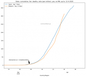
Sweden: Stability with increasing tendency
Bulgaria, Skopje: Inexplicable recent increase
Greece: remaining low.
All countries presented below are:
UK, Greece, Italy, Spain, France, Belgium, Germany, Sweden, Netherlands, US, Ireland, Switzerland, Poland, Germany, Russia, Bulgaria, Skopje, Mexico, Peru, Brazil, South Korea, Turkey, Iran
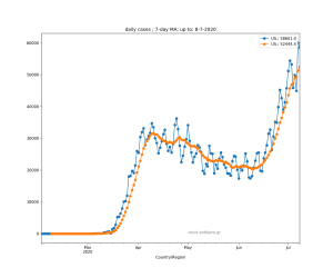
First set of graphs is with daily cases (and 7d moving average)


Second set of graphs is daily deaths (and 7-day average)